
Health & Wellness Industry Projects
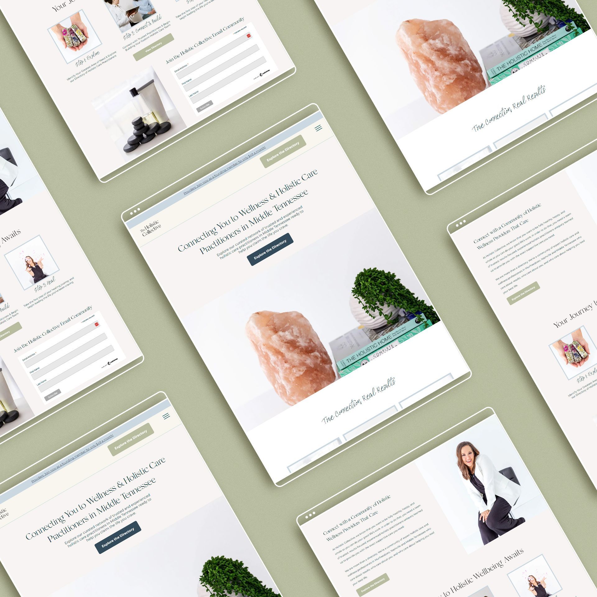
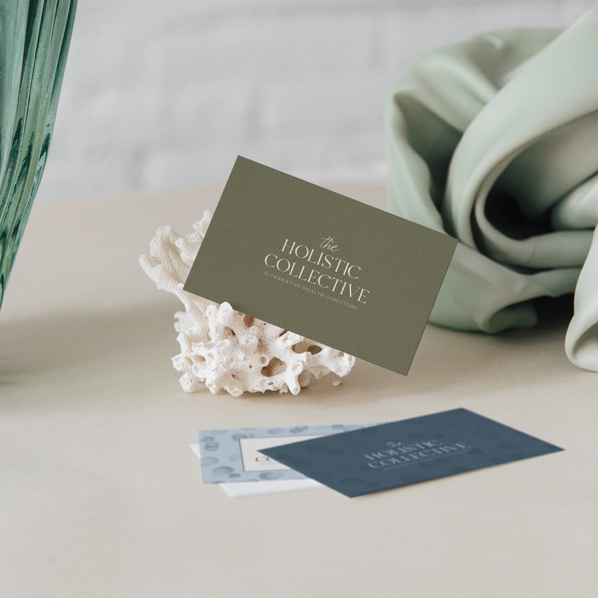
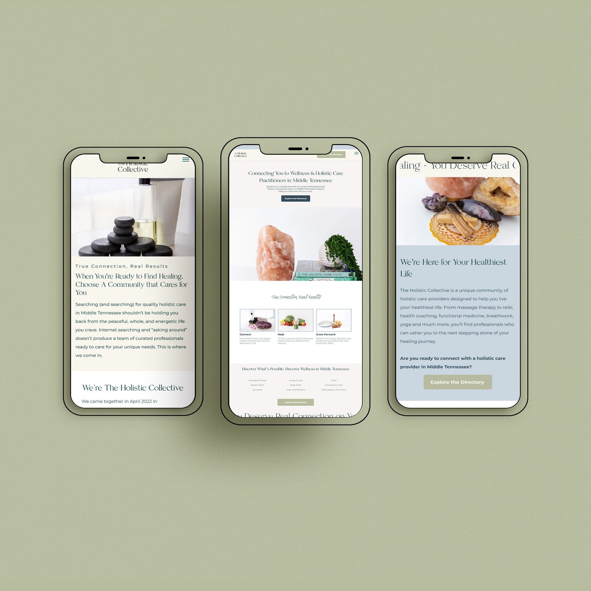
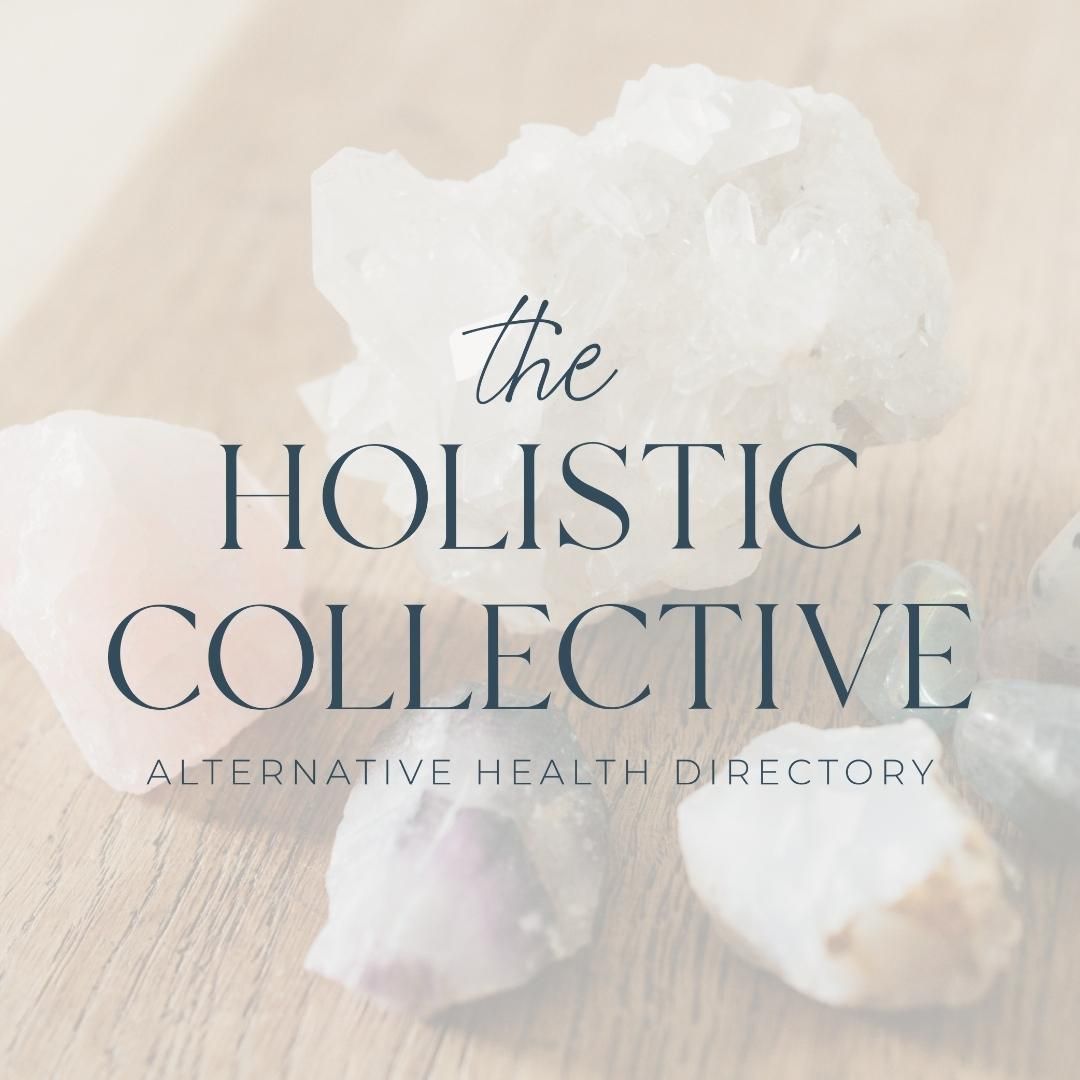
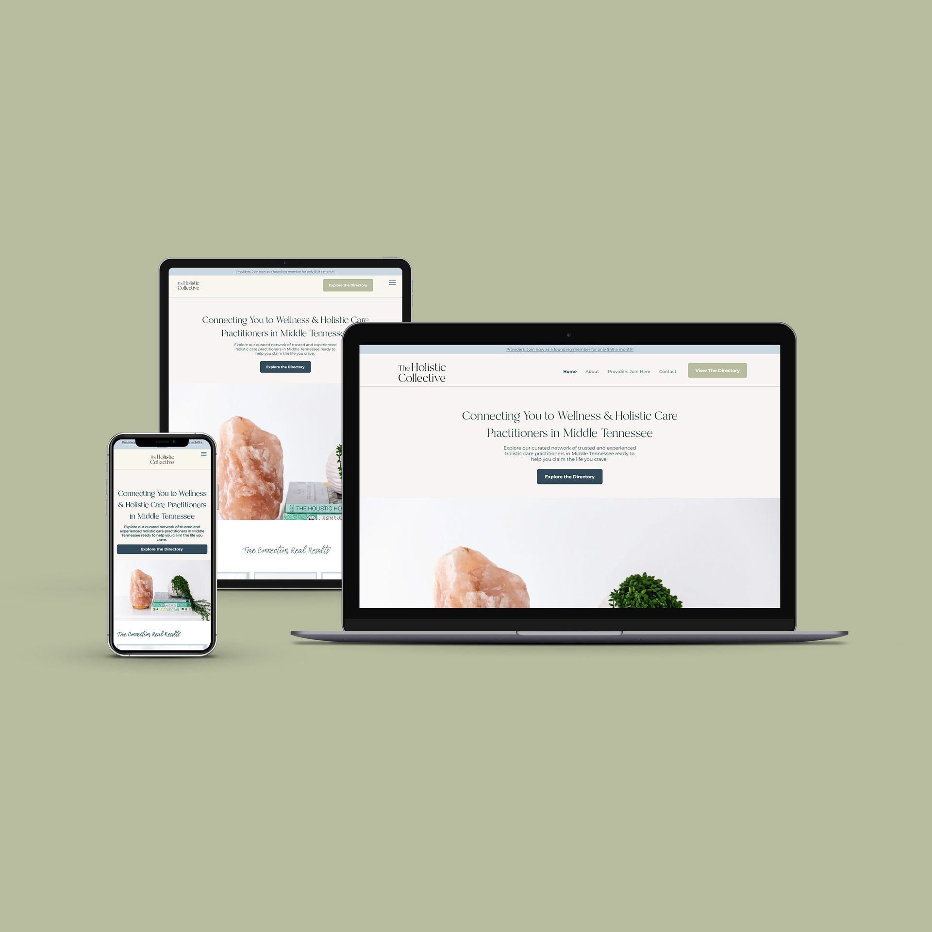
The Holistic Collective
BRAND | COPY | WEBSITE DESIGN | DIRECTORY DEVELOPMENT
We had the joy of collaborating with Amanda Spence, an inspiring visionary, and now a cherished friend, on a brand and website design project for The Holistic Collective. This project wasn't just about crafting visuals; it was about bringing to life a vision that could transform countless lives in Middle Tennessee. The Holistic Collective is a unique concept, a conduit between those seeking alternative healthcare options and a wide variety of holistic providers.
For this project, we meticulously crafted a brand design that would resonate with the diverse array of providers and clients who would interact with the brand. We integrated these design elements into a comprehensive, user-friendly website, complete with directory functionality to seamlessly connect patients with the care they seek. Amanda's vision went beyond just creating a business; she sought to create a community. Our copywriting encapsulated this, injecting the passion and commitment Amanda carries for holistic healthcare into every word.
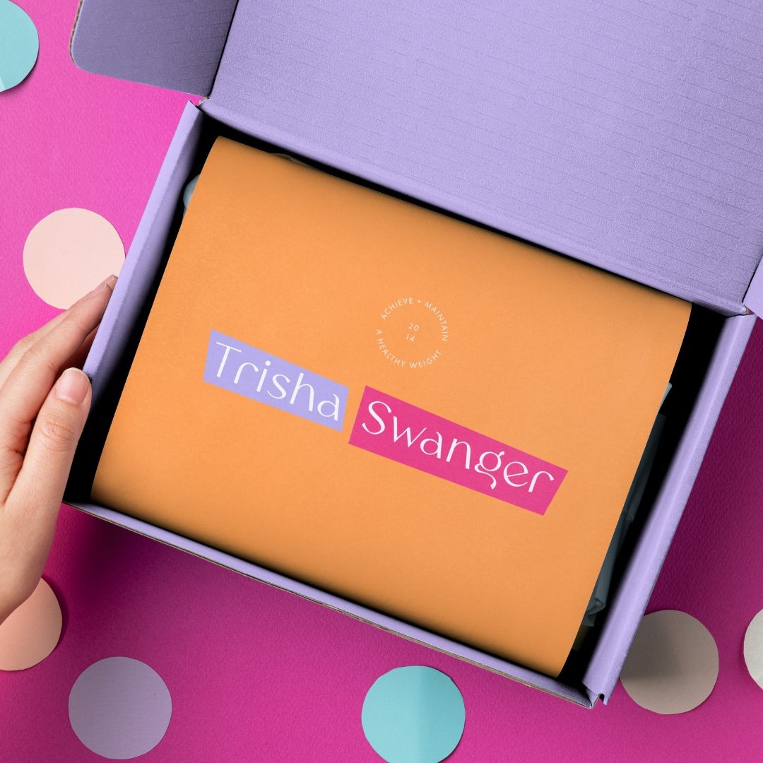
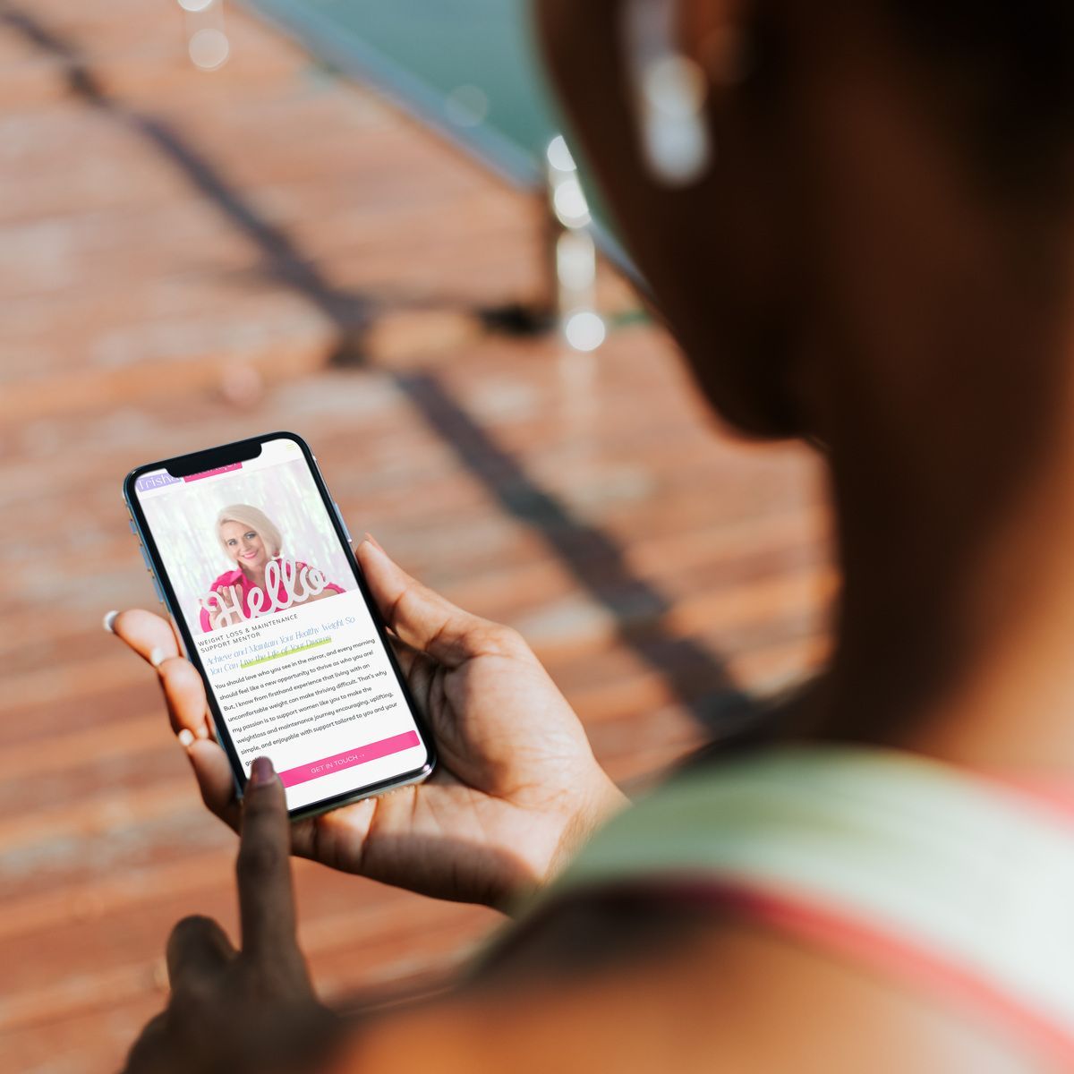
Trisha Swanger
BRAND | COPY | WEBSITE DESIGN
For Trisha Swanger, we crafted a brand and website design that’s as colorful, bright, and confident as the transformative experiences she offers her clients. Our design reflects Trisha’s vibrant approach to teaching clients to step out from being wallflowers to embracing a bold, confident presence. With a palette that pops and visuals that energize, we've created a space online that embodies the essence of Trisha’s coaching philosophy—encouraging everyone to shine brightly in their own lives. Working with Trisha was an inspiring journey, showcasing the power of confidence through design.


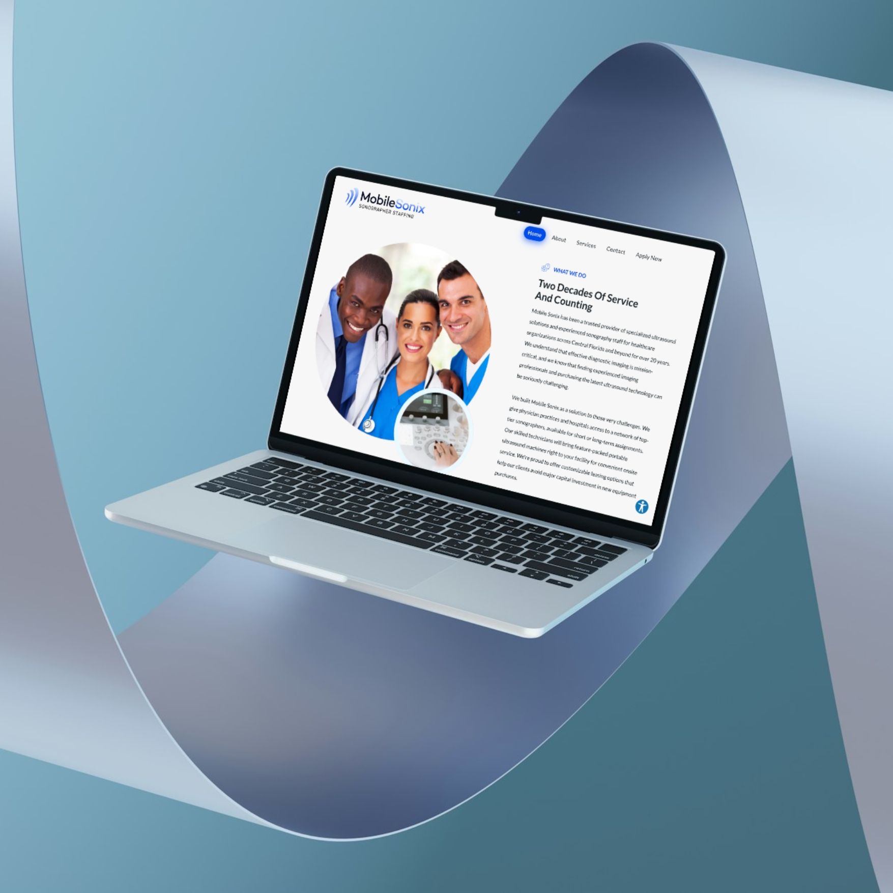
Mobile Sonix
BRAND | COPY | WEBSITE DESIGN
For MobileSonix, a Florida-based mobile ultrasound service, we delivered a brand, website, and copy that reflect the cutting-edge and comprehensive nature of their services—ironically, excluding baby ultrasounds. Our design captures the essence of their professionalism and accessibility, with a clean, modern aesthetic that communicates the ease and convenience of their mobile offerings for doctor's offices. This project was about clarity and trust, ensuring that every element conveys MobileSonix's commitment to helping providers expand their service and convenience for their patients.


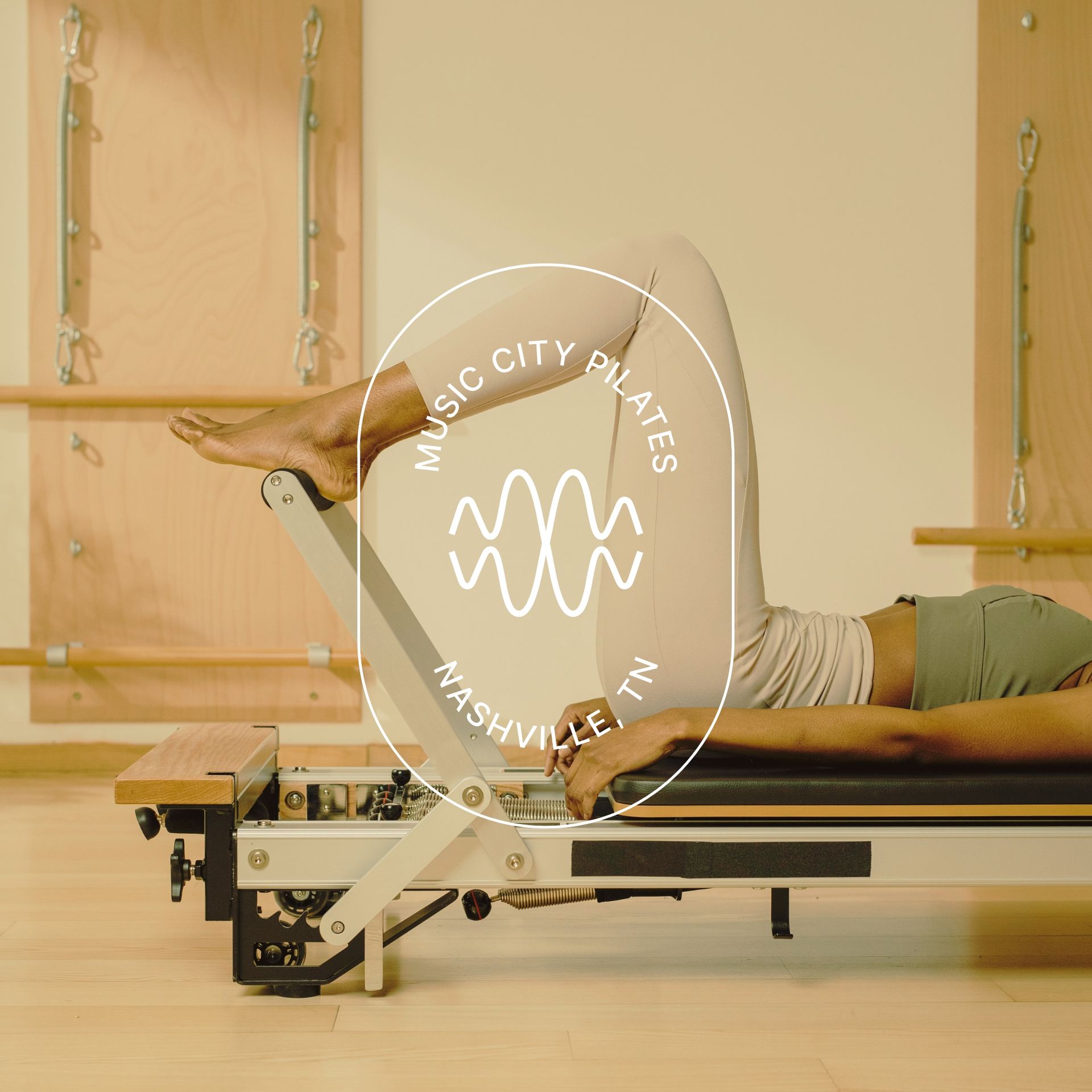
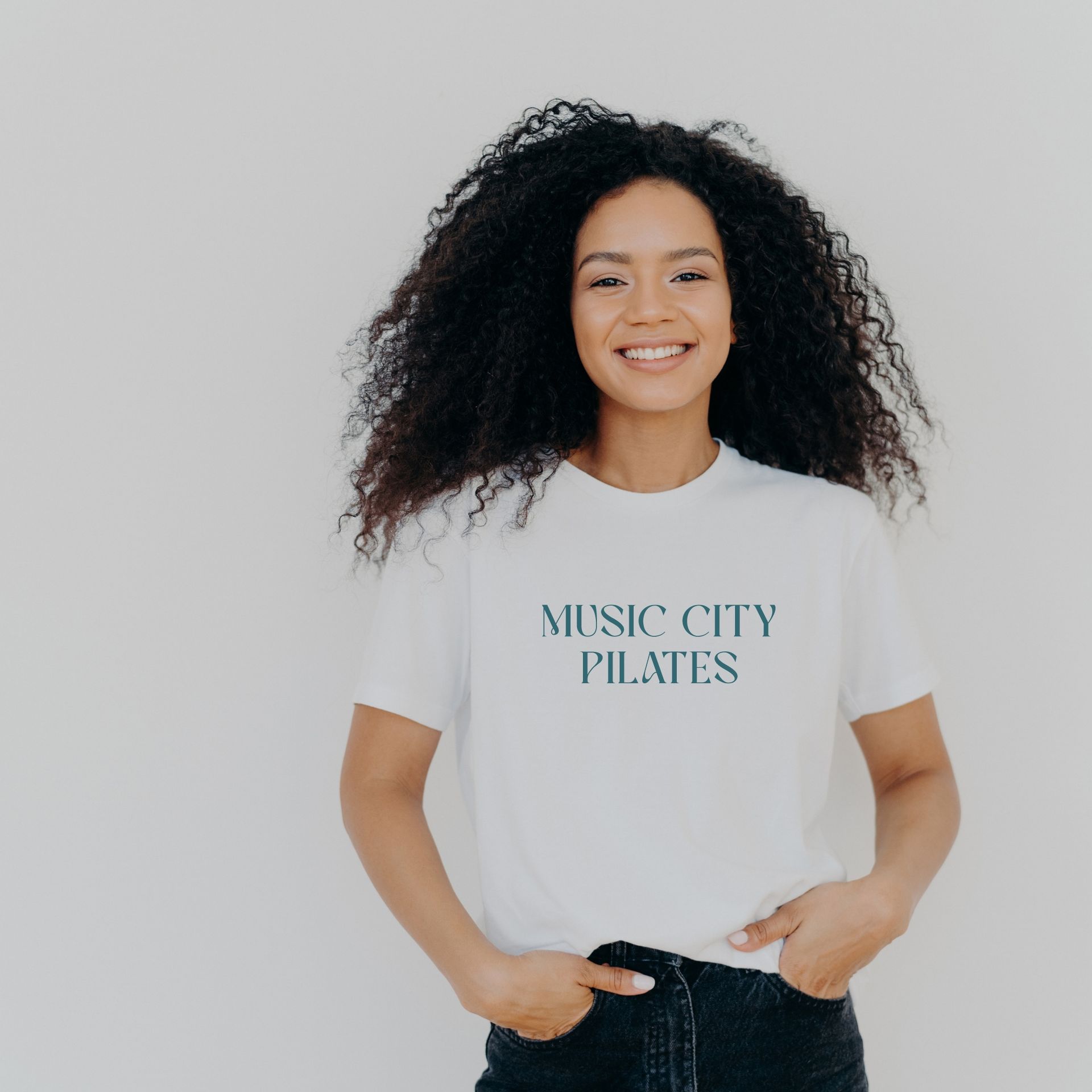
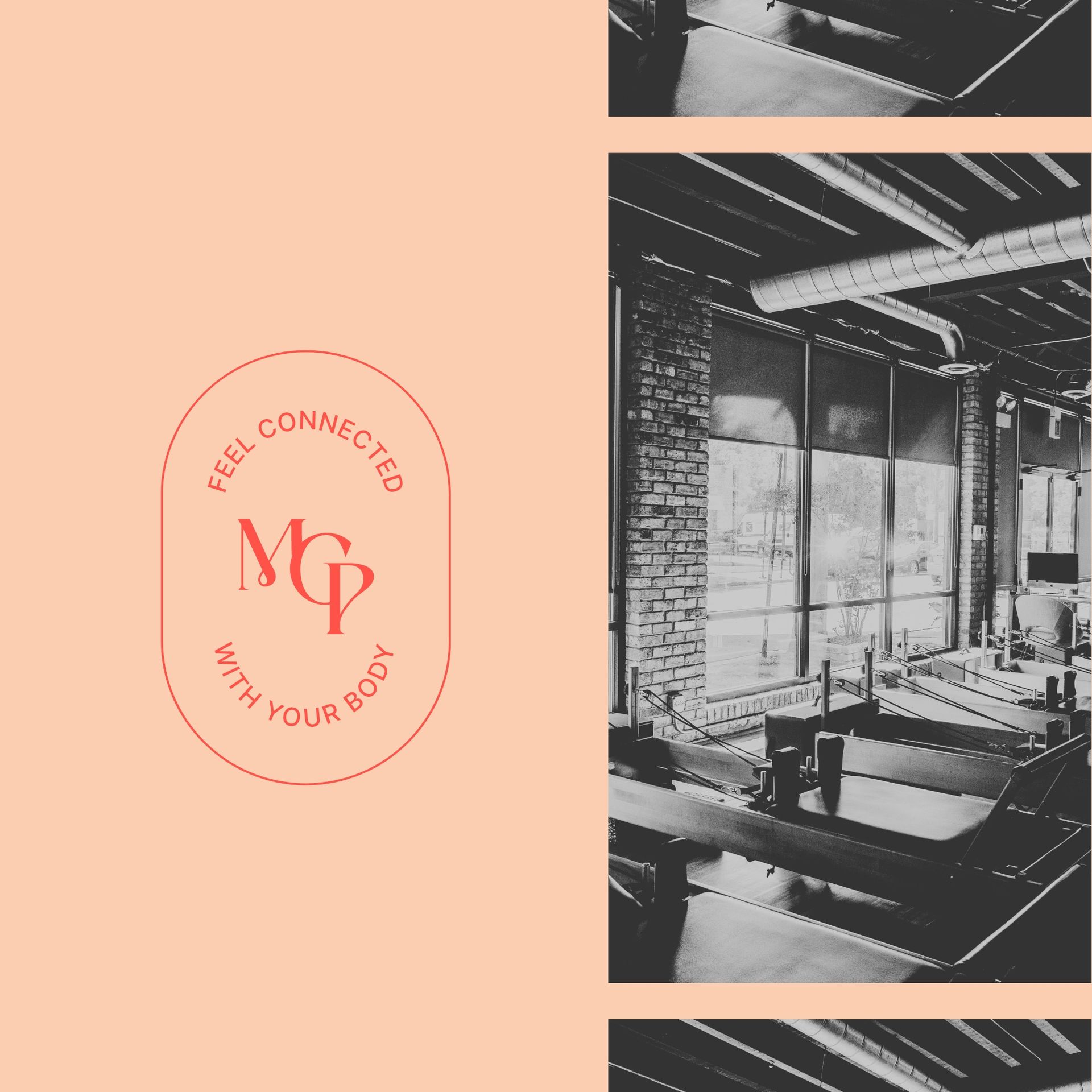
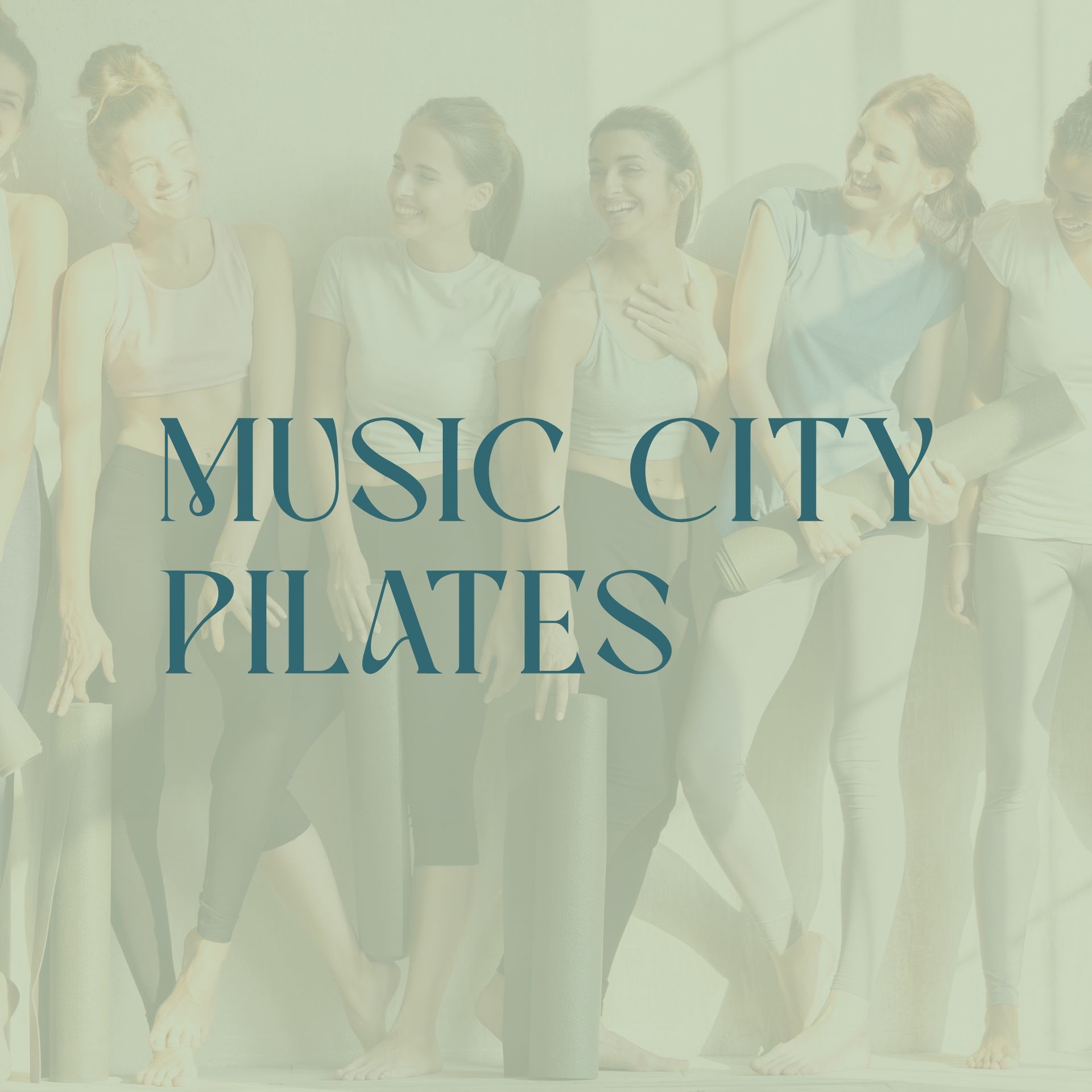
Music City Pilates
BRAND DESIGN
For Music City Pilates, run by the dynamic Jen Peters, we designed a brand that hits all the right notes—merging vintage charm with the fluid grace of Pilates. Reflecting Nashville's iconic music scene, our branding incorporates slightly vintage vibes that resonate with the studio's location and ethos. The client's request for a font with "kick your butt vibes" led us to select a bold, impactful typeface that motivates and energizes, perfectly complementing the studio’s spirited approach to fitness. This brand design encapsulates the essence of Music City Pilates: a place where strength meets rhythm, and movement creates harmony.


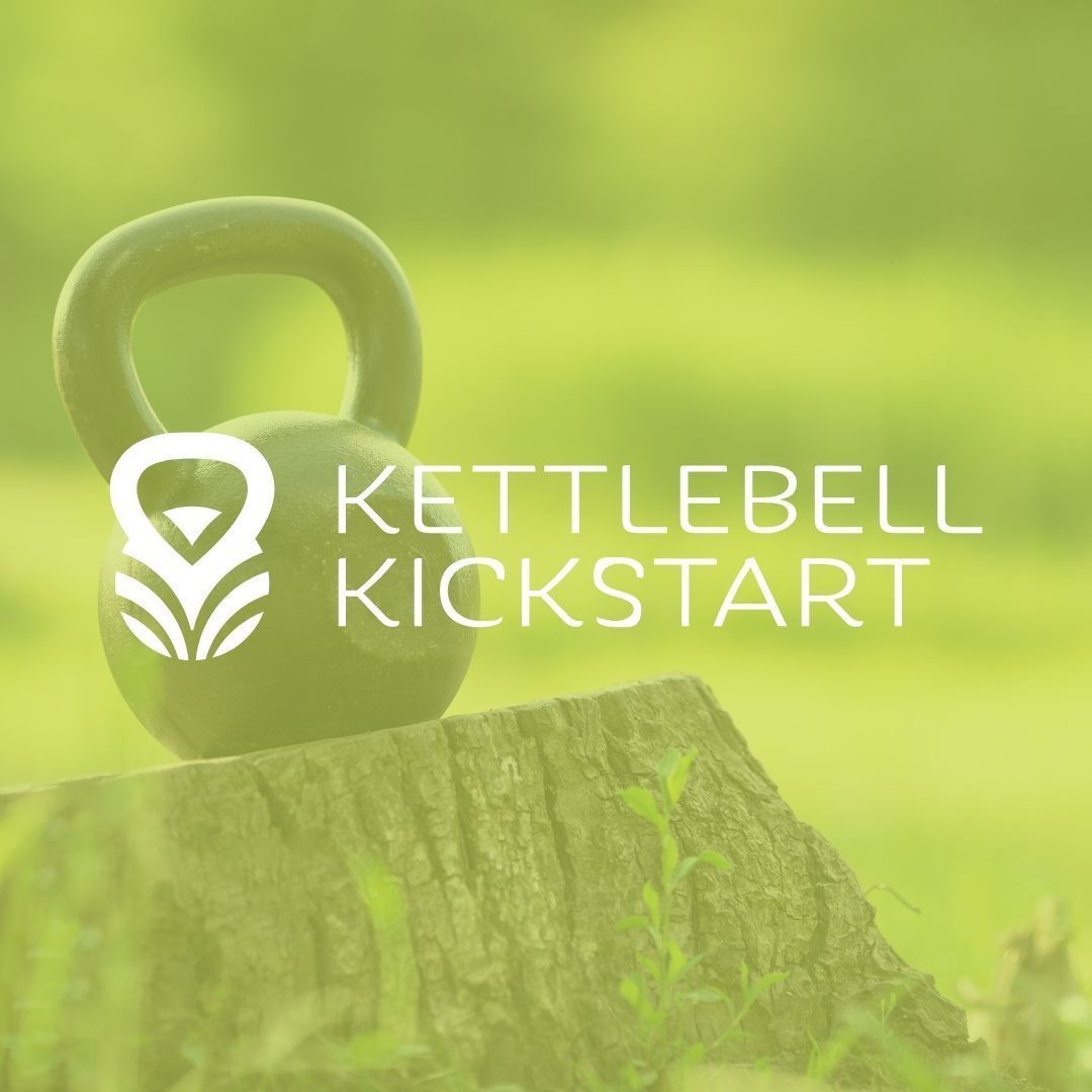
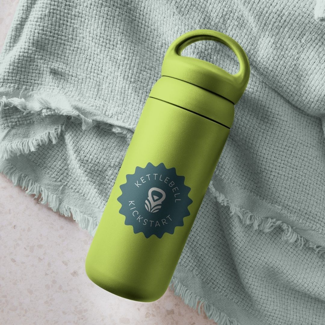
KETTLEBELL KICKSTART
BRAND DESIGN
We had the fantastic opportunity to work with Vanessa Flores and Sam Gonzalez, the dynamic duo behind Kettlebell Kickstart, on their brand design. This project was all about inspiring men and women to embrace a healthier lifestyle through the power of targeted kettlebell workouts.
Kettlebell Kickstart isn't just a fitness program; it's a lifeline to vitality and an active life, enabling people to feel their best, have the energy to play with their kids, and overall, live a healthier lifestyle. Vanessa and Sam needed a brand identity that encapsulated this transformative experience.
Our creative journey led us to a design that blends strength, movement, and vitality – mirroring the experience Kettlebell Kickstart offers to its clients. We delivered a brand design that is as dynamic and motivating as the high-impact kettlebell workouts they champion.
Working with Vanessa and Sam was a thrill. Their passion for wellness and their commitment to making fitness accessible and enjoyable was not only inspiring, but it also fueled our creativity, resulting in a brand design that truly embodies the spirit of Kettlebell Kickstart.
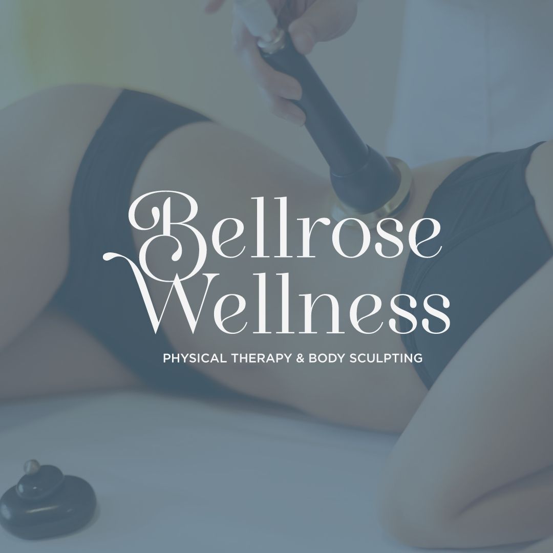
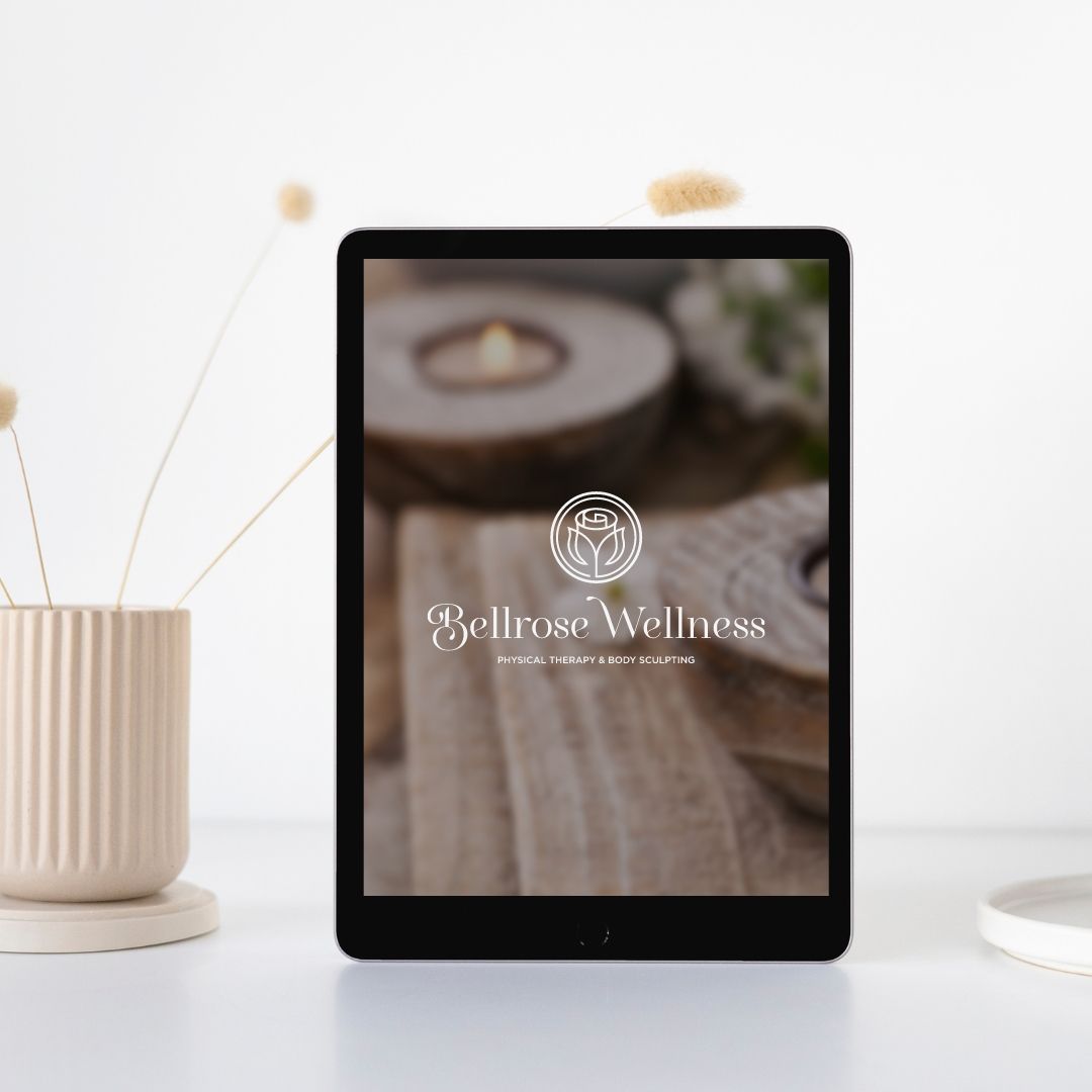
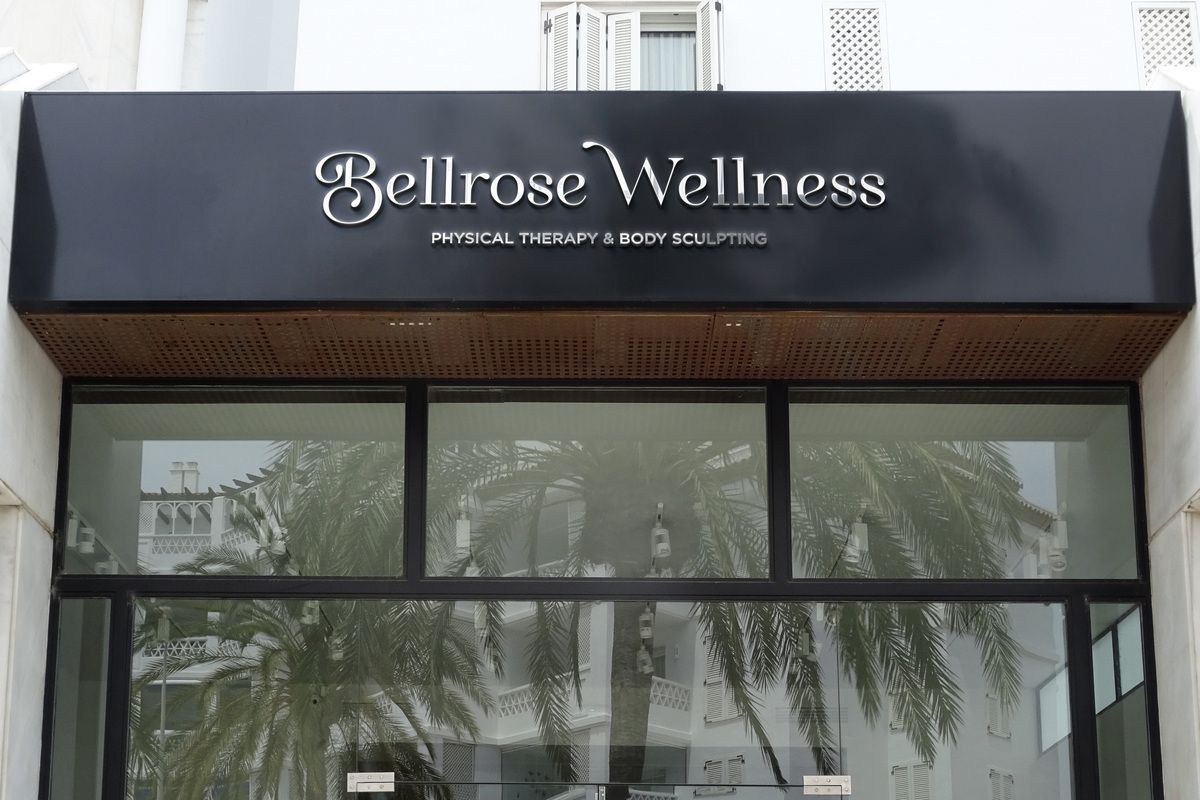
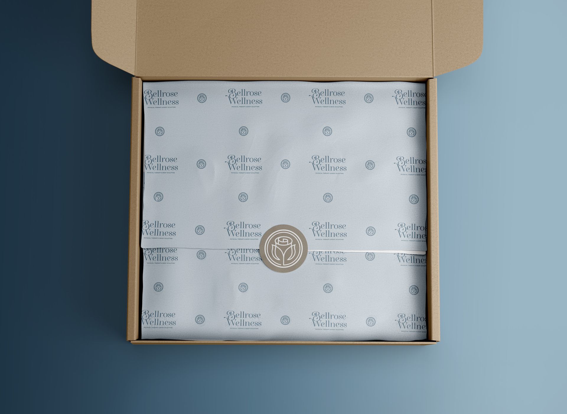
BELLROSE WELLNESS
BRAND DESIGN
Embodying luxury and personal transformation, our team was thrilled to create a unique brand design for Bellrose Wellness, a boutique body sculpting and physical therapy office, owned by Claire Dean. Named after her two daughters' middle names, Claire envisioned a brand identity that was deeply personal and reflected the transformative journey she takes her clients on.
Our creative challenge was to merge the high-end luxury feel of her bespoke services with the heartfelt symbolism of the bell and rose elements. We meticulously crafted a logo that artistically combined these elements, creating a powerful symbol that encapsulates the essence of Bellrose Wellness.
The final design is not only a visual treat, but also a fitting tribute to the ethos of Bellrose Wellness. It captures the luxury of their offerings, the personal journey of transformation that they guide their clients through, and the intimate, familial values that lie at the heart of Claire's business.
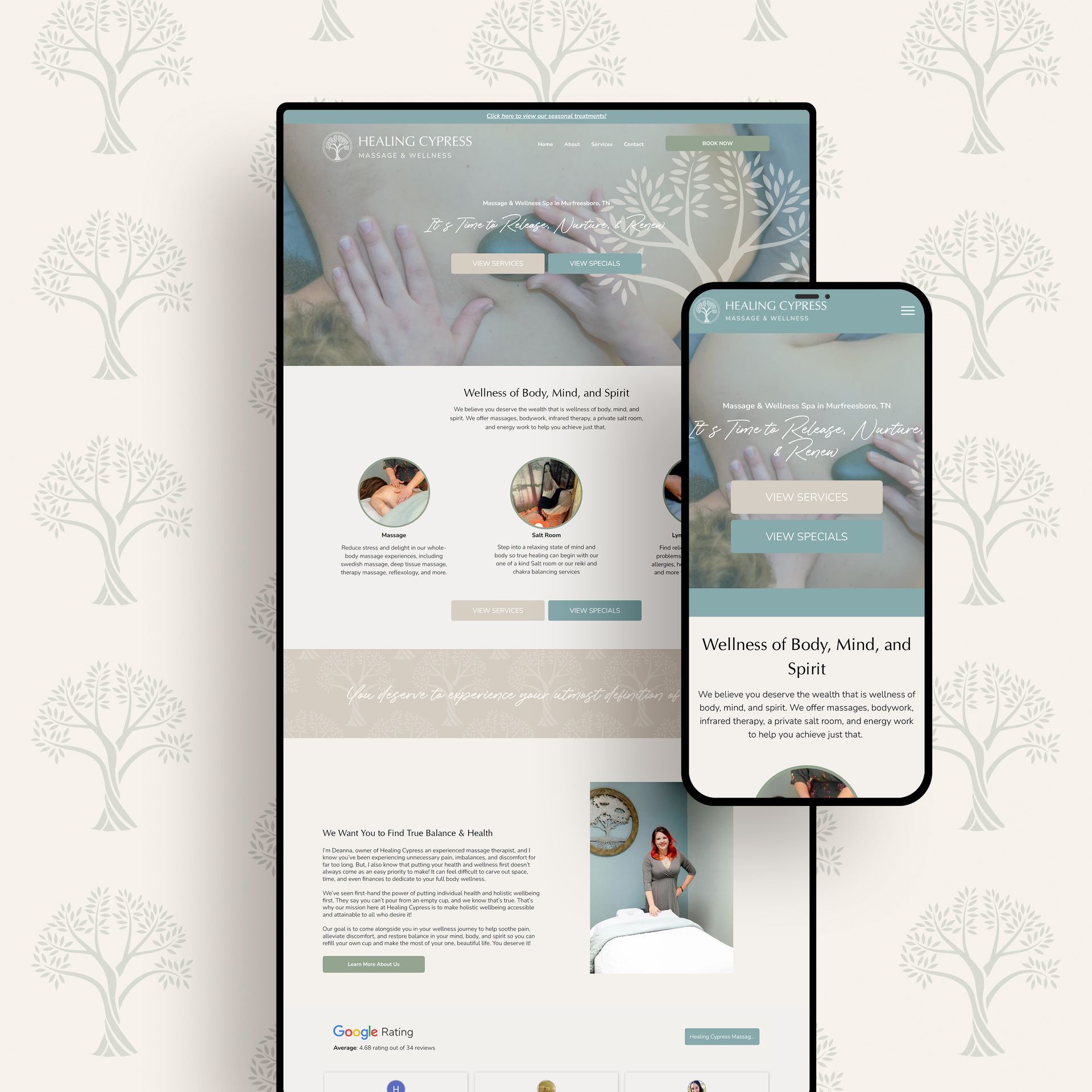
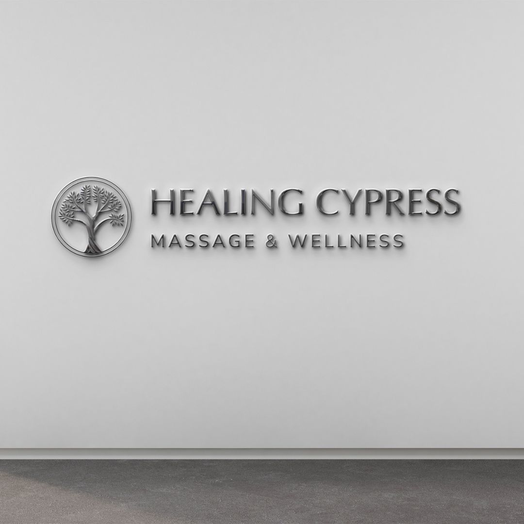
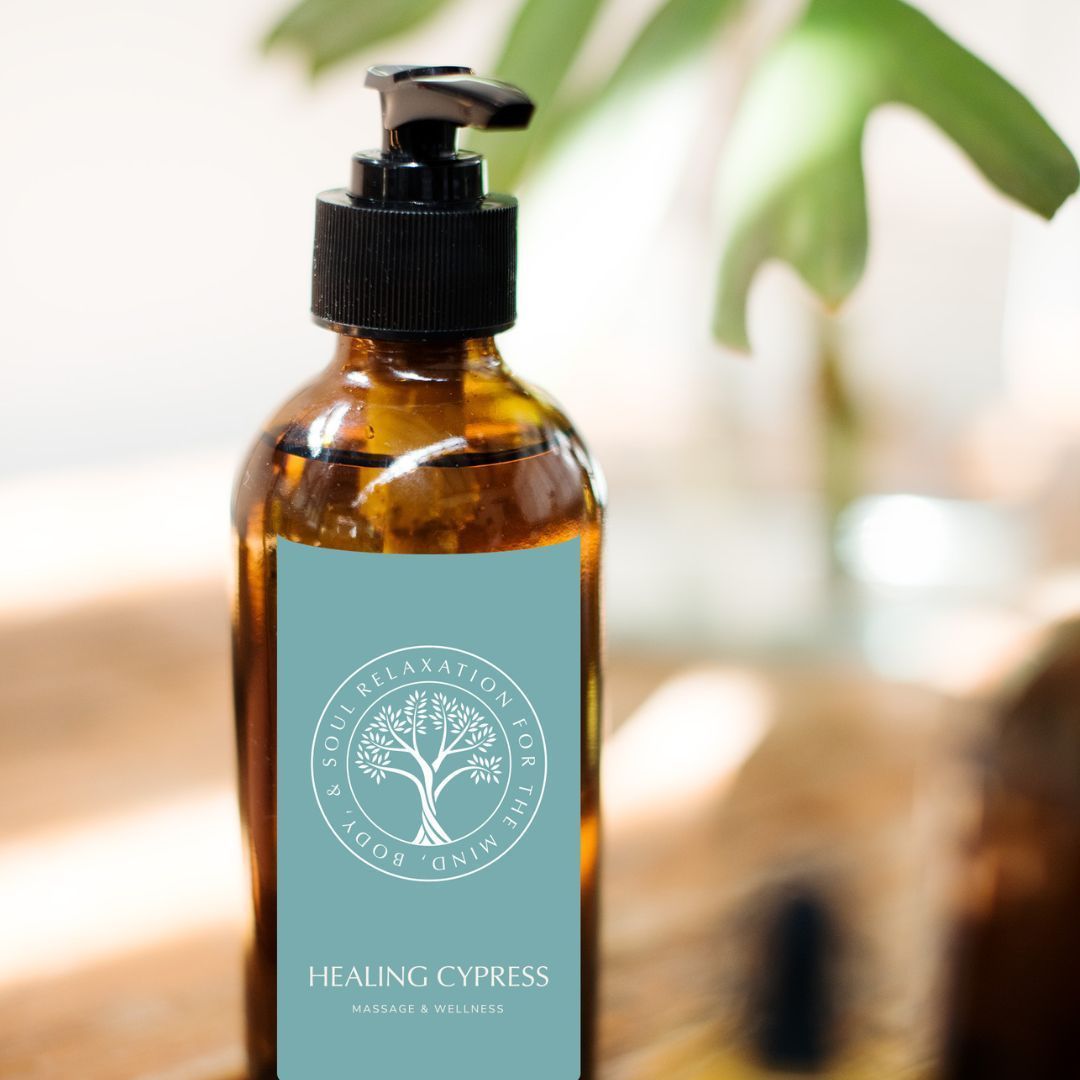
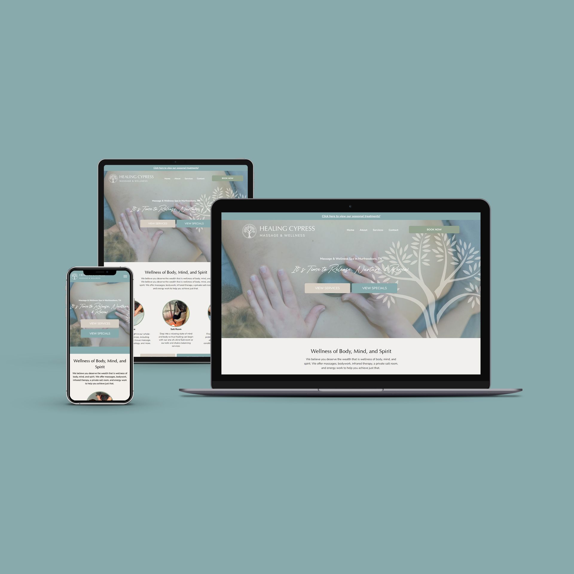
HEALING CYPRESS MASSAGE & WELLNESS
BRAND | COPY | WEBSITE DESIGN
Transforming a lifelong dream into a thriving reality, Deanna Alexander, the compassionate soul behind Healing Cypress Massage & Wellness, partnered with us for a full brand and website design project. Our work also included crafting compelling copy that encapsulated the healing spirit of her practice.
Deanna's passion for massage therapy is rooted in a deep desire to bring comfort, restoration, and balance to her clients' lives. Inspired by this, we crafted a brand identity and website design that exudes tranquility, serenity, and wellness. The design mirrors the calming environment Deanna creates for her clients, where tension melts away, and healing begins.
Our copywriting efforts aimed to voice Deanna's passion and dedication to wellness. The result is an engaging narrative that not only positions Healing Cypress Massage & Wellness as a sanctuary for relaxation and rejuvenation, but also shines a spotlight on Deanna's journey and the warm, nurturing spirit that drives her practice.
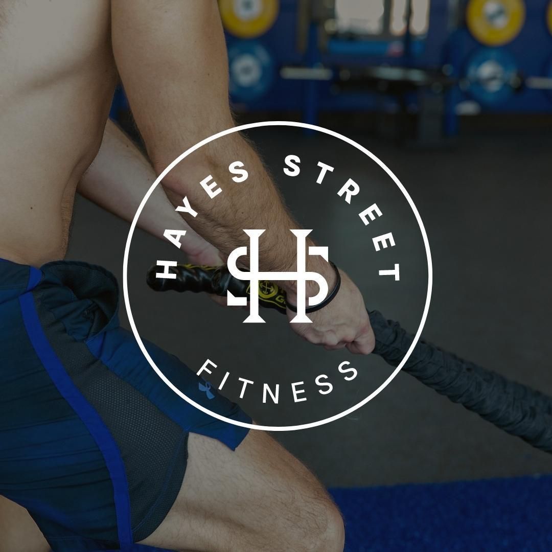
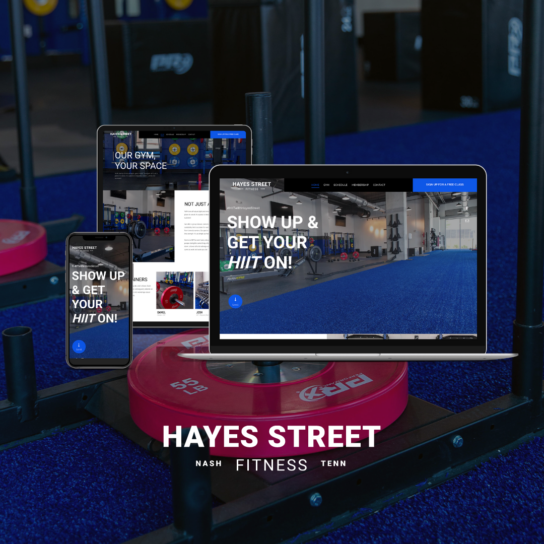
HAYES STREET FITNESS
BRAND | WEBSITE DESIGN
Stepping into the dynamic world of fitness, we embarked on a brand and website design project for Hayes Street Fitness, a vibrant gym located in the heart of downtown Nashville. This project held an extra dash of excitement for me, Makena, as it brought an unforgettable personal moment to life.
Our team rolled up their sleeves to shape a brand identity and website that captured the energetic atmosphere and strong community spirit of Hayes Street Fitness. We highlighted their top-notch facilities and diverse training programs, inviting city dwellers to embark on their own unique fitness journeys right in the hub of Nashville.
As the designer behind the brand, I had a truly surreal experience in 2022. While holiday shopping with my dad, we unexpectedly stumbled upon the storefront of Hayes Street Fitness. Witnessing a logo I designed, prominently displayed in downtown Nashville, brought a sense of accomplishment and pride that's hard to put into words. Seeing my work come alive in this way was a memory I will always treasure.


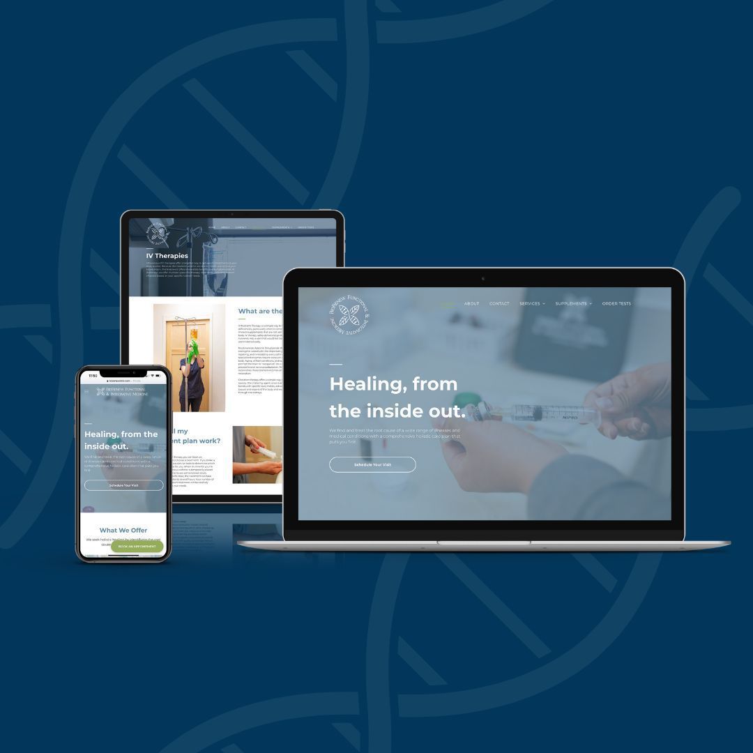
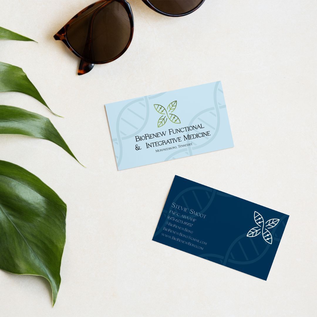
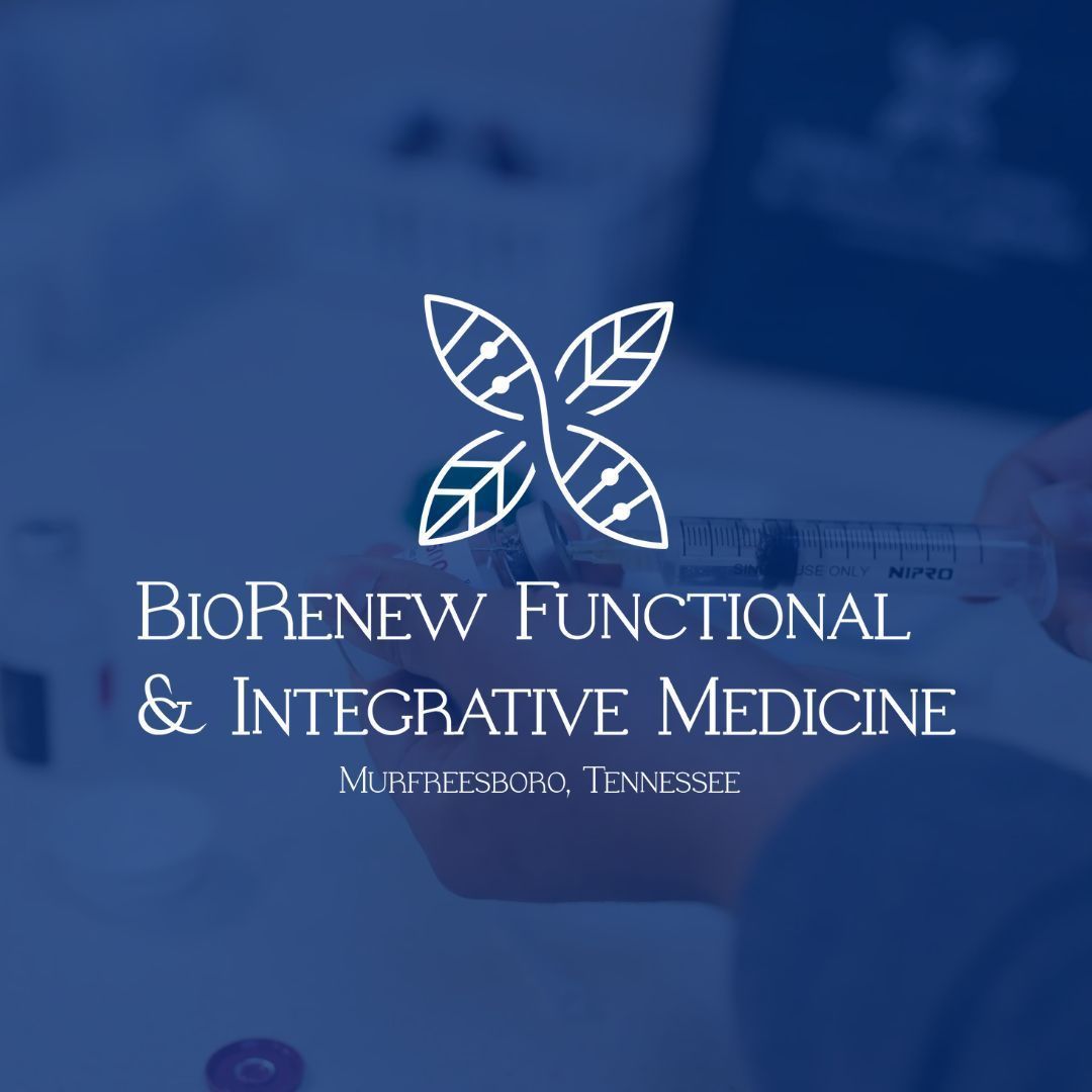
BIORENEW FUNCTIONAL & INTEGRATIVE MEDICINE
BRAND | COPY | WEBSITE DESIGN
On this unique project, we had the pleasure of collaborating with BioRenew Functional and Integrative Medicine, a forward-thinking medical practice that bridges the gap between traditional and integrative health. This transformative brand and website design project also involved carefully crafted copywriting to effectively communicate their distinctive approach to wellness.
Guided by their deep-rooted belief in a whole-person approach to health, we designed a brand and website that mirrored the innovative spirit of the practice. We ensured that the aesthetic was a balance of professional and approachable, reflecting their philosophy of personalized care. The copy was meticulously written to explain their multifaceted approach to treatment, that seeks to identify and address the root causes of illness, rather than simply treating symptoms.
This design and writing project truly resonated with our team, as it was an opportunity to amplify a voice in the healthcare sector that is deeply committed to empowering patients to achieve optimal health. We are proud to have helped shape BioRenew Functional and Integrative Medicine's digital presence, enabling them to connect with a wider audience in their mission to revolutionize healthcare.
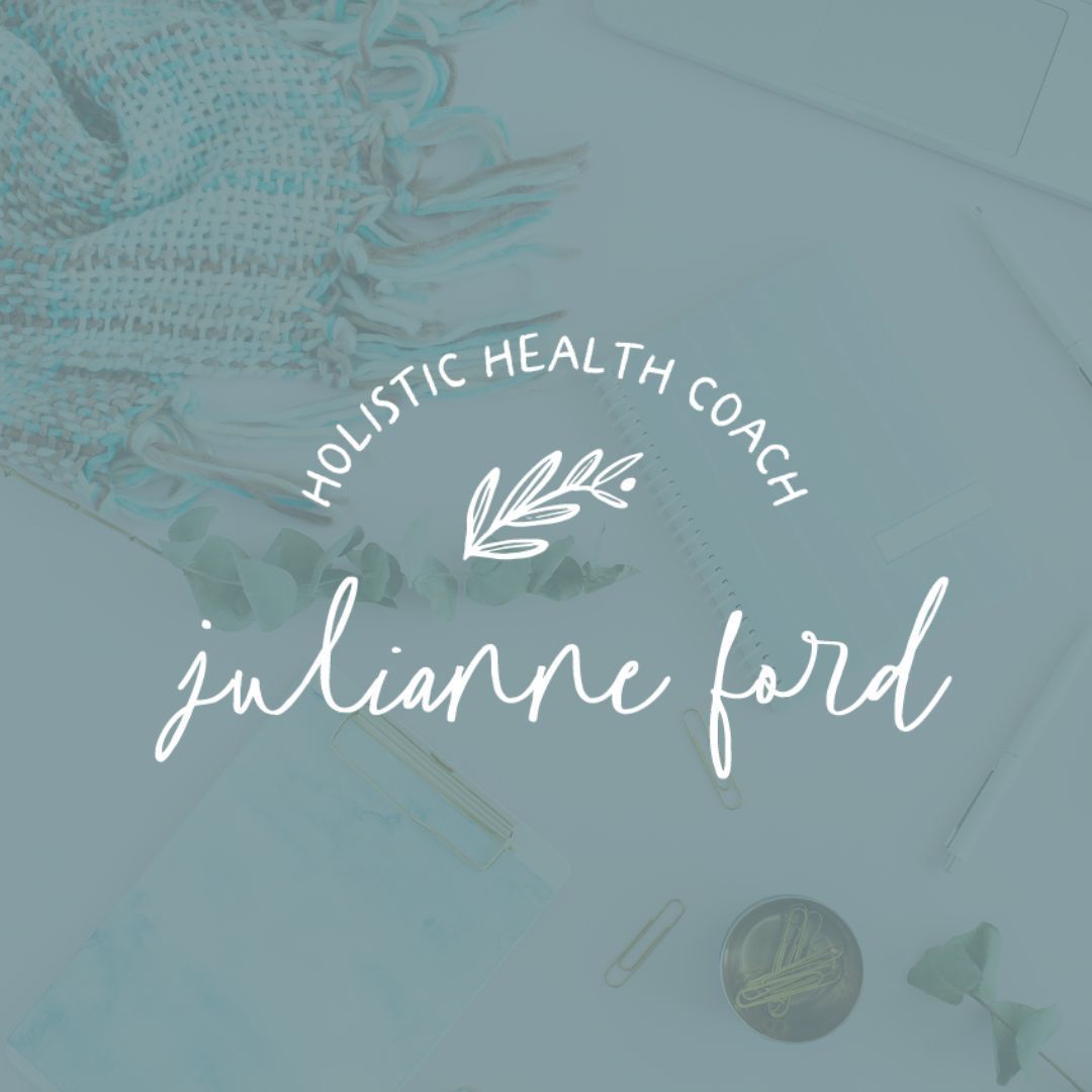
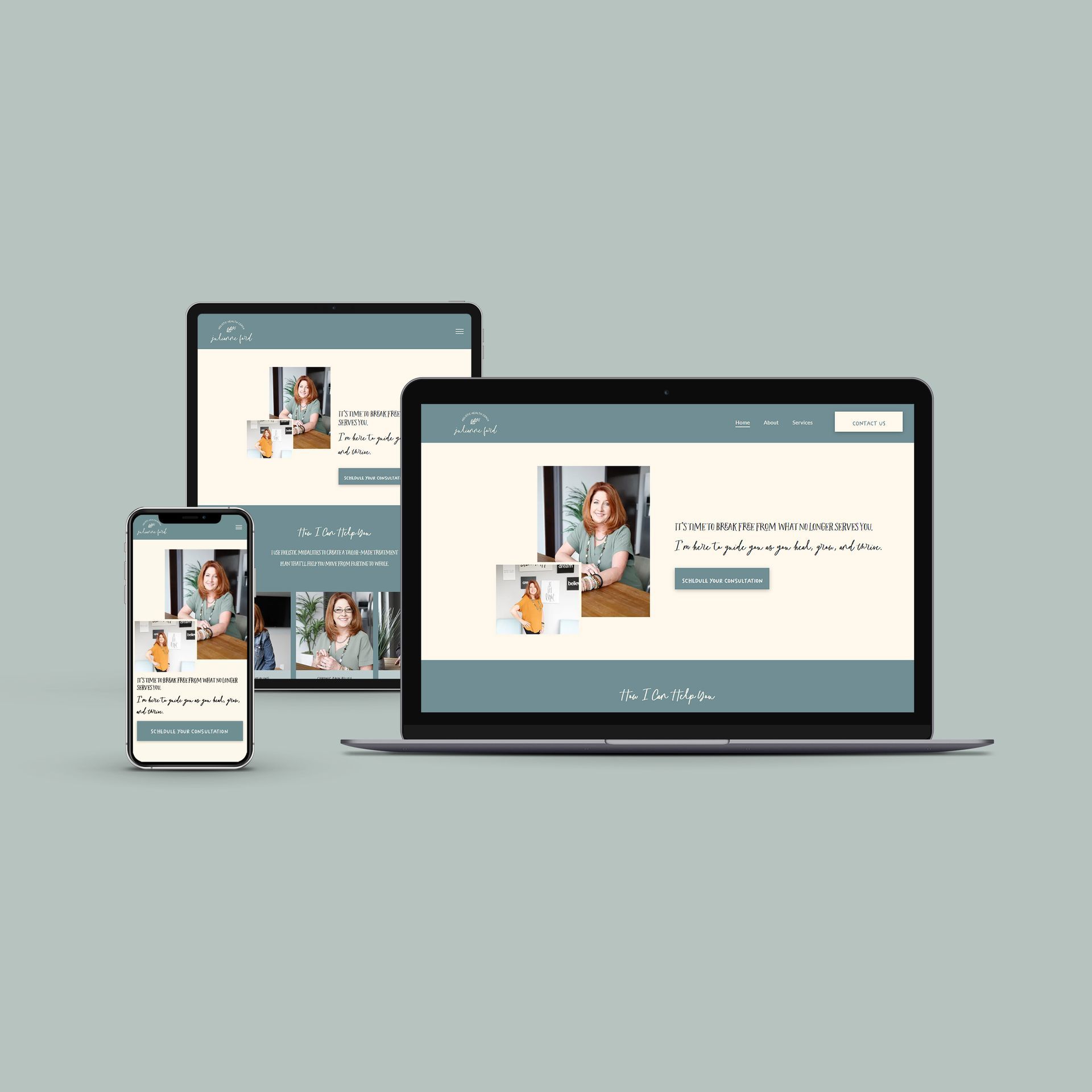
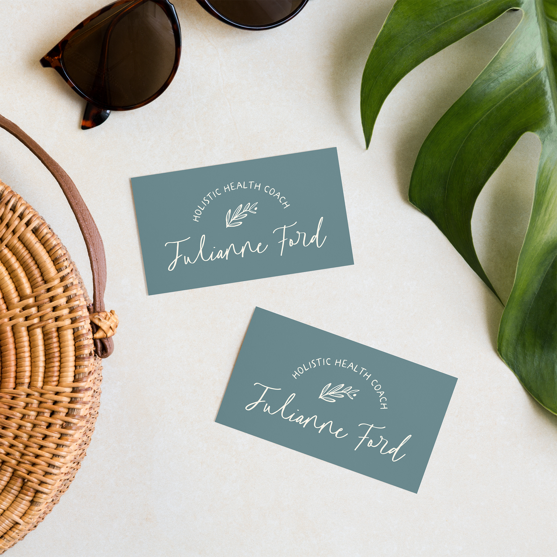
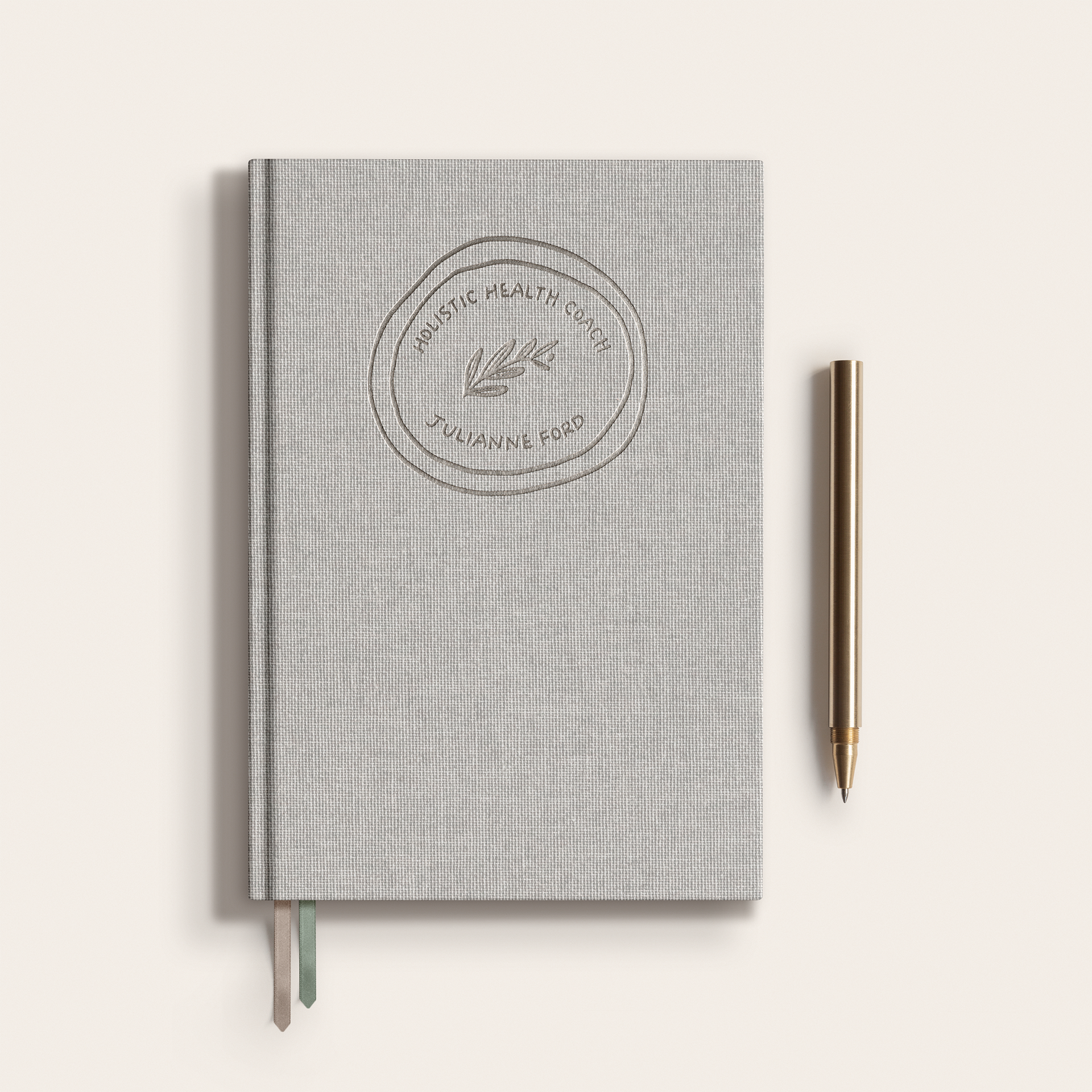
JULIANNE FORD
BRAND | COPY | WEBSITE DESIGN
Step into the realm of transformative wellness with Julianne Ford - a dedicated health and wellness coach who believes in the power of innovative healing modalities. In this exciting brand and website design project, we were privileged to work with Julianne, whose specialty lies in offering an array of unique products designed to alleviate pain and elevate overall health.
Using her understanding of patches and frequencies, Julianne offers a different take on traditional wellness approaches. The design and branding we developed for Julianne encapsulate this unique and futuristic aspect of her services, translating her passion for healing into a visually stunning digital presence.
Julianne's website now offers a seamless user experience, guiding visitors through her array of services, each explained in easy-to-understand language. Her brand captures the essence of her philosophy - welcoming, innovative, and transformative, giving potential clients a glimpse into the enriching journey they are about to embark on with her. The project was a true blend of science, art, and the shared desire to bring positive change to people's lives.
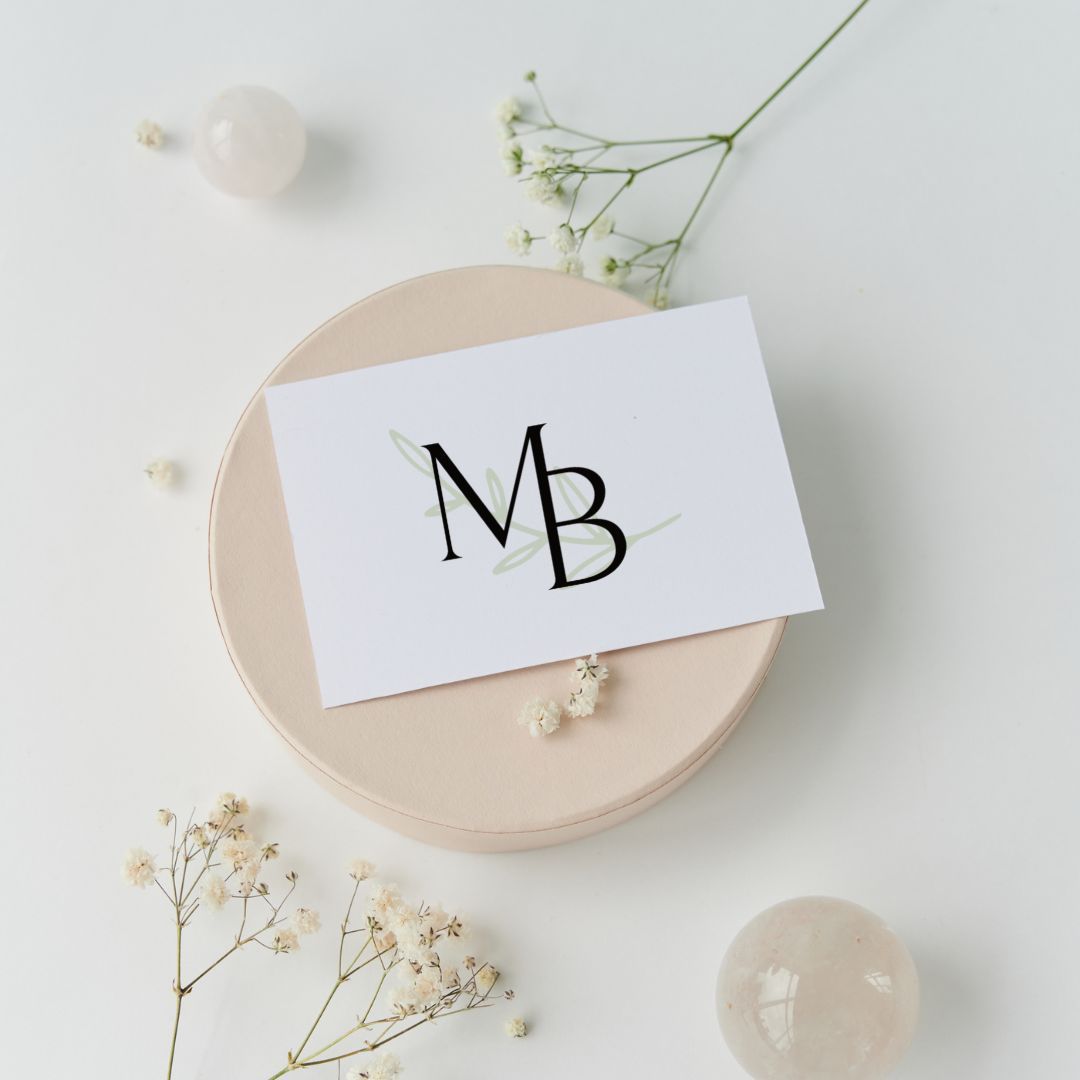
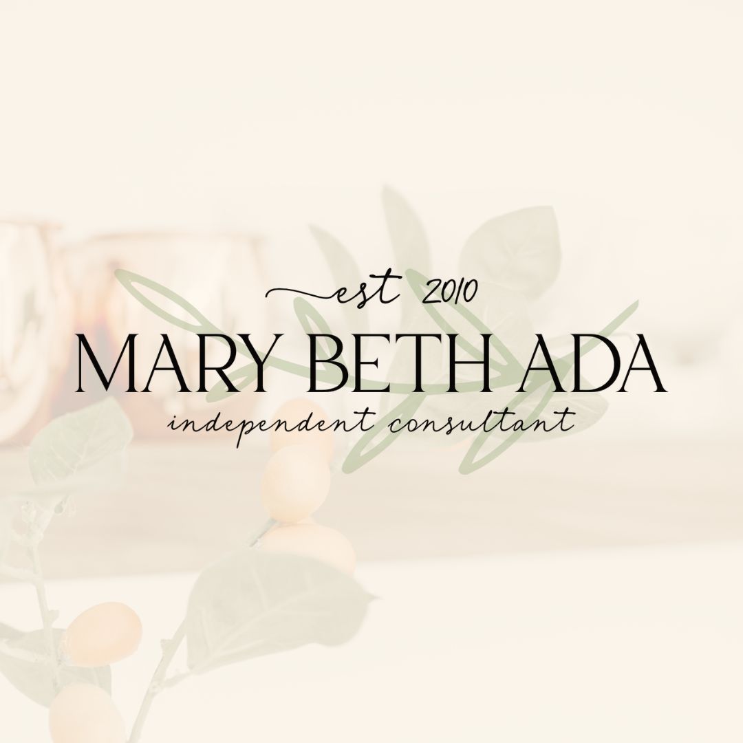
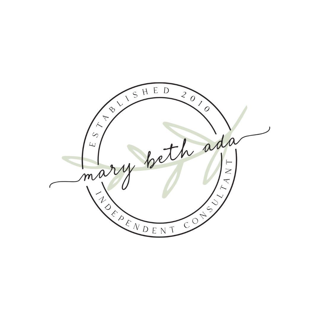
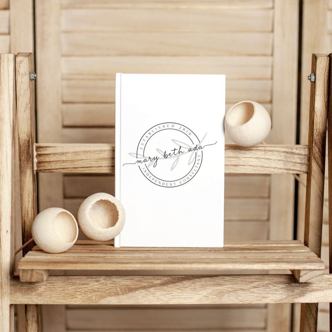
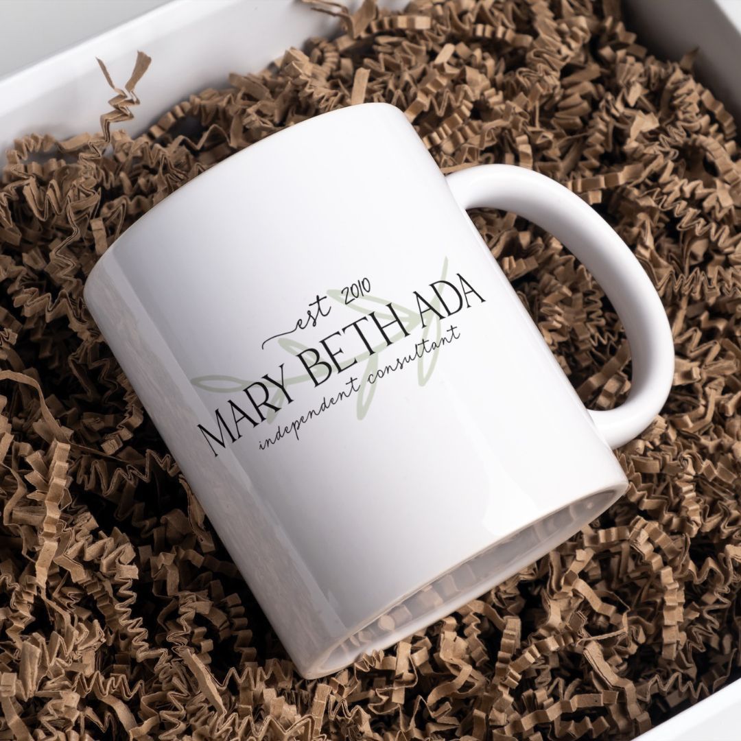
MARYBETH ADA - INDEPENDENT CONSULTANT
BRAND DESIGN
Ready to tap into the youthful, forward-thinking crowd, Mary Beth Ada, an independent Arbonne consultant, approached us with a vision. Her goal? An organic yet warm brand that radiates appeal to a new generation looking for a resilient income stream and a life of their design.
For Mary Beth, we focused on crafting a brand that embodied her vibrant personality and her commitment to providing high-quality Arbonne products. We created a design that perfectly married the organic essence of Arbonne with an inviting, warm aesthetic, capturing the essence of Mary Beth's mission.
The final result was a brand that serves as a visual representation of Mary Beth's dedication to helping her audience build a meaningful life and a resilient income. With its youthful energy and warmth, the new branding harmoniously echoes the spirit of Mary Beth Ada - a committed Arbonne consultant with a big heart and a clear vision.

-
![]() Raise your glasses to the power of impactful branding 🥂✨. We had the pleasure of collaborating with Lesa from @cheerspromotions, a wizard in the wine & spirits tasting arena. Our mission? To uncork the good vibes of Cheers Promotions with a brand and website design as distinctive and inviting as the fine beverages they promote. 🍷💻 Our journey with Lesa has been a toast to innovation, blending her vision with our creativity to serve up powerful promotions that capture attention and elevate beverage brands to new heights. Ready to transform your brand into the talk of the town? Let’s chat about crafting a brand experience that your audience will love. 🚀💌 What’s your beverage of choice to celebrate a successful collaboration? Share with us in the comments! 🎉Button
Raise your glasses to the power of impactful branding 🥂✨. We had the pleasure of collaborating with Lesa from @cheerspromotions, a wizard in the wine & spirits tasting arena. Our mission? To uncork the good vibes of Cheers Promotions with a brand and website design as distinctive and inviting as the fine beverages they promote. 🍷💻 Our journey with Lesa has been a toast to innovation, blending her vision with our creativity to serve up powerful promotions that capture attention and elevate beverage brands to new heights. Ready to transform your brand into the talk of the town? Let’s chat about crafting a brand experience that your audience will love. 🚀💌 What’s your beverage of choice to celebrate a successful collaboration? Share with us in the comments! 🎉Button -
![]() Dive into a workspace that goes beyond the desk! 🌟✨ Did you know a co-working space offers you incredible perks you might not have thought of? Here's the top 3: 1. **Lift as You Succeed** – Imagine a place where every milestone is celebrated, not just by you but by a community that cheers you on every step of the way. 🎉 2. **Professional Development Opportunities** – It’s not just about having a spot for your laptop; it’s an investment in your growth. Workshops, seminars, and networking events right at your fingertips can be the game-changer your business needs. 💼🚀 3. **Creating Meaningful Relationships** – Beyond business connections, coworking spaces foster environments where lifelong friendships and mentorships blossom. 🌱❤️ Who knew work could offer so much more? Ready to transform how you work and who you work with? Share your thoughts or tag someone who could benefit from joining a coworking space! 👇💬 Come join me anytime @thesapphiresuiteButton
Dive into a workspace that goes beyond the desk! 🌟✨ Did you know a co-working space offers you incredible perks you might not have thought of? Here's the top 3: 1. **Lift as You Succeed** – Imagine a place where every milestone is celebrated, not just by you but by a community that cheers you on every step of the way. 🎉 2. **Professional Development Opportunities** – It’s not just about having a spot for your laptop; it’s an investment in your growth. Workshops, seminars, and networking events right at your fingertips can be the game-changer your business needs. 💼🚀 3. **Creating Meaningful Relationships** – Beyond business connections, coworking spaces foster environments where lifelong friendships and mentorships blossom. 🌱❤️ Who knew work could offer so much more? Ready to transform how you work and who you work with? Share your thoughts or tag someone who could benefit from joining a coworking space! 👇💬 Come join me anytime @thesapphiresuiteButton -
![]() Feliz Cinco de Mayo! 🎉 Today, we celebrate the rich history and vibrant traditions that make this day so special. Whether it's gathering with friends over margaritas, savoring the crunch of chips and salsa, or engaging in your own unique traditions, there’s no wrong way to commemorate this day. How do you embrace the spirit of Cinco de Mayo? 🌮🍹 For me, Cinco De Mayo is actually my late Grandpa Jack's birthday! So my family always celebrates with some good tacos, and his TRUE favorite, a chocolate shake. Happy birthday in Heaven, Grandpa Jack! 📸: @lifestylebyleblanc Seasonal Sparkle Minis!Button
Feliz Cinco de Mayo! 🎉 Today, we celebrate the rich history and vibrant traditions that make this day so special. Whether it's gathering with friends over margaritas, savoring the crunch of chips and salsa, or engaging in your own unique traditions, there’s no wrong way to commemorate this day. How do you embrace the spirit of Cinco de Mayo? 🌮🍹 For me, Cinco De Mayo is actually my late Grandpa Jack's birthday! So my family always celebrates with some good tacos, and his TRUE favorite, a chocolate shake. Happy birthday in Heaven, Grandpa Jack! 📸: @lifestylebyleblanc Seasonal Sparkle Minis!Button -
![]() Ever feel like your business has evolved, but your logo still lives in the past? 🤔💡 It's a common milestone on the journey to greatness. A logo isn't just a mark; it's the embodiment of your brand's identity, values, and vision. As your business grows and transforms, your logo should too. Embracing a new logo can be the catalyst for change, signaling to the world not just who you are, but who you aspire to be. It’s more than a refresh; it’s an evolution. Ready to change the trajectory of your business with a logo that tells your story? Let's explore how a new logo can bring new possibilities for your brand. 💫🚀 Have you experienced the transformative power of rebranding? Share your story or leave a comment below! 🌟Button
Ever feel like your business has evolved, but your logo still lives in the past? 🤔💡 It's a common milestone on the journey to greatness. A logo isn't just a mark; it's the embodiment of your brand's identity, values, and vision. As your business grows and transforms, your logo should too. Embracing a new logo can be the catalyst for change, signaling to the world not just who you are, but who you aspire to be. It’s more than a refresh; it’s an evolution. Ready to change the trajectory of your business with a logo that tells your story? Let's explore how a new logo can bring new possibilities for your brand. 💫🚀 Have you experienced the transformative power of rebranding? Share your story or leave a comment below! 🌟Button -
![]() We had the honor of partnering with the incredible Sherry Ristau, owner of Amethyst Bold Leadership Community, an oasis for Christian women in leadership seeking transformational coaching and a nurturing community. Together, we crafted a brand that truly embodies her mission of empowerment and connection. Witnessing her vision come alive has been an inspiring journey. 💜 Are you ready to elevate your brand’s essence and connect more deeply with your audience? Let's chat about your vision. Send a direct message or leave a comment below! ✨Button
We had the honor of partnering with the incredible Sherry Ristau, owner of Amethyst Bold Leadership Community, an oasis for Christian women in leadership seeking transformational coaching and a nurturing community. Together, we crafted a brand that truly embodies her mission of empowerment and connection. Witnessing her vision come alive has been an inspiring journey. 💜 Are you ready to elevate your brand’s essence and connect more deeply with your audience? Let's chat about your vision. Send a direct message or leave a comment below! ✨Button -
![]() Ever felt like your brand is whispering when it should be confidently speaking out? 💬 I'm Makena, your go-to brand and website designer, on a mission to amplify your voice online! With a blend of creativity and strategy, let's transform your brand into what you've always dreamed it could be – memorable, impactful, and utterly you. Ready to elevate your digital presence? Let's chat! Drop me a message or leave a comment below. 🌟 #DreamBigWithMakenaButton
Ever felt like your brand is whispering when it should be confidently speaking out? 💬 I'm Makena, your go-to brand and website designer, on a mission to amplify your voice online! With a blend of creativity and strategy, let's transform your brand into what you've always dreamed it could be – memorable, impactful, and utterly you. Ready to elevate your digital presence? Let's chat! Drop me a message or leave a comment below. 🌟 #DreamBigWithMakenaButton -
![]() Oops! Used a JPEG instead of a PNG; now our logo’s transparency is history. I always joke with my clients that I should never see a white box with your logo in it… always use the png file in Canva!Button
Oops! Used a JPEG instead of a PNG; now our logo’s transparency is history. I always joke with my clients that I should never see a white box with your logo in it… always use the png file in Canva!Button -
![]() Client Showcase! Bringing visions to life with purpose and passion ✨ We recently teamed up with Tammy of The Fitzpatrick Collective (@thefitzpatrickcollective), a beacon of empowerment for leaders striving to elevate their organizations and nurture dynamic teams. Our collaboration? A journey of brand and website design that mirrors the essence of transformation and growth. 🌱 With Tammy's vision in guiding us, we embraced the elegance of neutral tones to design an online space that reflects the powerful impact of her advisory. Every detail was crafted with the intention of inspiring leaders to embark on their journey of revitalization with confidence. Are you ready to transform your leadership and foster a thriving environment? Connect with Tammy to begin your transformation. Inspired to redefine your brand or create a digital space that truly represents your mission? Let's make it happen together! Send us a direct message or leave a comment below. Here's to creating impactful legacies! 🌟Button
Client Showcase! Bringing visions to life with purpose and passion ✨ We recently teamed up with Tammy of The Fitzpatrick Collective (@thefitzpatrickcollective), a beacon of empowerment for leaders striving to elevate their organizations and nurture dynamic teams. Our collaboration? A journey of brand and website design that mirrors the essence of transformation and growth. 🌱 With Tammy's vision in guiding us, we embraced the elegance of neutral tones to design an online space that reflects the powerful impact of her advisory. Every detail was crafted with the intention of inspiring leaders to embark on their journey of revitalization with confidence. Are you ready to transform your leadership and foster a thriving environment? Connect with Tammy to begin your transformation. Inspired to redefine your brand or create a digital space that truly represents your mission? Let's make it happen together! Send us a direct message or leave a comment below. Here's to creating impactful legacies! 🌟Button -
![]() April showers bring May flowers 🌧️🌸 As we welcome the rejuvenating rains of April, I can't help but reflect on the beauty and resilience that flowers represent. Each bloom, a burst of color and life, is a testament to patience, growth, and the power of nurturing. Just like the delicate petals that weather the storms to bask in the sunlight, we too have the strength to rise through challenges and flourish. Flowers remind us of new beginnings, the cycle of renewal, and the endless possibilities that await with each season. They symbolize the journey of growth, teaching us to embrace change and find beauty in the transitions. What’s your favorite flower and what does it symbolize for you? 🌼 Let’s share and celebrate the meanings behind these natural wonders. Drop a comment or send us a direct message. Here’s to blooming, no matter the season! 🌿✨Button
April showers bring May flowers 🌧️🌸 As we welcome the rejuvenating rains of April, I can't help but reflect on the beauty and resilience that flowers represent. Each bloom, a burst of color and life, is a testament to patience, growth, and the power of nurturing. Just like the delicate petals that weather the storms to bask in the sunlight, we too have the strength to rise through challenges and flourish. Flowers remind us of new beginnings, the cycle of renewal, and the endless possibilities that await with each season. They symbolize the journey of growth, teaching us to embrace change and find beauty in the transitions. What’s your favorite flower and what does it symbolize for you? 🌼 Let’s share and celebrate the meanings behind these natural wonders. Drop a comment or send us a direct message. Here’s to blooming, no matter the season! 🌿✨Button -
![]() Let your jewelry be the spark that ignites conversations 🌟✨Funny enough, my #1 sales tip is something that I discovered on complete accident- wearing jewelry that is a conversation piece! Picture this: You're at a business event, and the unique piece you're wearing catches someone's eye. That's your opening - a chance to engage, share stories, and perhaps, weave the beginnings of a thriving partnership. Jewelry can embody stories, values, and even your brand's essence, serving as a silent ambassador that invites curiosity and dialogue. It's not just an accessory; it's a conversation starter that can pave the way to unexpected collaborations and success stories. Obviously, you want to wear something that stands out in a GOOD way, in a way that truly does represent your brand and your business, so make sure to make the right choice! Next time you choose a piece to wear, think of it as selecting your conversation 'wingman.' What story do you want it to tell? Share with us your memorable connections sparked by a piece of jewelry! Ready to turn every encounter into an opportunity? Remember, the right piece can be just the 'spark' you need. 💬✨Button
Let your jewelry be the spark that ignites conversations 🌟✨Funny enough, my #1 sales tip is something that I discovered on complete accident- wearing jewelry that is a conversation piece! Picture this: You're at a business event, and the unique piece you're wearing catches someone's eye. That's your opening - a chance to engage, share stories, and perhaps, weave the beginnings of a thriving partnership. Jewelry can embody stories, values, and even your brand's essence, serving as a silent ambassador that invites curiosity and dialogue. It's not just an accessory; it's a conversation starter that can pave the way to unexpected collaborations and success stories. Obviously, you want to wear something that stands out in a GOOD way, in a way that truly does represent your brand and your business, so make sure to make the right choice! Next time you choose a piece to wear, think of it as selecting your conversation 'wingman.' What story do you want it to tell? Share with us your memorable connections sparked by a piece of jewelry! Ready to turn every encounter into an opportunity? Remember, the right piece can be just the 'spark' you need. 💬✨Button -
![]() Branding is more than a logo; it's the soul of your business 🌟. It's the harmony of colors, fonts, values, and the voice that speaks directly to your heart. It's how your story comes alive and how your audience feels deeply connected to what you do. From the meticulous choice of typography that speaks your language, to the color palette that reflects your energy, and the imagery that narrates your journey – every element is a piece of a puzzle that, when combined, captures the essence of your unique brand. 🎨✨ We relish the process of uncovering the soul of your brand. Bringing to light not just a logo, but a living, breathing identity that resonates with your audience and echoes your vision. That’s our specialty – crafting brands that not only stand out but also stand for something. Are you ready to unveil the essence of your business? Let’s embark on this transformative journey together. Drop us a message or leave a comment below. Because your brand is more, much more, than just a logo. 🚀 #BrandingWithSoulButton
Branding is more than a logo; it's the soul of your business 🌟. It's the harmony of colors, fonts, values, and the voice that speaks directly to your heart. It's how your story comes alive and how your audience feels deeply connected to what you do. From the meticulous choice of typography that speaks your language, to the color palette that reflects your energy, and the imagery that narrates your journey – every element is a piece of a puzzle that, when combined, captures the essence of your unique brand. 🎨✨ We relish the process of uncovering the soul of your brand. Bringing to light not just a logo, but a living, breathing identity that resonates with your audience and echoes your vision. That’s our specialty – crafting brands that not only stand out but also stand for something. Are you ready to unveil the essence of your business? Let’s embark on this transformative journey together. Drop us a message or leave a comment below. Because your brand is more, much more, than just a logo. 🚀 #BrandingWithSoulButton -
![]() CLIENT SHOWCASE! Transforming ideas into reality 🌟 When Mobile Sonix approached us with their vision of providing flexible and reliable ultrasound solutions, we couldn't wait to dive in! Behind every brand we collaborate with, there is a story waiting to burst forth - and what a joy it was to bring this website to life. From concept to creation, our journey with Mobile Sonix was nothing short of inspiring. 💫 Now, we want to know: What's the story behind YOUR brand? Drop us a message or leave a comment below. Let’s bring that vision to light! ✨Button
CLIENT SHOWCASE! Transforming ideas into reality 🌟 When Mobile Sonix approached us with their vision of providing flexible and reliable ultrasound solutions, we couldn't wait to dive in! Behind every brand we collaborate with, there is a story waiting to burst forth - and what a joy it was to bring this website to life. From concept to creation, our journey with Mobile Sonix was nothing short of inspiring. 💫 Now, we want to know: What's the story behind YOUR brand? Drop us a message or leave a comment below. Let’s bring that vision to light! ✨Button -
![]() Diving into the future with AI 🚀 Just got back from an enlightening AI conference (well, I'm a lil overdue on posting this, admittedly it was in January), and wow, the insights gathered were mind-blowing! Embracing AI in our workflows has been a game-changer, streamlining processes and amplifying productivity without sacrificing creativity. 🌟 From automating mundane tasks to unlocking new avenues for innovation, the benefits of AI are truly transformative. It's not just about saving time; it's about enhancing our capability to create, think, and innovate on levels we've only dreamed of. ✨ Curious about integrating AI into your work or wondering how it can redefine efficiency? Let’s chat! Drop a comment below or send us a DM. Let's embrace the future, together! 🔍 @impactdrivenai @amberhousley @kristensmccall @theliteracydiveButton
Diving into the future with AI 🚀 Just got back from an enlightening AI conference (well, I'm a lil overdue on posting this, admittedly it was in January), and wow, the insights gathered were mind-blowing! Embracing AI in our workflows has been a game-changer, streamlining processes and amplifying productivity without sacrificing creativity. 🌟 From automating mundane tasks to unlocking new avenues for innovation, the benefits of AI are truly transformative. It's not just about saving time; it's about enhancing our capability to create, think, and innovate on levels we've only dreamed of. ✨ Curious about integrating AI into your work or wondering how it can redefine efficiency? Let’s chat! Drop a comment below or send us a DM. Let's embrace the future, together! 🔍 @impactdrivenai @amberhousley @kristensmccall @theliteracydiveButton -
![]() Cheers to networking 🥂! The art of building connections can propel you and your business to new heights, offering invaluable opportunities, insights, and partnerships. Did you know there are several types of networking? From casual meet-ups and industry-specific events to online forums and social media groups, the avenues to connect are diverse and plentiful. So, how do you find these golden opportunities? Start local! Check out community boards, LinkedIn, event platforms like Eventbrite, or join professional groups related to your industry. Don't forget about the power of word-of-mouth – ask colleagues or mentors about events they love. Networking is more than exchanging business cards; it's about building lasting relationships. Ready to expand your network? Why not share your favorite networking tip or event below! Let's grow together. 🌱Button
Cheers to networking 🥂! The art of building connections can propel you and your business to new heights, offering invaluable opportunities, insights, and partnerships. Did you know there are several types of networking? From casual meet-ups and industry-specific events to online forums and social media groups, the avenues to connect are diverse and plentiful. So, how do you find these golden opportunities? Start local! Check out community boards, LinkedIn, event platforms like Eventbrite, or join professional groups related to your industry. Don't forget about the power of word-of-mouth – ask colleagues or mentors about events they love. Networking is more than exchanging business cards; it's about building lasting relationships. Ready to expand your network? Why not share your favorite networking tip or event below! Let's grow together. 🌱Button -
![]() Empowering transformations, both digital and physical! 💪 We had the incredible privilege of working with Nikki @nrfit_4 to bring her vision of Christ-centered, in-person and virtual group workouts to life, through the lens of a beautifully designed website. For Nikki, fitness goes beyond the physical; it's about community, faith, and pushing towards your goals, together. A heartfelt thank you to Nikki for allowing us to be a part of your journey. Your passion is truly infectious, and now, with your new website, you can share that energy and inspiration with even more people. Feeling inspired? Whether it's for fitness or fueling your dreams with a website that tells your story, why wait? Let's create something beautiful together! ✨ Send us a DM or leave a comment below to get started!Button
Empowering transformations, both digital and physical! 💪 We had the incredible privilege of working with Nikki @nrfit_4 to bring her vision of Christ-centered, in-person and virtual group workouts to life, through the lens of a beautifully designed website. For Nikki, fitness goes beyond the physical; it's about community, faith, and pushing towards your goals, together. A heartfelt thank you to Nikki for allowing us to be a part of your journey. Your passion is truly infectious, and now, with your new website, you can share that energy and inspiration with even more people. Feeling inspired? Whether it's for fitness or fueling your dreams with a website that tells your story, why wait? Let's create something beautiful together! ✨ Send us a DM or leave a comment below to get started!Button -
![]() ✨ Have you ever experienced the magic of co-working spaces? They offer a vibrant community, endless opportunities, valuable education, supportive owners, and fantastic networking. Dive into the co-working revolution and watch your business flourish among like-minded individuals! Ready to unlock the perks? Let's explore together! 🌟 Want a free day pass? I can hook you up! Let's co-work together! #CoWorkingLove #BusinessCommunity #GrowTogether @thesapphiresuiteButton
✨ Have you ever experienced the magic of co-working spaces? They offer a vibrant community, endless opportunities, valuable education, supportive owners, and fantastic networking. Dive into the co-working revolution and watch your business flourish among like-minded individuals! Ready to unlock the perks? Let's explore together! 🌟 Want a free day pass? I can hook you up! Let's co-work together! #CoWorkingLove #BusinessCommunity #GrowTogether @thesapphiresuiteButton -
![]() What am I celebrating? April Fools Day is upon us, a day steeped in history and humor! 🃏 Did you know its origins are a bit of a mystery? Some say it dates back to 1582 when France switched from the Julian to the Gregorian calendar, and those still celebrating the new year in late March (instead of January 1st) were the first April fools. Others suggest it's a celebration tied to the vernal equinox, when Mother Nature fools us with unpredictable weather. ☀️🌧️ In school @franklin_classical_school, Dr. Grant used to talk about the day's history before he started his lecture. I guess my interest in weird history has never left! No matter its true beginnings, today gives us all a free pass to embrace our playful side and engage in light-hearted pranks and jokes. So, here's a fun challenge: Can you fool me today? Drop your most creative or humorous ideas in the comments or send a direct message. Let's see who can pull off the ultimate April Fools' prank! Just remember, the goal is to share a smile or a laugh, keeping everything in the spirit of fun. 🎈Don't try to hurt me or spill something on me because I will NOT think it's funny. 🤩 Ready, set, fool! 🎉 #AprilFoolsDay"Button
What am I celebrating? April Fools Day is upon us, a day steeped in history and humor! 🃏 Did you know its origins are a bit of a mystery? Some say it dates back to 1582 when France switched from the Julian to the Gregorian calendar, and those still celebrating the new year in late March (instead of January 1st) were the first April fools. Others suggest it's a celebration tied to the vernal equinox, when Mother Nature fools us with unpredictable weather. ☀️🌧️ In school @franklin_classical_school, Dr. Grant used to talk about the day's history before he started his lecture. I guess my interest in weird history has never left! No matter its true beginnings, today gives us all a free pass to embrace our playful side and engage in light-hearted pranks and jokes. So, here's a fun challenge: Can you fool me today? Drop your most creative or humorous ideas in the comments or send a direct message. Let's see who can pull off the ultimate April Fools' prank! Just remember, the goal is to share a smile or a laugh, keeping everything in the spirit of fun. 🎈Don't try to hurt me or spill something on me because I will NOT think it's funny. 🤩 Ready, set, fool! 🎉 #AprilFoolsDay"Button -
![]() Hop into the joy and hope that Easter brings! 🌷💕 On this blessed day, as we celebrate the resurrection of Jesus, let's remember the endless possibilities that come with new beginnings. Jesus's triumphant return brings us light, love, and the promise of a fresh start. How are you reflecting on this miraculous day? Share your thoughts or your favorite Easter tradition with us in the comments or send a direct message. Let's embrace this season of renewal together with open hearts. Happy Easter! #EasterSunday #Resurrection #NewBeginnings #HeIsRisen #EasterJoy #SpringRenewal #FaithAndHope #EasterTraditions #CelebrateEaster #HopeSpringsEternal #BlessedEaster #MiracleOfEaster #EasterBlessings #FamilyTraditions #HeavenlyHope #SpringForward #FaithFilledEaster #EasterReflections #RenewAndRejoice #EasterMiracles 📸: @lifestylebyleblanc Seasonal Sparkle MinisButton
Hop into the joy and hope that Easter brings! 🌷💕 On this blessed day, as we celebrate the resurrection of Jesus, let's remember the endless possibilities that come with new beginnings. Jesus's triumphant return brings us light, love, and the promise of a fresh start. How are you reflecting on this miraculous day? Share your thoughts or your favorite Easter tradition with us in the comments or send a direct message. Let's embrace this season of renewal together with open hearts. Happy Easter! #EasterSunday #Resurrection #NewBeginnings #HeIsRisen #EasterJoy #SpringRenewal #FaithAndHope #EasterTraditions #CelebrateEaster #HopeSpringsEternal #BlessedEaster #MiracleOfEaster #EasterBlessings #FamilyTraditions #HeavenlyHope #SpringForward #FaithFilledEaster #EasterReflections #RenewAndRejoice #EasterMiracles 📸: @lifestylebyleblanc Seasonal Sparkle MinisButton -
![]() When working with a Brand & Website Designer, asking the right questions is crucial. From nailing down color schemes to ensuring client satisfaction, these questions will guide you through the design process. To uncover the secrets to a stellar design collaboration, communication is key! Ask about things like recent design ventures, what design tools are used, and how to stay current with the latest trends. 💻 Let's chat about creativity, innovation, and staying ahead of the curve! 🎨💡#DesignQuestionsAnswered#ClientDesignerCollab #BuildingOnlineSuccess #AskTheRightQuestions #CuriousClient #DesignDiscovery #ClientNeedsFirst #EmpoweredByDesign #WebsiteWisdomButton
When working with a Brand & Website Designer, asking the right questions is crucial. From nailing down color schemes to ensuring client satisfaction, these questions will guide you through the design process. To uncover the secrets to a stellar design collaboration, communication is key! Ask about things like recent design ventures, what design tools are used, and how to stay current with the latest trends. 💻 Let's chat about creativity, innovation, and staying ahead of the curve! 🎨💡#DesignQuestionsAnswered#ClientDesignerCollab #BuildingOnlineSuccess #AskTheRightQuestions #CuriousClient #DesignDiscovery #ClientNeedsFirst #EmpoweredByDesign #WebsiteWisdomButton -
![]() 🌟 Dive into the luxurious world of the premiere skin spa in Franklin, tailor-made for women with Mia @sungloaesthetics. We collaborated on Mia's branding, website design, and copywriting to craft a stunning online sanctuary that resonates with her ideal clientele, making marketing a breeze. Mia radiate expertise in contouring, correcting, and customizing for your best skin.✨ 💆 #SkinCareGurus #GlowUpGoals #CustomSkinSolutions #SkincareLuxury #BeautyRituals #SkinConfidence #SpaDayEveryDay #GlowGetter #SkinCareGoals #BeautyFromWithin #YourBestSkinEverButton
🌟 Dive into the luxurious world of the premiere skin spa in Franklin, tailor-made for women with Mia @sungloaesthetics. We collaborated on Mia's branding, website design, and copywriting to craft a stunning online sanctuary that resonates with her ideal clientele, making marketing a breeze. Mia radiate expertise in contouring, correcting, and customizing for your best skin.✨ 💆 #SkinCareGurus #GlowUpGoals #CustomSkinSolutions #SkincareLuxury #BeautyRituals #SkinConfidence #SpaDayEveryDay #GlowGetter #SkinCareGoals #BeautyFromWithin #YourBestSkinEverButton -
![]() We collaborated with Josh @freshsouthernchef to create a website that ensures Fresh Southern Chef attracts repeat clients who can easily explore and order their favorite meals. Working alongside Josh was a delight, and we can't wait to enjoy in his culinary creations. 🍽✨ Through our website design, Fresh Southern Chef now effortlessly serves up meals that nourish the soul and create lasting memories around the table. Indulge in chef-inspired dishes crafted just for you and experience the magic of how food brings us together. Cheers to the power of good food and great company! 🍽✨ P.S. @Freshsouthernchef is my bestie @anywhereeverywheretravel 's husband! They are greatest! I love them both dearly! #ChefCreations #FoodIsLove #WebsiteDesignSuccess #FoodieDelights #WebsiteDesignSuccess #SouthernEats #FoodieFavorites #CulinaryCreativity #ChefSpecials #MealTimeMagic #TasteOfTheSouth #GourmetGoodnessButton
We collaborated with Josh @freshsouthernchef to create a website that ensures Fresh Southern Chef attracts repeat clients who can easily explore and order their favorite meals. Working alongside Josh was a delight, and we can't wait to enjoy in his culinary creations. 🍽✨ Through our website design, Fresh Southern Chef now effortlessly serves up meals that nourish the soul and create lasting memories around the table. Indulge in chef-inspired dishes crafted just for you and experience the magic of how food brings us together. Cheers to the power of good food and great company! 🍽✨ P.S. @Freshsouthernchef is my bestie @anywhereeverywheretravel 's husband! They are greatest! I love them both dearly! #ChefCreations #FoodIsLove #WebsiteDesignSuccess #FoodieDelights #WebsiteDesignSuccess #SouthernEats #FoodieFavorites #CulinaryCreativity #ChefSpecials #MealTimeMagic #TasteOfTheSouth #GourmetGoodnessButton -
![]() 🌟 Big News Alert! 🌟 I'm thrilled to announce that I'm part of something truly spectacular - the Action by April bundle! 🚀 If you've been with me for a while, you know how much I adore a value-packed bundle. Honestly, they're my secret sauce to leveling up in business! 📈 With over 20 incredible contributors, this bundle is your golden ticket to expanding your horizons and mastering new skills. 🌈🎓 From marketing magic to design delights, there's something for everyone. Check the link in my bio or message me to claim yours! Are YOU ready to transform your April into a month of action and achievement? 🌷💪 Drop a comment below or send a direct message to dive deeper into this amazing opportunity. Let's crush those goals together with the Action by April bundle! #ActionByApril #TransformYourAprilButton
🌟 Big News Alert! 🌟 I'm thrilled to announce that I'm part of something truly spectacular - the Action by April bundle! 🚀 If you've been with me for a while, you know how much I adore a value-packed bundle. Honestly, they're my secret sauce to leveling up in business! 📈 With over 20 incredible contributors, this bundle is your golden ticket to expanding your horizons and mastering new skills. 🌈🎓 From marketing magic to design delights, there's something for everyone. Check the link in my bio or message me to claim yours! Are YOU ready to transform your April into a month of action and achievement? 🌷💪 Drop a comment below or send a direct message to dive deeper into this amazing opportunity. Let's crush those goals together with the Action by April bundle! #ActionByApril #TransformYourAprilButton -
![]() Hey there! I'm feeling lucky as a four-leaf clover on this St. Patrick's Day! 🍀 Grateful for all my amazing clients whose trust and support light up my journey. Wishing you the luck of the Irish today and always. How are you spreading the good vibes on this special day? 💚🌈 #StPatricksDayMagic #LuckOfTheIrish #GratefulHeart #ClientAppreciation 📸: @lifestylebyleblanc Seasonal Sparkle MinisButton
Hey there! I'm feeling lucky as a four-leaf clover on this St. Patrick's Day! 🍀 Grateful for all my amazing clients whose trust and support light up my journey. Wishing you the luck of the Irish today and always. How are you spreading the good vibes on this special day? 💚🌈 #StPatricksDayMagic #LuckOfTheIrish #GratefulHeart #ClientAppreciation 📸: @lifestylebyleblanc Seasonal Sparkle MinisButton -
![]() Get to know Green Clover Cleaning. 🍀 Together, we brought her brand to life back in the fall; Green Clover Cleaning is inspired by a certain scent that my client, Annalise LOVES! As we celebrate St. Patrick's Day, it's the perfect time to shine a light on Green Clover Cleaning. Just like a rare four-leaf clover, amazing clients and exceptional cleaning services are treasures. Annalise's vision is to transform your typical cleaning day into a delightful home experience. Green Clover Cleaning radiates trust, care, and a personal touch, treating your space with the utmost respect. Working with Annalise to embody her essence in both her personality and business was a joy. Are you excited to embrace the green touch with Green Clover? 💚🧹 #CleanGreen #HomeSweetHome #ClientSpotlight #ShamrockMagic #CleaningWithCare #CleaningGoals #SparklingSpaces #HomeRefresh #CleaningServices #LocalCleaners #HomeCleaning #GreenCleaning #ProfessionalCleanersButton
Get to know Green Clover Cleaning. 🍀 Together, we brought her brand to life back in the fall; Green Clover Cleaning is inspired by a certain scent that my client, Annalise LOVES! As we celebrate St. Patrick's Day, it's the perfect time to shine a light on Green Clover Cleaning. Just like a rare four-leaf clover, amazing clients and exceptional cleaning services are treasures. Annalise's vision is to transform your typical cleaning day into a delightful home experience. Green Clover Cleaning radiates trust, care, and a personal touch, treating your space with the utmost respect. Working with Annalise to embody her essence in both her personality and business was a joy. Are you excited to embrace the green touch with Green Clover? 💚🧹 #CleanGreen #HomeSweetHome #ClientSpotlight #ShamrockMagic #CleaningWithCare #CleaningGoals #SparklingSpaces #HomeRefresh #CleaningServices #LocalCleaners #HomeCleaning #GreenCleaning #ProfessionalCleanersButton -
![]() Educational Tip! 💫 Be Organized. Staying organized isn't just about neat desks; it's about setting yourself up for success in all areas of your life. From jotting down dates to managing work and personal commitments, being organized is key to staying on top of it all. What tools do you use in your business to stay organized? @studio320vs has me using Clickup and it's been a game changer! 📝 #OrganizationIsKey #OrganizedLife #DeclutterYourSpace #TimeManagement #ProductivityHacks #StayOnTrack #PlanAhead #SimplifyYourLife #EfficiencyAtItsBest #StructuredLiving #OrderInChaosButton
Educational Tip! 💫 Be Organized. Staying organized isn't just about neat desks; it's about setting yourself up for success in all areas of your life. From jotting down dates to managing work and personal commitments, being organized is key to staying on top of it all. What tools do you use in your business to stay organized? @studio320vs has me using Clickup and it's been a game changer! 📝 #OrganizationIsKey #OrganizedLife #DeclutterYourSpace #TimeManagement #ProductivityHacks #StayOnTrack #PlanAhead #SimplifyYourLife #EfficiencyAtItsBest #StructuredLiving #OrderInChaosButton -
![]() Hey there! Sharing some creative vibes from our recent project with Abby Findlay of @franklintutoring. 🌟 We're all about supporting parents seeking homeschool help and private tutoring for grades K-12. Our team crafted Abby's website and copy to bring a sense of peace and assurance to her visitors. Working with Abby was a joy; we believe in meeting students where they are to nurture their success. How do you support students in their learning journey? 📚 #ClientLove #TutoringSupport #BrandDesign #EducationMatters #StudentSuccess #WebsiteDesign #Copywriting #TutoringServices #HomeschoolingHelp #ClientShowcase #BrandAgency #EmpoweringStudentsButton
Hey there! Sharing some creative vibes from our recent project with Abby Findlay of @franklintutoring. 🌟 We're all about supporting parents seeking homeschool help and private tutoring for grades K-12. Our team crafted Abby's website and copy to bring a sense of peace and assurance to her visitors. Working with Abby was a joy; we believe in meeting students where they are to nurture their success. How do you support students in their learning journey? 📚 #ClientLove #TutoringSupport #BrandDesign #EducationMatters #StudentSuccess #WebsiteDesign #Copywriting #TutoringServices #HomeschoolingHelp #ClientShowcase #BrandAgency #EmpoweringStudentsButton -
![]() 🌟 Introducing our incredible client: Jerkins Law! 🎉 We had the privilege of partnering with Luke, a passionate civil litigator, to create a brand, website, and compelling website copy that truly represents his heart to bring justice to our hometown. 💼 From unexpected situations to legal solutions, Luke is dedicated to helping our community find the justice they deserve. 🏛️ Check out the stunning website we crafted for Jerkins Law and let us know your thoughts in the comments! 💬 #clientshowcase #branddesign #websitedesignButton
🌟 Introducing our incredible client: Jerkins Law! 🎉 We had the privilege of partnering with Luke, a passionate civil litigator, to create a brand, website, and compelling website copy that truly represents his heart to bring justice to our hometown. 💼 From unexpected situations to legal solutions, Luke is dedicated to helping our community find the justice they deserve. 🏛️ Check out the stunning website we crafted for Jerkins Law and let us know your thoughts in the comments! 💬 #clientshowcase #branddesign #websitedesignButton -
![]() Hey, It's me Makena! While I love to create stunning brands and websites to help your businesses thrive, I am also passionate about all things beauty and hair care! Let's dive into some beauty and hair care secrets - what are your go-to tips for maintaining that radiant glow and fabulous hair? Share your wisdom with us! Mine is Curology's Tretinoin and Amika hair products! 💄💇 #MultiTalented #BeautyEnthusiast #HairCareMagic #BrandDesigner #WebsiteDesigner #BusinessConsultant #BeautyTips #HairGoals #BeautyInspirationButton
Hey, It's me Makena! While I love to create stunning brands and websites to help your businesses thrive, I am also passionate about all things beauty and hair care! Let's dive into some beauty and hair care secrets - what are your go-to tips for maintaining that radiant glow and fabulous hair? Share your wisdom with us! Mine is Curology's Tretinoin and Amika hair products! 💄💇 #MultiTalented #BeautyEnthusiast #HairCareMagic #BrandDesigner #WebsiteDesigner #BusinessConsultant #BeautyTips #HairGoals #BeautyInspirationButton -
![]() Introducing our remarkable client: Rock Creek Farm! 🌿💍 Lisa and Rodney Nannini, the passionate owners of this enchanting wedding and event venue in Gallatin, TN, go above and beyond to make every bride feel like family. 👰💖 We were privileged to collaborate with them and create a brand-new brand that captures the charm and elegance of Rock Creek Farm. From the mesmerizing logo and brand design to the captivating website and compelling copy, every element was crafted with love and attention to detail. ✨ It might actually be one of my favorite brand designs of all time. But I do say that quite often! 🤩 If you're dreaming of a picturesque wedding or a memorable event in the heart of nature, Rock Creek Farm is the place to be! Experience the exceptional hospitality and breathtaking beauty that Lisa and Rodney offer, and let them make your special day truly unforgettable. 🌸💒 Visit their stunning website to explore the magic of Rock Creek Farm and share your thoughts in the comments below! 💬🌷 #clientspotlight #weddingvenue #eventvenueButton
Introducing our remarkable client: Rock Creek Farm! 🌿💍 Lisa and Rodney Nannini, the passionate owners of this enchanting wedding and event venue in Gallatin, TN, go above and beyond to make every bride feel like family. 👰💖 We were privileged to collaborate with them and create a brand-new brand that captures the charm and elegance of Rock Creek Farm. From the mesmerizing logo and brand design to the captivating website and compelling copy, every element was crafted with love and attention to detail. ✨ It might actually be one of my favorite brand designs of all time. But I do say that quite often! 🤩 If you're dreaming of a picturesque wedding or a memorable event in the heart of nature, Rock Creek Farm is the place to be! Experience the exceptional hospitality and breathtaking beauty that Lisa and Rodney offer, and let them make your special day truly unforgettable. 🌸💒 Visit their stunning website to explore the magic of Rock Creek Farm and share your thoughts in the comments below! 💬🌷 #clientspotlight #weddingvenue #eventvenueButton -
![]() 👩💻 Looking to make your website design more visually appealing? Consider utilizing negative space! 🌟 Also known as whitespace, it's the empty areas between your elements. Embracing negative space can create a clean and modern look, drawing attention to your key content. #websitedesigntip #negativespace #modernwebdesignButton
👩💻 Looking to make your website design more visually appealing? Consider utilizing negative space! 🌟 Also known as whitespace, it's the empty areas between your elements. Embracing negative space can create a clean and modern look, drawing attention to your key content. #websitedesigntip #negativespace #modernwebdesignButton -
![]() Calling all fierce women in business! 👩💼💃 When it comes to building meaningful connections and growing your brand, attending networking events can be a game-changer. 🌟✨ As the resident queen of networking, I've seen firsthand the benefits of these empowering gatherings. So, let me share a valuable networking tip with you today! 💼🌸 When attending events, embrace the opportunity to connect with like-minded small business owners and solopreneurs. Share your experiences, exchange insights, and celebrate one another's successes. Everyone is just as nervous as you are! Don't be afraid to voice your nerves and you just might find your new best friend! 💪💕 Remember, networking isn't just about collecting business cards—it's about fostering genuine relationships. Take the time to listen, understand, and uplift your fellow entrepreneurs. By nurturing these connections, you'll build a network of incredible women who have your back, both personally and professionally. 🤝💫 So, whether you're at an in-person event or a virtual gathering, step out of your comfort zone, introduce yourself, and let your authentic self shine. You never know who you'll meet and the amazing opportunities that await! 🌟🙌 Share in the comments below: What's your favorite networking tip for women in business? Let's empower one another with our wisdom and experiences! 💭💖 @thesapphiresuite @theliteracydive #WomenInBusiness #NetworkingPower #SupportWomenInBusiness #SolopreneurLife #SmallBusinessOwners #EmpoweredConnections #CollaborationOverCompetition #AuthenticNetworking #EntrepreneurCommunity #WomenEmpoweringWomen #BusinessInsights #LiftEachOtherUp #CelebrateSuccess #BuildYourTribe #EmpoweredEntrepreneurshipButton
Calling all fierce women in business! 👩💼💃 When it comes to building meaningful connections and growing your brand, attending networking events can be a game-changer. 🌟✨ As the resident queen of networking, I've seen firsthand the benefits of these empowering gatherings. So, let me share a valuable networking tip with you today! 💼🌸 When attending events, embrace the opportunity to connect with like-minded small business owners and solopreneurs. Share your experiences, exchange insights, and celebrate one another's successes. Everyone is just as nervous as you are! Don't be afraid to voice your nerves and you just might find your new best friend! 💪💕 Remember, networking isn't just about collecting business cards—it's about fostering genuine relationships. Take the time to listen, understand, and uplift your fellow entrepreneurs. By nurturing these connections, you'll build a network of incredible women who have your back, both personally and professionally. 🤝💫 So, whether you're at an in-person event or a virtual gathering, step out of your comfort zone, introduce yourself, and let your authentic self shine. You never know who you'll meet and the amazing opportunities that await! 🌟🙌 Share in the comments below: What's your favorite networking tip for women in business? Let's empower one another with our wisdom and experiences! 💭💖 @thesapphiresuite @theliteracydive #WomenInBusiness #NetworkingPower #SupportWomenInBusiness #SolopreneurLife #SmallBusinessOwners #EmpoweredConnections #CollaborationOverCompetition #AuthenticNetworking #EntrepreneurCommunity #WomenEmpoweringWomen #BusinessInsights #LiftEachOtherUp #CelebrateSuccess #BuildYourTribe #EmpoweredEntrepreneurshipButton -
![]() 🎉 Happy 65th Birthday to the coolest dad around! 🎉 They say age is just a number, but with every year, you're proof that "coolness" has no expiration date! 😎 Keep rocking those dad jokes and spreading the laughter. Wishing you a day filled with belly laughs and unforgettable memories. Cheers to 65 awesome years, Dad! 🥳🎈 #HappyBirthdayDad #65andFabulous @alancdelaneyButton
🎉 Happy 65th Birthday to the coolest dad around! 🎉 They say age is just a number, but with every year, you're proof that "coolness" has no expiration date! 😎 Keep rocking those dad jokes and spreading the laughter. Wishing you a day filled with belly laughs and unforgettable memories. Cheers to 65 awesome years, Dad! 🥳🎈 #HappyBirthdayDad #65andFabulous @alancdelaneyButton -
![]() 📸✨ Wine & Say Cheez🍷📸 Step into the spotlight, real estate agents! 🏡✨ It's time to uncork your personal brand and showcase your unique personality with the help of Wine & Say Cheez - the ultimate branding photography experience! 🎉💼 Picture this: a glamorous gathering where you can indulge in the finer things in life while getting fabulous headshots from a variety of talented photographers. 🥂📸 Let the cameras capture your charisma and confidence, while reflecting the essence of your real estate expertise. 📷💼 At our brand and website design agency, we had the honor of writing and designing the sales page and creating a captivating brand identity for Wine & Say Cheez. We poured our heart and soul into this project, ensuring a seamless experience for all participants. 🌟💫 This event is not just about capturing stunning photos; it's a golden opportunity to network, connect, and collaborate with fellow industry professionals. 🤝✨ Exchange insights, build relationships, and discover the power of collaboration in the real estate world. 🏡💼 Share in the comments below: How do you embrace your personal brand as a real estate agent? Let's celebrate the power of a strong brand presence in the industry! 🌟💬 #WineAndSayCheez #BrandPhotographyExperience #RealEstateAgents #NetworkingEvent #ElevateYourBrand #PersonalBrand #ProfessionalHeadshots #RealEstateCommunity #ConnectionAndCollaboration #BusinessInsights #CaptureTheMoment #BrandPresence #UnleashYourCharisma #MemorableNetworking #RealEstateExpertiseButton
📸✨ Wine & Say Cheez🍷📸 Step into the spotlight, real estate agents! 🏡✨ It's time to uncork your personal brand and showcase your unique personality with the help of Wine & Say Cheez - the ultimate branding photography experience! 🎉💼 Picture this: a glamorous gathering where you can indulge in the finer things in life while getting fabulous headshots from a variety of talented photographers. 🥂📸 Let the cameras capture your charisma and confidence, while reflecting the essence of your real estate expertise. 📷💼 At our brand and website design agency, we had the honor of writing and designing the sales page and creating a captivating brand identity for Wine & Say Cheez. We poured our heart and soul into this project, ensuring a seamless experience for all participants. 🌟💫 This event is not just about capturing stunning photos; it's a golden opportunity to network, connect, and collaborate with fellow industry professionals. 🤝✨ Exchange insights, build relationships, and discover the power of collaboration in the real estate world. 🏡💼 Share in the comments below: How do you embrace your personal brand as a real estate agent? Let's celebrate the power of a strong brand presence in the industry! 🌟💬 #WineAndSayCheez #BrandPhotographyExperience #RealEstateAgents #NetworkingEvent #ElevateYourBrand #PersonalBrand #ProfessionalHeadshots #RealEstateCommunity #ConnectionAndCollaboration #BusinessInsights #CaptureTheMoment #BrandPresence #UnleashYourCharisma #MemorableNetworking #RealEstateExpertiseButton -
![]() Hey there, lovely ladies! This Galentine's Day, let's raise a glass to the incredible friendships that bring so much joy, laughter, and support into our lives. 🥂✨ Tag your gal pals below and let them know how much they mean to you! 💕 Share your favorite Galentine's Day memories or what makes your friendships special in the comments below! Let's spread the love and inspire others to cherish their girl squads! 💃🌟 Happy Galentine's Day, friends! Remember, your friendship is a treasure that shines brighter than any diamonds. Cheers to the amazing women in our lives! 🌟💫 #GalentinesDay #GirlSquadLove #FriendshipGoals #CelebrateWomen #GirlsSupportingGirls #GirlsNightIn #Sisterhood #BestiesForever #SelfLoveJourney #WomenEmpoweringWomen #LoveYourselfFirst #SpreadLove #CherishYourFriends #GalPals #FriendshipMattersButton
Hey there, lovely ladies! This Galentine's Day, let's raise a glass to the incredible friendships that bring so much joy, laughter, and support into our lives. 🥂✨ Tag your gal pals below and let them know how much they mean to you! 💕 Share your favorite Galentine's Day memories or what makes your friendships special in the comments below! Let's spread the love and inspire others to cherish their girl squads! 💃🌟 Happy Galentine's Day, friends! Remember, your friendship is a treasure that shines brighter than any diamonds. Cheers to the amazing women in our lives! 🌟💫 #GalentinesDay #GirlSquadLove #FriendshipGoals #CelebrateWomen #GirlsSupportingGirls #GirlsNightIn #Sisterhood #BestiesForever #SelfLoveJourney #WomenEmpoweringWomen #LoveYourselfFirst #SpreadLove #CherishYourFriends #GalPals #FriendshipMattersButton -
![]() 🎉🎂 It's my birthday and I'm feeling so grateful and loved! 💖✨ Another year around the sun, and it's been a journey filled with adventures, growth, and amazing memories. 🌟🌈 Birthdays are a special opportunity to reflect on the past year, set goals for the future, and celebrate all the moments that have shaped us. 🎁💫 I'm grateful for every person who has been a part of my journey, both near and far. Your love, support, and presence have made my days brighter and my heart fuller. ❤️✨ So, let's make a wish together! 🌟💭 Close your eyes, think of something that will bring you joy! Now, share your birthday wishes with me in the comments below! Let's fill this space with positivity and love. 🎉💖 Thank you for being a part of my journey and for making my birthday even more special! Cheers to another year of laughter, growth, and creating beautiful memories together! 🥂✨ #BirthdayLove #GratefulHeart #BirthdayReflections #BirthdayCelebration #BirthdayWishes #BirthdayVibes #JoyfulMoments #MakingMemories #EmbraceTheJourney #SpreadLove #BirthdayBlessings #LiveEveryMoment #CheersToLife #CelebratingAnotherYear #BirthdayFunButton
🎉🎂 It's my birthday and I'm feeling so grateful and loved! 💖✨ Another year around the sun, and it's been a journey filled with adventures, growth, and amazing memories. 🌟🌈 Birthdays are a special opportunity to reflect on the past year, set goals for the future, and celebrate all the moments that have shaped us. 🎁💫 I'm grateful for every person who has been a part of my journey, both near and far. Your love, support, and presence have made my days brighter and my heart fuller. ❤️✨ So, let's make a wish together! 🌟💭 Close your eyes, think of something that will bring you joy! Now, share your birthday wishes with me in the comments below! Let's fill this space with positivity and love. 🎉💖 Thank you for being a part of my journey and for making my birthday even more special! Cheers to another year of laughter, growth, and creating beautiful memories together! 🥂✨ #BirthdayLove #GratefulHeart #BirthdayReflections #BirthdayCelebration #BirthdayWishes #BirthdayVibes #JoyfulMoments #MakingMemories #EmbraceTheJourney #SpreadLove #BirthdayBlessings #LiveEveryMoment #CheersToLife #CelebratingAnotherYear #BirthdayFunButton -
![]() 🌟 Branding Tip Alert! 🌟 Whether you're starting a new business or revamping your existing brand, nailing down your brand personality is key! 💫✨ Think of your brand as a person, with its own unique traits and characteristics. Are you bold and energetic? Calm and sophisticated? Friendly and approachable? 💼💡 Once you define your brand personality, let it shine through every aspect of your visual identity - from logo design to color palette and typography. Consistency is key! 💛🎨 Remember, your brand personality helps you connect with your ideal audience on a deeper level and leaves a lasting impression. So go ahead, embrace your brand's unique vibe and watch your connection with your audience soar! 🚀💕 Share in the comments below: How would you describe the personality of your brand? Let's celebrate authenticity! 💭🎉 #BrandDesignInspo #BrandingGoals #BrandIdentity #VisualIdentity #CreativeDesign #BrandPersonality #BrandConsistency #BusinessTip #DesignInspiration #SocialMediaMarketing #SmallBusinessSuccess #EntrepreneurLife #DigitalMarketing #BrandStrategy #BrandStorytelling #CreativeEntrepreneur #BrandBuilding #MarketingInspiration #GraphicDesign #BrandRecognition #BrandingExpertButton
🌟 Branding Tip Alert! 🌟 Whether you're starting a new business or revamping your existing brand, nailing down your brand personality is key! 💫✨ Think of your brand as a person, with its own unique traits and characteristics. Are you bold and energetic? Calm and sophisticated? Friendly and approachable? 💼💡 Once you define your brand personality, let it shine through every aspect of your visual identity - from logo design to color palette and typography. Consistency is key! 💛🎨 Remember, your brand personality helps you connect with your ideal audience on a deeper level and leaves a lasting impression. So go ahead, embrace your brand's unique vibe and watch your connection with your audience soar! 🚀💕 Share in the comments below: How would you describe the personality of your brand? Let's celebrate authenticity! 💭🎉 #BrandDesignInspo #BrandingGoals #BrandIdentity #VisualIdentity #CreativeDesign #BrandPersonality #BrandConsistency #BusinessTip #DesignInspiration #SocialMediaMarketing #SmallBusinessSuccess #EntrepreneurLife #DigitalMarketing #BrandStrategy #BrandStorytelling #CreativeEntrepreneur #BrandBuilding #MarketingInspiration #GraphicDesign #BrandRecognition #BrandingExpertButton -
![]() 🌟 Personal Branding Success Story! 🌟 Let me take you behind the scenes of one of our recent projects! 🎨✨ We had the incredible opportunity to work with Kim Diehl, an insurance agent extraordinaire! 💼🔒 From the ground up, we crafted a powerful brand that truly encompasses Kim's expertise and personality. 🌟 To top it off, we carefully wrote her website copy and designed a stunning website that captures her vision. 🖋️💻 But wait, there's more! 📸📱 We joined forces with Lifestyle By LeBlanc for captivating photography and True You Social for an engaging social media strategy. Together, we crafted a comprehensive presence for Kim that stands out in the insurance world. 📷💪 And did you know? Insurance is a subject close to my heart. It was actually my first job at just 18 years old! 🎓 So I understand the importance of personal branding in this field. Helping Kim bring her vision to life was an absolute joy! 😊✨ Join us on this branding journey and get inspired to elevate your own presence. Share your thoughts below: What's your favorite part of personal branding? 💭💖 @trueyousocial @lifestylebyleblanc #BrandSuccess #Insurancelife #PersonalBrandingJourney #BusinessBrandIng #InsuranceAgentLife #WebDesignInspiration #SmallBusinessLove #PhotographyGoals #SocialMediaStrategy EntrepreneurMindset #CreativeCollaboration #BrandIdentityButton
🌟 Personal Branding Success Story! 🌟 Let me take you behind the scenes of one of our recent projects! 🎨✨ We had the incredible opportunity to work with Kim Diehl, an insurance agent extraordinaire! 💼🔒 From the ground up, we crafted a powerful brand that truly encompasses Kim's expertise and personality. 🌟 To top it off, we carefully wrote her website copy and designed a stunning website that captures her vision. 🖋️💻 But wait, there's more! 📸📱 We joined forces with Lifestyle By LeBlanc for captivating photography and True You Social for an engaging social media strategy. Together, we crafted a comprehensive presence for Kim that stands out in the insurance world. 📷💪 And did you know? Insurance is a subject close to my heart. It was actually my first job at just 18 years old! 🎓 So I understand the importance of personal branding in this field. Helping Kim bring her vision to life was an absolute joy! 😊✨ Join us on this branding journey and get inspired to elevate your own presence. Share your thoughts below: What's your favorite part of personal branding? 💭💖 @trueyousocial @lifestylebyleblanc #BrandSuccess #Insurancelife #PersonalBrandingJourney #BusinessBrandIng #InsuranceAgentLife #WebDesignInspiration #SmallBusinessLove #PhotographyGoals #SocialMediaStrategy EntrepreneurMindset #CreativeCollaboration #BrandIdentityButton -
![]() 🌟 CLIENT SHOWCASE 🌟 We're thrilled to present another remarkable collaboration with the incredible Brass & Bliss Craft Co.! 🎉✨ As experts in rubber stamps and crafting supplies, they recently embarked on an exciting journey to relaunch their 30-year-old company into the vibrant world of 2024. It was an absolute honor to be part of this transformative project, where we had the privilege of rebranding their business. Under the visionary leadership of Beth Miller, the talented co-owner of Brass & Bliss Craft Co., we worked closely together to capture the essence of their beloved brand and bring it into the present day. The result? A fresh, modern, and captivating brand identity that perfectly reflects their passion for creativity and craftsmanship. Plus, I'm always super honored when a friend chooses to trust me again for a project for their business! Love you, friend! @bethmiller_photography Now, Brass & Bliss Craft Co. is ready to inspire the crafting community once again with their awesome rubber stamps and crafting supplies. From intricate designs to personalized creations, they have everything you need to bring your artistic visions to life. Ready to unleash your creativity? Follow @brassandblisscraftco for endless inspiration, exciting product launches, and creative tips that will take your crafting game to new heights. ✨🎨 #BrassAndBlissCraftCo #RubberStamps #CraftingSupplies #RelaunchingIn2023 #CreativeCollaboration #FreshBrandIdentity #BethMillerPhotography #InspirationalCrafting #HandcraftedCreations #LetYourCreativityShine #CraftingCommunityButton
🌟 CLIENT SHOWCASE 🌟 We're thrilled to present another remarkable collaboration with the incredible Brass & Bliss Craft Co.! 🎉✨ As experts in rubber stamps and crafting supplies, they recently embarked on an exciting journey to relaunch their 30-year-old company into the vibrant world of 2024. It was an absolute honor to be part of this transformative project, where we had the privilege of rebranding their business. Under the visionary leadership of Beth Miller, the talented co-owner of Brass & Bliss Craft Co., we worked closely together to capture the essence of their beloved brand and bring it into the present day. The result? A fresh, modern, and captivating brand identity that perfectly reflects their passion for creativity and craftsmanship. Plus, I'm always super honored when a friend chooses to trust me again for a project for their business! Love you, friend! @bethmiller_photography Now, Brass & Bliss Craft Co. is ready to inspire the crafting community once again with their awesome rubber stamps and crafting supplies. From intricate designs to personalized creations, they have everything you need to bring your artistic visions to life. Ready to unleash your creativity? Follow @brassandblisscraftco for endless inspiration, exciting product launches, and creative tips that will take your crafting game to new heights. ✨🎨 #BrassAndBlissCraftCo #RubberStamps #CraftingSupplies #RelaunchingIn2023 #CreativeCollaboration #FreshBrandIdentity #BethMillerPhotography #InspirationalCrafting #HandcraftedCreations #LetYourCreativityShine #CraftingCommunityButton -
![]() 🌟 CLIENT SHOWCASE 🌟 We are thrilled to showcase our collaboration with the exceptional Kimber Watson Closets, a bespoke closet design company that brings dream closets to life for high-profile and celebrity clients! 💫✨ As experts in crafting luxurious and functional storage solutions, Kimber Watson Closets has redefined closet design, turning these spaces into havens of style and organization. It was an absolute pleasure to work alongside Becky Watson, building a website that highlights her incredible service. From walk-in wardrobes filled with designer pieces to customized shelving systems that maximize space, Kimber Watson Closets delivers elegance and personalized solutions that reflect the unique needs and preferences of each client. Every detail is meticulously considered, elevating the closet experience to new heights. We are incredibly proud to have played a part in showcasing Becky's exquisite work and collaborating with her to develop a website that perfectly captures the essence of her business. ✨ #KimberWatsonClosets #LuxuryClosetDesign #BespokeStorageSolutions #DreamClosetGoals #HighProfileClients #CelebrityStyle #EleganceAndFunctionality #ClientShowcase #ClosetInspiration #TransformYourSpaceButton
🌟 CLIENT SHOWCASE 🌟 We are thrilled to showcase our collaboration with the exceptional Kimber Watson Closets, a bespoke closet design company that brings dream closets to life for high-profile and celebrity clients! 💫✨ As experts in crafting luxurious and functional storage solutions, Kimber Watson Closets has redefined closet design, turning these spaces into havens of style and organization. It was an absolute pleasure to work alongside Becky Watson, building a website that highlights her incredible service. From walk-in wardrobes filled with designer pieces to customized shelving systems that maximize space, Kimber Watson Closets delivers elegance and personalized solutions that reflect the unique needs and preferences of each client. Every detail is meticulously considered, elevating the closet experience to new heights. We are incredibly proud to have played a part in showcasing Becky's exquisite work and collaborating with her to develop a website that perfectly captures the essence of her business. ✨ #KimberWatsonClosets #LuxuryClosetDesign #BespokeStorageSolutions #DreamClosetGoals #HighProfileClients #CelebrityStyle #EleganceAndFunctionality #ClientShowcase #ClosetInspiration #TransformYourSpaceButton -
![]() Hey there, lovely friends! Just a quick note to let you know that I'll be embarking on an exciting business planning retreat until next Monday with my fave biz coach @amandasowbo, and all my biz besties in the @sowbo_official community! During this retreat, we'll be diving deep into strategizing, setting goals, and dreaming BIG for the year ahead. 💪🌟 It's going to be an incredible opportunity to brainstorm fresh ideas, fine-tune our processes, and elevate our services to better serve you, my amazing clients. And guess what? We won't be all work and no play! 🌊🏄♀️ While we're busy planning and strategizing, we'll also be having a blast at the beach, soaking up the sun, and taking refreshing dips in the ocean. After all, inspiration flows best when our toes are in the sand, right? 😉 Actually, I hate sand, so IDK about that. Rest assured, I'll be back in the office on Monday, fully recharged and armed with exciting plans to make the upcoming year our best one yet! 🎉✨ In the meantime, feel free to browse our website and explore our portfolio to get a taste of the magic that awaits. If you have any urgent inquiries or would like to schedule a consultation, please don't hesitate to reach out. Our team will be available to assist you in my absence. Thank you for your understanding and support as we embark on this business planning adventure. Let's make waves together and create a year filled with success and joy! 🌊🌟 #OutofOffice #BusinessPlanningRetreat #DreamingBig #SettingGoals #BeachsideBrainstorming #PlanningForSuccess #InspirationAtTheBeach #MakingWaves #ElevatingOurServices #Recharging #ExcitingTimesAheadButton
Hey there, lovely friends! Just a quick note to let you know that I'll be embarking on an exciting business planning retreat until next Monday with my fave biz coach @amandasowbo, and all my biz besties in the @sowbo_official community! During this retreat, we'll be diving deep into strategizing, setting goals, and dreaming BIG for the year ahead. 💪🌟 It's going to be an incredible opportunity to brainstorm fresh ideas, fine-tune our processes, and elevate our services to better serve you, my amazing clients. And guess what? We won't be all work and no play! 🌊🏄♀️ While we're busy planning and strategizing, we'll also be having a blast at the beach, soaking up the sun, and taking refreshing dips in the ocean. After all, inspiration flows best when our toes are in the sand, right? 😉 Actually, I hate sand, so IDK about that. Rest assured, I'll be back in the office on Monday, fully recharged and armed with exciting plans to make the upcoming year our best one yet! 🎉✨ In the meantime, feel free to browse our website and explore our portfolio to get a taste of the magic that awaits. If you have any urgent inquiries or would like to schedule a consultation, please don't hesitate to reach out. Our team will be available to assist you in my absence. Thank you for your understanding and support as we embark on this business planning adventure. Let's make waves together and create a year filled with success and joy! 🌊🌟 #OutofOffice #BusinessPlanningRetreat #DreamingBig #SettingGoals #BeachsideBrainstorming #PlanningForSuccess #InspirationAtTheBeach #MakingWaves #ElevatingOurServices #Recharging #ExcitingTimesAheadButton -
![]() 📷 SELF-LOVE APPRECIATION 📷 Today, let's take a moment to celebrate YOU, incredible women! 🥰💖 It's easy to get caught up in the hustle and bustle of daily life, but it's essential to pause and shower yourself with the love and appreciation you deserve. ✨ So, here's a little reminder: you are strong, capable, and absolutely amazing! 💪🌟 Embrace your unique qualities, talents, and passions that make you shine. 💫 Take a moment to reflect on how far you've come, the challenges you've conquered, and the resilience that lives within you. Celebrate your accomplishments, big and small, because each one has contributed to the incredible person you are today. 🎉 Now, let's capture this moment of self-love and share it with the world! 📸💕 Post a photo of yourself on your IG that showcases your radiant personality and tag me. I'd love to celebrate alongside you and cheer you on! Remember, beautiful souls, self-love is not selfish—it's a vital practice that nurtures your mind, body, and soul. Let's spread love, positivity, and inspiration together! 🌈✨ Photo Cred to @LifestyleByLeblanc Seasonal Sparkle Minis! DM me to join in on the next one! #SelfLoveAppreciation #CelebrateYourself #InnerStrength #ShineBright #EmbraceYourUniqueness #SelfLoveJourney #IncredibleWomen #PowerfulYou #RadiantPersonality #SpreadLoveAndPositivity #BeYourOwnCheerleaderButton
📷 SELF-LOVE APPRECIATION 📷 Today, let's take a moment to celebrate YOU, incredible women! 🥰💖 It's easy to get caught up in the hustle and bustle of daily life, but it's essential to pause and shower yourself with the love and appreciation you deserve. ✨ So, here's a little reminder: you are strong, capable, and absolutely amazing! 💪🌟 Embrace your unique qualities, talents, and passions that make you shine. 💫 Take a moment to reflect on how far you've come, the challenges you've conquered, and the resilience that lives within you. Celebrate your accomplishments, big and small, because each one has contributed to the incredible person you are today. 🎉 Now, let's capture this moment of self-love and share it with the world! 📸💕 Post a photo of yourself on your IG that showcases your radiant personality and tag me. I'd love to celebrate alongside you and cheer you on! Remember, beautiful souls, self-love is not selfish—it's a vital practice that nurtures your mind, body, and soul. Let's spread love, positivity, and inspiration together! 🌈✨ Photo Cred to @LifestyleByLeblanc Seasonal Sparkle Minis! DM me to join in on the next one! #SelfLoveAppreciation #CelebrateYourself #InnerStrength #ShineBright #EmbraceYourUniqueness #SelfLoveJourney #IncredibleWomen #PowerfulYou #RadiantPersonality #SpreadLoveAndPositivity #BeYourOwnCheerleaderButton -
![]() 💼 CLIENT SHOWCASE 💼 We're thrilled to highlight our amazing client, CE at Sea, a leading provider of continuing education for real estate agents...on a cruise ship! ⚓️🌊✨ We had the extraordinary opportunity to collaborate with the incredible Mike & Jenn Otto, owners of CE at Sea, on their business venture. 😍🚢 It's always an honor to work with Jenn, who has been one of my longest standing clients and even more importantly, a dear friend. Her unwavering passion for supporting real estate professionals and creating extraordinary learning experiences is truly inspiring! Imagine expanding your knowledge and earning CE credits while enjoying the breathtaking views of the open sea. 🌅🚢 CE at Sea offers educational conferences on luxury cruises, creating an unparalleled combination of professional development and adventure. Don't miss the chance to network, enhance your skills, and embrace unforgettable experiences in the real estate industry. #CEatSea #ContinuingEducation #RealEstateAgents #LearningAtSea #ProfessionalDevelopment #LuxuryCruises #UnforgettableExperiences #ClientShowcase #ShoutOutToPhotographersButton
💼 CLIENT SHOWCASE 💼 We're thrilled to highlight our amazing client, CE at Sea, a leading provider of continuing education for real estate agents...on a cruise ship! ⚓️🌊✨ We had the extraordinary opportunity to collaborate with the incredible Mike & Jenn Otto, owners of CE at Sea, on their business venture. 😍🚢 It's always an honor to work with Jenn, who has been one of my longest standing clients and even more importantly, a dear friend. Her unwavering passion for supporting real estate professionals and creating extraordinary learning experiences is truly inspiring! Imagine expanding your knowledge and earning CE credits while enjoying the breathtaking views of the open sea. 🌅🚢 CE at Sea offers educational conferences on luxury cruises, creating an unparalleled combination of professional development and adventure. Don't miss the chance to network, enhance your skills, and embrace unforgettable experiences in the real estate industry. #CEatSea #ContinuingEducation #RealEstateAgents #LearningAtSea #ProfessionalDevelopment #LuxuryCruises #UnforgettableExperiences #ClientShowcase #ShoutOutToPhotographersButton -
![]() 🌈 Did you know that color psychology can have a powerful impact on how people perceive your brand? 🎨 Understanding the psychology behind colors can help you create a strong emotional connection and influence your audience's behavior. 💡 Dive into the world of colors and discover how to make the right choices for your brand! Share in the comments below: What is your favorite color and why? Let's embrace the power of color together! 💫 #ColorPsychology #BrandColors #EmotionalConnection #BrandDesign #WebsiteDesign #BrandingInspiration #GraphicDesignButton
🌈 Did you know that color psychology can have a powerful impact on how people perceive your brand? 🎨 Understanding the psychology behind colors can help you create a strong emotional connection and influence your audience's behavior. 💡 Dive into the world of colors and discover how to make the right choices for your brand! Share in the comments below: What is your favorite color and why? Let's embrace the power of color together! 💫 #ColorPsychology #BrandColors #EmotionalConnection #BrandDesign #WebsiteDesign #BrandingInspiration #GraphicDesignButton -
![]() Ready for a workout? A BRAIN workout, that is! Grab your phone and open the Notes app, because we're about to do a 5-minute brainstorming session! Here's how it works...First, set a timer for 3 minutes and do a brain dump of any ideas about taking your business to the next level that come to mind. Second, take a minute and write down any potential roadblocks or questions that need answering based on the ideas you thought of. For the last minute of your brainstorming session, think of ways you can get more inspiration for your ideas, like reading magazines, scrolling on Pinterest, or reaching out to a peer. There you have it! In five minutes flat, you were able to flex your creativity muscle! Wasn't that fun? Care to share any ideas you thought of in the comments? I'd love to hear them! #branddesign #websitedesign #logodesign #graphicdesign #brandingtips #webdesigner #visualidentity #userexperience #creativeagency #digitaldesign #brandstrategy #webdevelopment #uxdesign #creativeminds #designinspirationButton
Ready for a workout? A BRAIN workout, that is! Grab your phone and open the Notes app, because we're about to do a 5-minute brainstorming session! Here's how it works...First, set a timer for 3 minutes and do a brain dump of any ideas about taking your business to the next level that come to mind. Second, take a minute and write down any potential roadblocks or questions that need answering based on the ideas you thought of. For the last minute of your brainstorming session, think of ways you can get more inspiration for your ideas, like reading magazines, scrolling on Pinterest, or reaching out to a peer. There you have it! In five minutes flat, you were able to flex your creativity muscle! Wasn't that fun? Care to share any ideas you thought of in the comments? I'd love to hear them! #branddesign #websitedesign #logodesign #graphicdesign #brandingtips #webdesigner #visualidentity #userexperience #creativeagency #digitaldesign #brandstrategy #webdevelopment #uxdesign #creativeminds #designinspirationButton -
![]() 🌟 Introducing Our Incredible 2023 Portfolio 🌟 2023 was an extraordinary year for us, as we had the amazing opportunity to bring to life brands and websites from a wide range of industries! From interior design to business coaches, bookkeeping to landscaping, travel agencies to doulas and dog trainers, and so many more, we are grateful for the trust placed in us to elevate these businesses. As we look ahead to 2024, we’re bursting with excitement for what’s to come! With exciting connections already in the works, we can’t wait to help even more incredible people achieve their dreams. Stay tuned for more updates and success stories that will inspire and motivate you along the way. Tell us, which industry or profession are you most excited to see grow in the new year? Drop a comment below and let’s ignite the conversation! 💫💼✨ #NewBeginnings #2023Portfolio #DreamChasers #BusinessSuccess #2024GoalsButton
🌟 Introducing Our Incredible 2023 Portfolio 🌟 2023 was an extraordinary year for us, as we had the amazing opportunity to bring to life brands and websites from a wide range of industries! From interior design to business coaches, bookkeeping to landscaping, travel agencies to doulas and dog trainers, and so many more, we are grateful for the trust placed in us to elevate these businesses. As we look ahead to 2024, we’re bursting with excitement for what’s to come! With exciting connections already in the works, we can’t wait to help even more incredible people achieve their dreams. Stay tuned for more updates and success stories that will inspire and motivate you along the way. Tell us, which industry or profession are you most excited to see grow in the new year? Drop a comment below and let’s ignite the conversation! 💫💼✨ #NewBeginnings #2023Portfolio #DreamChasers #BusinessSuccess #2024GoalsButton -
![]() 🎉🌟 Year in Review! 🌟🎉 Oh, what a year it has been! As I look back on the past twelve months, I can't help but feel incredibly proud of all the incredible moments and achievements. It's been a whirlwind of creativity, growth, and amazing collaborations. Let's take a trip down memory lane together, shall we? 🖥️ Brand & Website Design: - Worked on 52 client projects, pouring my heart and soul into each and every one. 💞 - Launched 38 stunning websites, bringing visions to life and helping businesses thrive online. 🚀 📞 Connection & Communication: - Spent a whopping 306 hours on Zoom calls, connecting with clients, team members, and fellow entrepreneurs. 👩💻 - Attended 86 networking events, forging new relationships and expanding my professional circle. 🤝 - Enjoyed 82 coffee chats, sipping on inspiration and exchanging ideas with like-minded individuals. ☕ 👥 Thriving Team: - Grateful for my incredible team, consisting of 6 talented individuals who bring their unique skills and creativity to every project. 🙌 📢 Sharing Knowledge: - Had the honor of being a speaker at 2 impactful engagements, sharing insights and empowering others in the industry. 🎤 - Attended 3 enriching retreats and masterminds, soaking up wisdom and finding inspiration in the company of fellow trailblazers. 🌅 📚 Lifelong Learning: - Invested 73 hours in professional development and education, fueling my passion for growth and staying ahead in a rapidly evolving landscape. 📖✨ ✨ Unforgettable Moments: - Spent 15 incredible days working at The Sapphire Suite, surrounded by amazing friends who share my entrepreneurial spirit. 💎💃 Wow, what a year it has been! I am filled with gratitude for the opportunities, the growth, and the connections made along the way. As I reflect on these achievements, I am even more excited about what the future holds. Here's to another year of creativity, success, and making dreams come true! Tell me, what were some of your highlights this year? Share them in the comments below and let's celebrate together! 🥳💫 #YearInReview #2023Highlights #CreativeJourney #BusinessMilestones #WebsiteDesign #BrandTransformation #NetworkingEventsButton
🎉🌟 Year in Review! 🌟🎉 Oh, what a year it has been! As I look back on the past twelve months, I can't help but feel incredibly proud of all the incredible moments and achievements. It's been a whirlwind of creativity, growth, and amazing collaborations. Let's take a trip down memory lane together, shall we? 🖥️ Brand & Website Design: - Worked on 52 client projects, pouring my heart and soul into each and every one. 💞 - Launched 38 stunning websites, bringing visions to life and helping businesses thrive online. 🚀 📞 Connection & Communication: - Spent a whopping 306 hours on Zoom calls, connecting with clients, team members, and fellow entrepreneurs. 👩💻 - Attended 86 networking events, forging new relationships and expanding my professional circle. 🤝 - Enjoyed 82 coffee chats, sipping on inspiration and exchanging ideas with like-minded individuals. ☕ 👥 Thriving Team: - Grateful for my incredible team, consisting of 6 talented individuals who bring their unique skills and creativity to every project. 🙌 📢 Sharing Knowledge: - Had the honor of being a speaker at 2 impactful engagements, sharing insights and empowering others in the industry. 🎤 - Attended 3 enriching retreats and masterminds, soaking up wisdom and finding inspiration in the company of fellow trailblazers. 🌅 📚 Lifelong Learning: - Invested 73 hours in professional development and education, fueling my passion for growth and staying ahead in a rapidly evolving landscape. 📖✨ ✨ Unforgettable Moments: - Spent 15 incredible days working at The Sapphire Suite, surrounded by amazing friends who share my entrepreneurial spirit. 💎💃 Wow, what a year it has been! I am filled with gratitude for the opportunities, the growth, and the connections made along the way. As I reflect on these achievements, I am even more excited about what the future holds. Here's to another year of creativity, success, and making dreams come true! Tell me, what were some of your highlights this year? Share them in the comments below and let's celebrate together! 🥳💫 #YearInReview #2023Highlights #CreativeJourney #BusinessMilestones #WebsiteDesign #BrandTransformation #NetworkingEventsButton -
![]() Another year, another fresh start! 🎉✨ As we say goodbye to 2023 and welcome 2024 (I know, what the heck?!) with open arms, let's take a moment to reflect on the journey we've been on and the dreams we hope to achieve in the coming year. It's a time for resolutions, new beginnings, and embracing the possibilities that lie ahead. Share in the comments below your goals, aspirations, or the one word that will guide you through the year. Let's inspire each other to make this year the best one yet! Cheers to new beginnings, growth, and an amazing year ahead! 🥂💫 #NewYearNewChapter #2022Goals PS don't mind me enjoying the heck out of my photos from @lifestylebyleblanc's Seasonal Sparkle Mini Sessions!Button
Another year, another fresh start! 🎉✨ As we say goodbye to 2023 and welcome 2024 (I know, what the heck?!) with open arms, let's take a moment to reflect on the journey we've been on and the dreams we hope to achieve in the coming year. It's a time for resolutions, new beginnings, and embracing the possibilities that lie ahead. Share in the comments below your goals, aspirations, or the one word that will guide you through the year. Let's inspire each other to make this year the best one yet! Cheers to new beginnings, growth, and an amazing year ahead! 🥂💫 #NewYearNewChapter #2022Goals PS don't mind me enjoying the heck out of my photos from @lifestylebyleblanc's Seasonal Sparkle Mini Sessions!Button -
![]() Photo Cred goes to @lifestylebyleblanc and her Seasonal Sparkle Mini Sessions! Countdown to a Sparkling New Year! ✨🎉 Get ready to bid farewell to 2023and welcome 2024 with open arms. As we reflect on the memories made and lessons learned this year, let's embrace the magic of New Year's Eve. Whether you're donning your finest party attire or snuggled up in front of the TV, take a moment to appreciate the journey you've traveled and the dreams waiting to be realized. Share in the comments below how you plan to celebrate and what your wishes are for the coming year. Let's spread positivity and joy as we step into a brand new chapter together! 💫 Cheers to a year filled with love, laughter, and endless possibilities! 🥂 #NewYearVibes #Hello2024Button
Photo Cred goes to @lifestylebyleblanc and her Seasonal Sparkle Mini Sessions! Countdown to a Sparkling New Year! ✨🎉 Get ready to bid farewell to 2023and welcome 2024 with open arms. As we reflect on the memories made and lessons learned this year, let's embrace the magic of New Year's Eve. Whether you're donning your finest party attire or snuggled up in front of the TV, take a moment to appreciate the journey you've traveled and the dreams waiting to be realized. Share in the comments below how you plan to celebrate and what your wishes are for the coming year. Let's spread positivity and joy as we step into a brand new chapter together! 💫 Cheers to a year filled with love, laughter, and endless possibilities! 🥂 #NewYearVibes #Hello2024Button -
![]() 🎄❄️ Merry Christmas to all! 🎅🎁 It's the most wonderful time of the year and the perfect day to spread love, joy, and cheer. Whether you're surrounded by family, friends, or enjoying a peaceful day to yourself, I hope your day is filled with warmth and happiness. Share in the comments how you're celebrating this special day and what makes Christmas truly magical for you. Let's cherish the joy of the season and create beautiful memories that will last a lifetime. Wishing you a day of love, laughter, and the magic of Christmas! ✨🎄❤️ #MerryChristmas #JoyfulCelebrations Photo Cred to @lifestylebyleblanc and her seasonal sparkle mini sessions!Button
🎄❄️ Merry Christmas to all! 🎅🎁 It's the most wonderful time of the year and the perfect day to spread love, joy, and cheer. Whether you're surrounded by family, friends, or enjoying a peaceful day to yourself, I hope your day is filled with warmth and happiness. Share in the comments how you're celebrating this special day and what makes Christmas truly magical for you. Let's cherish the joy of the season and create beautiful memories that will last a lifetime. Wishing you a day of love, laughter, and the magic of Christmas! ✨🎄❤️ #MerryChristmas #JoyfulCelebrations Photo Cred to @lifestylebyleblanc and her seasonal sparkle mini sessions!Button -
![]() 🎄❄️ 'Tis the season to be merry and bright! Christmas Eve is officially HERE, and I can hardly contain my excitement. Time to gather 'round with loved ones, share laughter and joy, and create memories that warm our hearts throughout the year. ✨⛄️ I'm curious, what's your all-time favorite Christmas Eve tradition? Is it baking cookies for Santa, watching classic holiday movies, or having a cozy family dinner? Share your cherished traditions in the comments below and let's reminisce about the magic of this special night. 🎅🎁 As we count down the hours until jolly old Saint Nicholas arrives, may the spirit of Christmas fill your home with love, peace, and happiness. Wishing you a beautiful Christmas Eve filled with laughter, joy, and the warmth of those you hold dear. 🎅❤️ #ChristmasEveMagic #FavoriteTraditions #MerryAndBrightButton
🎄❄️ 'Tis the season to be merry and bright! Christmas Eve is officially HERE, and I can hardly contain my excitement. Time to gather 'round with loved ones, share laughter and joy, and create memories that warm our hearts throughout the year. ✨⛄️ I'm curious, what's your all-time favorite Christmas Eve tradition? Is it baking cookies for Santa, watching classic holiday movies, or having a cozy family dinner? Share your cherished traditions in the comments below and let's reminisce about the magic of this special night. 🎅🎁 As we count down the hours until jolly old Saint Nicholas arrives, may the spirit of Christmas fill your home with love, peace, and happiness. Wishing you a beautiful Christmas Eve filled with laughter, joy, and the warmth of those you hold dear. 🎅❤️ #ChristmasEveMagic #FavoriteTraditions #MerryAndBrightButton -
![]() 🎉💪 Get ready to kickstart the New Year with a TON of motivation and a dash of kettlebell power! Introducing our incredible brand design client, Kettlebell Kickstart, who is on a mission to help parents transform their fitness journey using the power of kettlebells. 💪✨ From sleepless nights and diaper changes to now rocking those kettlebell swings and squats, our clients at Kettlebell Kickstart prove that parenthood and fitness can go hand in hand. We're so proud to showcase the incredible transformations this community has achieved and the impact it has had on their lives. 💥🌟 If you're a parent looking to level up your fitness game and find that perfect balance between family life and personal wellness, look no further! Kettlebell Kickstart provides expert guidance, workout programs, and a supportive community that understands the unique challenges parents face. It's time to prioritize your health and set a fantastic example for your little ones. 💪❤️ So, let's raise our kettlebells high and celebrate the amazing journeys of our Kettlebell Kickstart clients! Share in the comments below your favorite success story or tag a parent who deserves a high-five for their commitment to health and wellness. Together, let's inspire and motivate one another as we kick off the New Year with strength, perseverance, and a whole lot of kettlebell-fueled power! 💥🌟 #KettlebellKickstart #FitParentJourney #NewYearNewYou @kettlebellkickstartButton
🎉💪 Get ready to kickstart the New Year with a TON of motivation and a dash of kettlebell power! Introducing our incredible brand design client, Kettlebell Kickstart, who is on a mission to help parents transform their fitness journey using the power of kettlebells. 💪✨ From sleepless nights and diaper changes to now rocking those kettlebell swings and squats, our clients at Kettlebell Kickstart prove that parenthood and fitness can go hand in hand. We're so proud to showcase the incredible transformations this community has achieved and the impact it has had on their lives. 💥🌟 If you're a parent looking to level up your fitness game and find that perfect balance between family life and personal wellness, look no further! Kettlebell Kickstart provides expert guidance, workout programs, and a supportive community that understands the unique challenges parents face. It's time to prioritize your health and set a fantastic example for your little ones. 💪❤️ So, let's raise our kettlebells high and celebrate the amazing journeys of our Kettlebell Kickstart clients! Share in the comments below your favorite success story or tag a parent who deserves a high-five for their commitment to health and wellness. Together, let's inspire and motivate one another as we kick off the New Year with strength, perseverance, and a whole lot of kettlebell-fueled power! 💥🌟 #KettlebellKickstart #FitParentJourney #NewYearNewYou @kettlebellkickstartButton -
![]() 🌟💼 One month left until our highly anticipated annual planning retreat with SOWBO! Time flies, doesn't it? We're about to embark on another incredible year, and I couldn't be more excited! But wait, there's something even more thrilling... In less than a month, we'll be soaking up the sun and ocean breeze with these three amazing faces in Carillon Beach! 🌊😍 The annual planning retreat is not just about strategizing for success, it's about recharging our minds and reconnecting with our incredible SOWBO Fam. Together, we'll dive into inspiring workshops, brainstorm game-changing ideas, and create an action plan that will set us up for an epic year ahead. 🚀💡 As we countdown the days to our beachside adventure, I can't help but feel a surge of anticipation and gratitude. The camaraderie, the laughter, and the shared vision of growth and impact make these retreats truly special. Excited is an understatement! Tell me, what are you looking forward to the most about the upcoming year? Share your thoughts in the comments below and let's fuel our excitement together as we get ready to make waves in the coming year! 🌟🌊 #AnnualPlanningRetreat #CountdownBegins #CarillonBeachBound @sowbo_official @Kembizsolutions @studio320vs @lifestylebyleblancButton
🌟💼 One month left until our highly anticipated annual planning retreat with SOWBO! Time flies, doesn't it? We're about to embark on another incredible year, and I couldn't be more excited! But wait, there's something even more thrilling... In less than a month, we'll be soaking up the sun and ocean breeze with these three amazing faces in Carillon Beach! 🌊😍 The annual planning retreat is not just about strategizing for success, it's about recharging our minds and reconnecting with our incredible SOWBO Fam. Together, we'll dive into inspiring workshops, brainstorm game-changing ideas, and create an action plan that will set us up for an epic year ahead. 🚀💡 As we countdown the days to our beachside adventure, I can't help but feel a surge of anticipation and gratitude. The camaraderie, the laughter, and the shared vision of growth and impact make these retreats truly special. Excited is an understatement! Tell me, what are you looking forward to the most about the upcoming year? Share your thoughts in the comments below and let's fuel our excitement together as we get ready to make waves in the coming year! 🌟🌊 #AnnualPlanningRetreat #CountdownBegins #CarillonBeachBound @sowbo_official @Kembizsolutions @studio320vs @lifestylebyleblancButton -
![]()
-
![]() Happy FRIDAY, ladies! Are you ready to tackle the day with all the brilliance and determination that's inside you? 💪✨ 📚 Here's a little dose of inspiration to kickstart your day: remember that success doesn't happen overnight. It's the result of consistent effort, continuous learning, and never giving up on your dreams. 🌟 💡 So, what's one thing you're laser-focused on achieving in your business or career right now? Share in the comments below! Let's support and cheer each other on as we crush our goals together! 🙌💥 ✨ You've got this, boss babes! Here's to a productive and fulfilling day ahead. Make every moment count and keep shining bright! ✨💼 Feel free to add your personal touch and make it your own, Makena! Good luck with your day ahead! 🌟👩💻✨ 📸 @bethmillerphotography 📸Button
Happy FRIDAY, ladies! Are you ready to tackle the day with all the brilliance and determination that's inside you? 💪✨ 📚 Here's a little dose of inspiration to kickstart your day: remember that success doesn't happen overnight. It's the result of consistent effort, continuous learning, and never giving up on your dreams. 🌟 💡 So, what's one thing you're laser-focused on achieving in your business or career right now? Share in the comments below! Let's support and cheer each other on as we crush our goals together! 🙌💥 ✨ You've got this, boss babes! Here's to a productive and fulfilling day ahead. Make every moment count and keep shining bright! ✨💼 Feel free to add your personal touch and make it your own, Makena! Good luck with your day ahead! 🌟👩💻✨ 📸 @bethmillerphotography 📸Button -
![]() ✨ Client Showcase: Trabeona Travels ✨ Get ready to embark on unforgettable adventures with Trabeona Travels, your go-to travel agency specializing in European travel and African safaris! 🌍✈️ Whether you're dreaming of exploring the charming streets of Paris or getting up close and personal with majestic wildlife on an African safari, Trabeona Travels has got you covered. 🦁🌿 With Aiste's extensive knowledge and experience living in the cultures you'll be visiting, Trabeona Travels curates extraordinary travel experiences that cater to your unique preferences and desires. From breathtaking landmarks to vibrant cultures, she handpicks every destination to ensure an unforgettable journey. 🗺️💫 Picture yourself strolling along cobblestone streets, indulging in delicious local cuisine, or witnessing the awe-inspiring wildlife in their natural habitats. Trabeona Travels' attention to detail and passion for crafting personalized itineraries sets them apart from the rest. 🌟 Ready to turn your travel dreams into reality? Reach out to Trabeona Travels today and let their team of experts guide you on the adventure of a lifetime. Get ready to create memories that will last a lifetime! 📸🌍 #TrabeonaTravels #EuropeanEscape #AfricanSafari #DreamTravelExperiencesButton
✨ Client Showcase: Trabeona Travels ✨ Get ready to embark on unforgettable adventures with Trabeona Travels, your go-to travel agency specializing in European travel and African safaris! 🌍✈️ Whether you're dreaming of exploring the charming streets of Paris or getting up close and personal with majestic wildlife on an African safari, Trabeona Travels has got you covered. 🦁🌿 With Aiste's extensive knowledge and experience living in the cultures you'll be visiting, Trabeona Travels curates extraordinary travel experiences that cater to your unique preferences and desires. From breathtaking landmarks to vibrant cultures, she handpicks every destination to ensure an unforgettable journey. 🗺️💫 Picture yourself strolling along cobblestone streets, indulging in delicious local cuisine, or witnessing the awe-inspiring wildlife in their natural habitats. Trabeona Travels' attention to detail and passion for crafting personalized itineraries sets them apart from the rest. 🌟 Ready to turn your travel dreams into reality? Reach out to Trabeona Travels today and let their team of experts guide you on the adventure of a lifetime. Get ready to create memories that will last a lifetime! 📸🌍 #TrabeonaTravels #EuropeanEscape #AfricanSafari #DreamTravelExperiencesButton -
![]() 🌟🎄 Hello, December! 🎄🌟 Can you believe it's already the last month of the year? It feels like just yesterday we were celebrating the arrival of 2023, and now we're ready to bid farewell to this chapter and welcome a brand new one. I'll be honest, as the years of my life pass by, each trip around the sun goes faster and faster 📅✨ 🎁 As we embrace the holiday season and reflect on the year that has passed, let's take a moment to appreciate all the blessings, challenges, and growth we've experienced. It's been a journey, filled with ups and downs, but through it all, we've remained resilient and determined. 💪❤️ ✨ December brings a sense of magic, hope, and endless possibilities. It's a time to cherish moments with loved ones, create memories, and set intentions for the upcoming year. What are you most looking forward to this December? Share in the comments below! 👇🌟 🌟 Let's make this last month of the year truly remarkable. Whether it's spreading kindness, pursuing new goals, or simply taking time to nurture yourself, let's make every day count. Together, let's create a December filled with joy, love, and gratitude. 🌟💖 Photo Cred goes to @lifestylebyleblanc and her amazing concept, Seasonal Mini sessions for business owners! Am I gonna post this photo again before Christmas, PROBABLY! Because I love it! Wishing you all a beautiful start to December! Let's make this month absolutely incredible! ✨🎉 #WebsiteDesigner #WebDesignInspiration #WebDesigners #WebsiteCreation #WebDesignTips #DigitalDesign #CreativeWebDesign #UserExperience #WebDesignServices #WebDesignInspo #WebsiteInspiration #CustomWebsiteDesign #WebsiteGoals #WebDesignTrends #WebDesignAgency #SmallBusinessWebDesign #ResponsiveDesign #DesignYourDreamWebsite #OnlinePresence #BeautifulWebDesignButton
🌟🎄 Hello, December! 🎄🌟 Can you believe it's already the last month of the year? It feels like just yesterday we were celebrating the arrival of 2023, and now we're ready to bid farewell to this chapter and welcome a brand new one. I'll be honest, as the years of my life pass by, each trip around the sun goes faster and faster 📅✨ 🎁 As we embrace the holiday season and reflect on the year that has passed, let's take a moment to appreciate all the blessings, challenges, and growth we've experienced. It's been a journey, filled with ups and downs, but through it all, we've remained resilient and determined. 💪❤️ ✨ December brings a sense of magic, hope, and endless possibilities. It's a time to cherish moments with loved ones, create memories, and set intentions for the upcoming year. What are you most looking forward to this December? Share in the comments below! 👇🌟 🌟 Let's make this last month of the year truly remarkable. Whether it's spreading kindness, pursuing new goals, or simply taking time to nurture yourself, let's make every day count. Together, let's create a December filled with joy, love, and gratitude. 🌟💖 Photo Cred goes to @lifestylebyleblanc and her amazing concept, Seasonal Mini sessions for business owners! Am I gonna post this photo again before Christmas, PROBABLY! Because I love it! Wishing you all a beautiful start to December! Let's make this month absolutely incredible! ✨🎉 #WebsiteDesigner #WebDesignInspiration #WebDesigners #WebsiteCreation #WebDesignTips #DigitalDesign #CreativeWebDesign #UserExperience #WebDesignServices #WebDesignInspo #WebsiteInspiration #CustomWebsiteDesign #WebsiteGoals #WebDesignTrends #WebDesignAgency #SmallBusinessWebDesign #ResponsiveDesign #DesignYourDreamWebsite #OnlinePresence #BeautifulWebDesignButton -
![]() 🛍️ Did you go on a Cyber Monday shopping spree yesterday? I'd love to hear what incredible deals you snagged! Share in the comments below and let's celebrate our fabulous finds together! Whether it's a new gadget, a stylish outfit, or something that sparks joy, let's embrace the excitement of Cyber Monday and show off our shopping triumphs. Plus, who doesn't love a good shopping story, right? 😉 So, spill the beans, my shopping queens! What did you buy on this epic online shopping day? Share all the details, tag your favorite brands, and let's revel in the cyber shopping goodness! 💃💻 Let the Cyber Monday fun continue! 🛍️✨💼Button
🛍️ Did you go on a Cyber Monday shopping spree yesterday? I'd love to hear what incredible deals you snagged! Share in the comments below and let's celebrate our fabulous finds together! Whether it's a new gadget, a stylish outfit, or something that sparks joy, let's embrace the excitement of Cyber Monday and show off our shopping triumphs. Plus, who doesn't love a good shopping story, right? 😉 So, spill the beans, my shopping queens! What did you buy on this epic online shopping day? Share all the details, tag your favorite brands, and let's revel in the cyber shopping goodness! 💃💻 Let the Cyber Monday fun continue! 🛍️✨💼Button -
![]() Black Friday shopping just got better, thanks to Nordstrom Rack! 🛍️ While everyone else is braving the crowds, I'm enjoying my peaceful shopping spree and snagging incredible finds. 🙌 Who else loves this retail therapy tradition? Share your Black Friday shopping stories in the comments! And yes, by the time you're reading this, I've already got my Nordy's loot. 😜 #BlackFridayShopping #NordstromRackFinds #RetailTherapy Awesome Seasonal Photo Cred to @lifestylebyleblanc Next time, I'm thinking we need some @nordstrom bags! 🤩Button
Black Friday shopping just got better, thanks to Nordstrom Rack! 🛍️ While everyone else is braving the crowds, I'm enjoying my peaceful shopping spree and snagging incredible finds. 🙌 Who else loves this retail therapy tradition? Share your Black Friday shopping stories in the comments! And yes, by the time you're reading this, I've already got my Nordy's loot. 😜 #BlackFridayShopping #NordstromRackFinds #RetailTherapy Awesome Seasonal Photo Cred to @lifestylebyleblanc Next time, I'm thinking we need some @nordstrom bags! 🤩Button -
![]() Grateful hearts and full bellies, that's what Thanksgiving is all about. 🍁🦃 Let's take a moment to appreciate the simple joys in life and the company of loved ones. What are you most thankful for this year? Share in the comments below! #ThanksgivingDay #GratefulHearts"Button
Grateful hearts and full bellies, that's what Thanksgiving is all about. 🍁🦃 Let's take a moment to appreciate the simple joys in life and the company of loved ones. What are you most thankful for this year? Share in the comments below! #ThanksgivingDay #GratefulHearts"Button -
![]() 🍂🦃 Out of Office Notice 🦃🍂 Hey there, lovely ladies! Just a quick heads-up that I'll be taking some time off to celebrate Thanksgiving with my family. From November 20th-24th, I'll be unplugging and enjoying some much-needed relaxation. During this time, I won't be able to respond to messages or emails, but don't worry, I'll be back in action on the 27th! 🙌 In the meantime, I encourage you to reflect on all the things you're grateful for in your business and personal life. 🌟 Whether it's the support of your amazing clients or the opportunity to chase your dreams every day, let gratitude fill your heart this Thanksgiving. 🙏 Before I sign off, I'd love to hear from you: What's one thing you're most grateful for this year? Share in the comments below!👇 Wishing you all a heartwarming and joyful Thanksgiving! 🍁✨"Button
🍂🦃 Out of Office Notice 🦃🍂 Hey there, lovely ladies! Just a quick heads-up that I'll be taking some time off to celebrate Thanksgiving with my family. From November 20th-24th, I'll be unplugging and enjoying some much-needed relaxation. During this time, I won't be able to respond to messages or emails, but don't worry, I'll be back in action on the 27th! 🙌 In the meantime, I encourage you to reflect on all the things you're grateful for in your business and personal life. 🌟 Whether it's the support of your amazing clients or the opportunity to chase your dreams every day, let gratitude fill your heart this Thanksgiving. 🙏 Before I sign off, I'd love to hear from you: What's one thing you're most grateful for this year? Share in the comments below!👇 Wishing you all a heartwarming and joyful Thanksgiving! 🍁✨"Button -
![]() 🌟 Introducing Trisha Swanger, your Weightloss Maintenance Mentor! 🌟 Ready to conquer your health and transform your lifestyle? Look no further than Trisha, your go-to expert for sustainable weight loss maintenance. 💪 Trisha's passion for empowering women shines through her personalized programs and wealth of knowledge. She's a game-changer in the health industry, helping you find balance while enjoying the journey towards your best self. 🌱 It's been an absolute joy working with Trisha on her brand and website design – a collaboration that truly captures her mission to inspire and support others. 🌟 Join Trisha's inspiring community today and gain the tools you need to maintain that progress you've worked so hard for! 🎉 @trisha_nicholle_swanger #WeightlossMaintenance #HealthyLifestyle #FindYourBalance #BrandandWebsiteDesigner #DesignInspiration #CreativeSolutions #WebDesignTrends #VisualIdentity #DigitalMarketing #SmallBusinessDesign #GraphicDesign #BrandingExpert #OnlinePresence #BrandStrategy #WebsiteDevelopment #CreativeEntrepreneur #SocialMediaDesign #UXDesign #HappyHashtaggingButton
🌟 Introducing Trisha Swanger, your Weightloss Maintenance Mentor! 🌟 Ready to conquer your health and transform your lifestyle? Look no further than Trisha, your go-to expert for sustainable weight loss maintenance. 💪 Trisha's passion for empowering women shines through her personalized programs and wealth of knowledge. She's a game-changer in the health industry, helping you find balance while enjoying the journey towards your best self. 🌱 It's been an absolute joy working with Trisha on her brand and website design – a collaboration that truly captures her mission to inspire and support others. 🌟 Join Trisha's inspiring community today and gain the tools you need to maintain that progress you've worked so hard for! 🎉 @trisha_nicholle_swanger #WeightlossMaintenance #HealthyLifestyle #FindYourBalance #BrandandWebsiteDesigner #DesignInspiration #CreativeSolutions #WebDesignTrends #VisualIdentity #DigitalMarketing #SmallBusinessDesign #GraphicDesign #BrandingExpert #OnlinePresence #BrandStrategy #WebsiteDevelopment #CreativeEntrepreneur #SocialMediaDesign #UXDesign #HappyHashtaggingButton -
![]() 🌸 Embrace the cozy vibes with a warm cup of tea! ☕️✨ ZRPWPBPFRP- (Pretend that sounded like a record stopping. Vibe with me here.) Pppffff anyone who knows me knows I'm not into coffee or tea drinks. There's something magical about wrapping yourself in a thick heated blanket and drinking your favorite drink. Lately, mine is a Diet Dr. Pepper with coconut coffee syrup in it. HOW HAVE I GONE MY WHOLE LIFE thinking I was a diet coke girl?!? WTH. Today, I'm taking a much-needed break as I sip on my Route 44 DDP w/coconut. No obligations, just pure relaxation and maybe a trip back to the kitchen for a comforting refill! 😌💕 What emotional support drink is keeping you company today? Share your favorite tea or coffee in the comments below, and let's raise our mugs to a cozy day! 🍵☕️✨ And check out my awesome new seasonal pictures from @lifestylebyleblanc!!!! She's truly the best! #CozyVibes #WarmDrinks #sonicroute44 #RelaxationMode #sonicdriveinButton
🌸 Embrace the cozy vibes with a warm cup of tea! ☕️✨ ZRPWPBPFRP- (Pretend that sounded like a record stopping. Vibe with me here.) Pppffff anyone who knows me knows I'm not into coffee or tea drinks. There's something magical about wrapping yourself in a thick heated blanket and drinking your favorite drink. Lately, mine is a Diet Dr. Pepper with coconut coffee syrup in it. HOW HAVE I GONE MY WHOLE LIFE thinking I was a diet coke girl?!? WTH. Today, I'm taking a much-needed break as I sip on my Route 44 DDP w/coconut. No obligations, just pure relaxation and maybe a trip back to the kitchen for a comforting refill! 😌💕 What emotional support drink is keeping you company today? Share your favorite tea or coffee in the comments below, and let's raise our mugs to a cozy day! 🍵☕️✨ And check out my awesome new seasonal pictures from @lifestylebyleblanc!!!! She's truly the best! #CozyVibes #WarmDrinks #sonicroute44 #RelaxationMode #sonicdriveinButton -
![]() 📣 Calling all service providers and CEOs! 🌟 Your brand and website are your digital calling card, the virtual front door to your business. 🚪✨ Here's the truth: A well-designed brand and website go way beyond aesthetics. They are powerful tools that set you apart from the competition, establish credibility, and attract your ideal clients like bees to honey. 🍯🐝 Investing in a cohesive visual identity creates a lasting impression and builds trust. 🤝💼 And let's not forget the user-friendly navigation that ensures a seamless experience for your visitors. 🌐 But it doesn't stop there! Compelling content is the secret sauce that keeps your audience engaged, hooked, and coming back for more. 📝✨ So, if you're ready to level up your online presence, let's dive headfirst into the fascinating world of branding and web design together. 🎨🌐 Are you excited to learn how to create a captivating brand and website? Share your thoughts and experiences in the comments below! 👇✨ #BrandAndWebsiteDesign #ElevateYourBrand #OnlinePresenceMattersButton
📣 Calling all service providers and CEOs! 🌟 Your brand and website are your digital calling card, the virtual front door to your business. 🚪✨ Here's the truth: A well-designed brand and website go way beyond aesthetics. They are powerful tools that set you apart from the competition, establish credibility, and attract your ideal clients like bees to honey. 🍯🐝 Investing in a cohesive visual identity creates a lasting impression and builds trust. 🤝💼 And let's not forget the user-friendly navigation that ensures a seamless experience for your visitors. 🌐 But it doesn't stop there! Compelling content is the secret sauce that keeps your audience engaged, hooked, and coming back for more. 📝✨ So, if you're ready to level up your online presence, let's dive headfirst into the fascinating world of branding and web design together. 🎨🌐 Are you excited to learn how to create a captivating brand and website? Share your thoughts and experiences in the comments below! 👇✨ #BrandAndWebsiteDesign #ElevateYourBrand #OnlinePresenceMattersButton -
![]() 🍁 Embracing the Final Months of the Year and Fall Vibes 🍂 As we step into the last two months of the year, there's a magical energy in the air. The crisp autumn breeze carries a sense of change, reminding us to reflect, reset, and make the most of these precious moments. 🌓 Fall symbolizes a transition—a time to let go of what no longer serves us and embrace new beginnings. It's an opportunity to find inspiration in the changing colors, indulge in pumpkin-spiced everything, and cozy up with loved ones. 🧡 Let's slow down, sip our warm beverages, and take a moment to appreciate the beauty around us. Share in the comments below how you're embracing this fall season and what you're looking forward to in these final months of the year! 🍁 #FallVibes #TransitioningSeasons #EmbracingChange #CozyMoments #FinalMonthsOfTheYearButton
🍁 Embracing the Final Months of the Year and Fall Vibes 🍂 As we step into the last two months of the year, there's a magical energy in the air. The crisp autumn breeze carries a sense of change, reminding us to reflect, reset, and make the most of these precious moments. 🌓 Fall symbolizes a transition—a time to let go of what no longer serves us and embrace new beginnings. It's an opportunity to find inspiration in the changing colors, indulge in pumpkin-spiced everything, and cozy up with loved ones. 🧡 Let's slow down, sip our warm beverages, and take a moment to appreciate the beauty around us. Share in the comments below how you're embracing this fall season and what you're looking forward to in these final months of the year! 🍁 #FallVibes #TransitioningSeasons #EmbracingChange #CozyMoments #FinalMonthsOfTheYearButton -
![]() ✨ Introducing Diamond Personnel, Toronto's premier Nanny & Household Staffing Agency! ✨ We had the pleasure of collaborating with this exceptional team to give their website and brand a complete makeover, bringing their design into 2023. 🏡 Diamond Personnel is dedicated to connecting families with top-notch domestic professionals who offer exceptional care and support. With their extensive network and personalized approach, they make finding the perfect nanny or household staff a breeze. 💎 Our goal was to create a sleek, modern, and user-friendly website that reflects Diamond Personnel's professionalism and commitment. From the moment you land on their site, you'll be captivated by elegant visuals, clear navigation, and a seamless experience tailored to meet the needs of families and job seekers alike. 🌟 Whether you're a busy CEO or a service provider, Diamond Personnel understands the importance of finding reliable and trustworthy staff to help maintain a balanced home life. With their expertise, you can rest assured knowing that they've carefully screened and matched candidates who possess the essential skills and values to suit your unique needs. 📣 Ready to experience the new Diamond Personnel website? Head over to their revamped online home and immerse yourself in their world of exceptional service and exceptional care. 👇 Drop a comment below and let us know what you think of their stunning new look! #DiamondPersonnel #HouseholdStaffing #NannyAgencyToronto #ExceptionalCare #NewWebsiteRevamp"Button
✨ Introducing Diamond Personnel, Toronto's premier Nanny & Household Staffing Agency! ✨ We had the pleasure of collaborating with this exceptional team to give their website and brand a complete makeover, bringing their design into 2023. 🏡 Diamond Personnel is dedicated to connecting families with top-notch domestic professionals who offer exceptional care and support. With their extensive network and personalized approach, they make finding the perfect nanny or household staff a breeze. 💎 Our goal was to create a sleek, modern, and user-friendly website that reflects Diamond Personnel's professionalism and commitment. From the moment you land on their site, you'll be captivated by elegant visuals, clear navigation, and a seamless experience tailored to meet the needs of families and job seekers alike. 🌟 Whether you're a busy CEO or a service provider, Diamond Personnel understands the importance of finding reliable and trustworthy staff to help maintain a balanced home life. With their expertise, you can rest assured knowing that they've carefully screened and matched candidates who possess the essential skills and values to suit your unique needs. 📣 Ready to experience the new Diamond Personnel website? Head over to their revamped online home and immerse yourself in their world of exceptional service and exceptional care. 👇 Drop a comment below and let us know what you think of their stunning new look! #DiamondPersonnel #HouseholdStaffing #NannyAgencyToronto #ExceptionalCare #NewWebsiteRevamp"Button -
![]() Hey there, lovely ladies! 💕 Don't let tech become an obstacle in achieving your dreams.🌟 If you're feeling overwhelmed, I'm here to offer a helping hand! Let's conquer those tech challenges together and make your dreams a reality.✨ Drop a comment or send me a DM if you need any tech guidance. I'm here for you! 🙌💻 #TechDreams #TechHelp #DreamBigButton
Hey there, lovely ladies! 💕 Don't let tech become an obstacle in achieving your dreams.🌟 If you're feeling overwhelmed, I'm here to offer a helping hand! Let's conquer those tech challenges together and make your dreams a reality.✨ Drop a comment or send me a DM if you need any tech guidance. I'm here for you! 🙌💻 #TechDreams #TechHelp #DreamBigButton -
![]() ✨ Let's talk about the power of investing in yourself, because you are worth it! 💪 When you invest in your brand, you're investing in your future success. 🌟 So, let me ask you: Are you ready to take that leap and make your brand shine like never before? Let's embark on this exciting journey together! 💕 #InvestInYourself #BrandTransformation #UnleashYourPotentialButton
✨ Let's talk about the power of investing in yourself, because you are worth it! 💪 When you invest in your brand, you're investing in your future success. 🌟 So, let me ask you: Are you ready to take that leap and make your brand shine like never before? Let's embark on this exciting journey together! 💕 #InvestInYourself #BrandTransformation #UnleashYourPotentialButton -
![]() Calling all service providers and CEOs! Are you looking to level up your brand and website design? Look no further! We are here to help you create stunning visuals that represent your business in the best way possible. 💼✨ We understand the importance of making a lasting impression. With our passion for design and expertise in creating captivating brand identities and user-friendly websites, we'll help you showcase your unique offerings and leave a memorable mark on your audience. Ready to take your online presence to new heights? Visit the link in my bio and let's bring your brand vision to life! 🎨 #BrandandWebsiteDesign #LevelUpYourBrand #MemorableImpressions #BrandDesignInspiration #WebsiteDesignSolutions #CreativityUnleashed #DigitalStrategy #SmallBusinessSuccess #GraphicDesignInspo #BrandingTips #OnlinePresenceMatters #WebDesignIdeas #EntrepreneurLife #SocialMediaMarketing #UXDesignInspiration #CreativeBiz #VisualStorytellingButton
Calling all service providers and CEOs! Are you looking to level up your brand and website design? Look no further! We are here to help you create stunning visuals that represent your business in the best way possible. 💼✨ We understand the importance of making a lasting impression. With our passion for design and expertise in creating captivating brand identities and user-friendly websites, we'll help you showcase your unique offerings and leave a memorable mark on your audience. Ready to take your online presence to new heights? Visit the link in my bio and let's bring your brand vision to life! 🎨 #BrandandWebsiteDesign #LevelUpYourBrand #MemorableImpressions #BrandDesignInspiration #WebsiteDesignSolutions #CreativityUnleashed #DigitalStrategy #SmallBusinessSuccess #GraphicDesignInspo #BrandingTips #OnlinePresenceMatters #WebDesignIdeas #EntrepreneurLife #SocialMediaMarketing #UXDesignInspiration #CreativeBiz #VisualStorytellingButton -
![]() ✨ Client Showcase: Zak Consulting Group ✨ Say hello to Zak Consulting Group, a trailblazing modern HR solution making waves in Nashville, TN! 🌟 When Zak Consulting Group approached us through Braintrust, we instantly connected with their vision. They were seeking a design style that perfectly harmonized with the world of healthcare and fintech styles. 🏥💻 With their dedication to providing top-notch fractional HR services, Zak Consulting Group needed a brand identity that exuded professionalism, innovation, and trust. We embraced the challenge and crafted a sleek and modern design that captured their essence. From the bold color palette to the clean lines and modern typography, every element was meticulously chosen to reflect their forward-thinking approach. 💡 We're thrilled to have worked with Zak Consulting Group and be a part of their journey to redefine HR solutions. To learn more about their game-changing services, head over to their website and let the revolution begin! 🌐💼 #ClientShowcase #ModernHR #BusinessRevolution #ZakConsultingGroupButton
✨ Client Showcase: Zak Consulting Group ✨ Say hello to Zak Consulting Group, a trailblazing modern HR solution making waves in Nashville, TN! 🌟 When Zak Consulting Group approached us through Braintrust, we instantly connected with their vision. They were seeking a design style that perfectly harmonized with the world of healthcare and fintech styles. 🏥💻 With their dedication to providing top-notch fractional HR services, Zak Consulting Group needed a brand identity that exuded professionalism, innovation, and trust. We embraced the challenge and crafted a sleek and modern design that captured their essence. From the bold color palette to the clean lines and modern typography, every element was meticulously chosen to reflect their forward-thinking approach. 💡 We're thrilled to have worked with Zak Consulting Group and be a part of their journey to redefine HR solutions. To learn more about their game-changing services, head over to their website and let the revolution begin! 🌐💼 #ClientShowcase #ModernHR #BusinessRevolution #ZakConsultingGroupButton -
![]() 🌸 We've made it to the middle of the week and the perfect time to sprinkle some motivation into our lives. 💪🏼✨ Whether it's your career, your passions, or the people who uplift you, let's take a moment to reflect and share what keeps us inspired! 💖✨ So tell me, my incredible service providers and CEOs, what fuels your motivation and drives you forward? Let's spread some inspiration in the comments below! 👇🏼💫 #MidWeekMotivation #InspireandBeInspiredButton
🌸 We've made it to the middle of the week and the perfect time to sprinkle some motivation into our lives. 💪🏼✨ Whether it's your career, your passions, or the people who uplift you, let's take a moment to reflect and share what keeps us inspired! 💖✨ So tell me, my incredible service providers and CEOs, what fuels your motivation and drives you forward? Let's spread some inspiration in the comments below! 👇🏼💫 #MidWeekMotivation #InspireandBeInspiredButton -
![]() Hey friends! 💕 It's all in the details, right?! I wanted to share a little sneak peek of the brand palette I'm absolutely smitten with right now. 🎨 Trust me, these little details can make a BIG difference in capturing that perfect vibe for your brand. Stay tuned for more behind-the-scenes goodies! 😉 #BrandPaletteLove #CreativeProcess #ObsessedWithDetailsButton
Hey friends! 💕 It's all in the details, right?! I wanted to share a little sneak peek of the brand palette I'm absolutely smitten with right now. 🎨 Trust me, these little details can make a BIG difference in capturing that perfect vibe for your brand. Stay tuned for more behind-the-scenes goodies! 😉 #BrandPaletteLove #CreativeProcess #ObsessedWithDetailsButton -
![]() As September comes to a close, my heart is filled with gratitude for the incredible women entrepreneurs I've had the privilege to work with. 🙌✨ From empowering collaborations to inspiring projects, each of you has left a lasting impact on me. Here's to raising a glass (of something other than alcohol because we all know I can't stand it 😝) and celebrating the incredible journeys we've embarked on together. 🥂✨ As we step into October, get ready for an even more elevated and empowering month of turning dreams into reality! Let's conquer new heights together, ladies! 💫💕 #Gratitude #WomenEntrepreneurs #ElevatingBrandsButton
As September comes to a close, my heart is filled with gratitude for the incredible women entrepreneurs I've had the privilege to work with. 🙌✨ From empowering collaborations to inspiring projects, each of you has left a lasting impact on me. Here's to raising a glass (of something other than alcohol because we all know I can't stand it 😝) and celebrating the incredible journeys we've embarked on together. 🥂✨ As we step into October, get ready for an even more elevated and empowering month of turning dreams into reality! Let's conquer new heights together, ladies! 💫💕 #Gratitude #WomenEntrepreneurs #ElevatingBrandsButton -
![]() Every day is a little brighter with @lifestylebyleblanc! 🌟 Today, I want to acknowledge our amazing friendship and how it brings so much joy to my life. SO SO thankful that @sowbo_offical community connected us! Share the love and tag your biz besties below! ❤️ P.S. Did you know that Shannon and I have cofounded another marketing business together? We had a brilliant idea one day, looped in @trueyousocial, and now we have an incredible business in the prelaunch phase! So exciting! #ForeverLaughingTogether #UnbreakableFriendship #InsideJokesForLife #LuckyToHaveYouAsAFriend #FriendshipCelebration #FriendshipMemories #GratefulForYou #FriendshipGoals #BrandAndWebsiteDesign #CreativeGenius #DesignForSuccess #ElevateYourBrand #DesignInspiration #BrandStrategy #WebDesignExpert #BusinessBranding #GraphicDesignMagicButton
Every day is a little brighter with @lifestylebyleblanc! 🌟 Today, I want to acknowledge our amazing friendship and how it brings so much joy to my life. SO SO thankful that @sowbo_offical community connected us! Share the love and tag your biz besties below! ❤️ P.S. Did you know that Shannon and I have cofounded another marketing business together? We had a brilliant idea one day, looped in @trueyousocial, and now we have an incredible business in the prelaunch phase! So exciting! #ForeverLaughingTogether #UnbreakableFriendship #InsideJokesForLife #LuckyToHaveYouAsAFriend #FriendshipCelebration #FriendshipMemories #GratefulForYou #FriendshipGoals #BrandAndWebsiteDesign #CreativeGenius #DesignForSuccess #ElevateYourBrand #DesignInspiration #BrandStrategy #WebDesignExpert #BusinessBranding #GraphicDesignMagicButton -
![]() 🌟 Breaking the mold with Black Sheep Strategies! 🐑✨ We had an absolute blast collaborating with Brittany, the visionary behind this exceptional consulting and marketing agency. Specializing in empowering roofing companies and their salesmen, Black Sheep Strategies is all about standing out from the flock and achieving outstanding results. 🏠💼 Now, let's talk about their logo – fun fact! 🐏 Initially, Brittany had her heart set on featuring a male sheep in the design. But as we delved deeper into the design process, we stumbled upon an interesting revelation—male sheep can have quite a demonic look! 😱💥 Not exactly the vibe we were going for! So, we took an inspired pivot, and who better to represent the incredible force behind the company than Brittany herself? We introduced a female sheep into the logo, showcasing her resilience, leadership, and unique perspective. 🌟✨ And let's be honest, she's definitely not your average sheep! Together, we crafted a solid brand strategy, designed a captivating logo featuring the extraordinary Brittany-turned-Black Sheep, and developed cutting-edge marketing techniques that set the industry abuzz. From boosting online presence to driving sales, Black Sheep Strategies is revolutionizing the game, one roofing company at a time! 🚀💪 #branddesigner #websitedesign #graphicdesign #digitaldesign #webdesigninspiration #logodesign #creativewebdesign #visualidentity #designportfolio #brandingexpert #webdesignerlife #uxdesign #webdevelopment #artistsoninstagram #creativedirection #digitalstudioButton
🌟 Breaking the mold with Black Sheep Strategies! 🐑✨ We had an absolute blast collaborating with Brittany, the visionary behind this exceptional consulting and marketing agency. Specializing in empowering roofing companies and their salesmen, Black Sheep Strategies is all about standing out from the flock and achieving outstanding results. 🏠💼 Now, let's talk about their logo – fun fact! 🐏 Initially, Brittany had her heart set on featuring a male sheep in the design. But as we delved deeper into the design process, we stumbled upon an interesting revelation—male sheep can have quite a demonic look! 😱💥 Not exactly the vibe we were going for! So, we took an inspired pivot, and who better to represent the incredible force behind the company than Brittany herself? We introduced a female sheep into the logo, showcasing her resilience, leadership, and unique perspective. 🌟✨ And let's be honest, she's definitely not your average sheep! Together, we crafted a solid brand strategy, designed a captivating logo featuring the extraordinary Brittany-turned-Black Sheep, and developed cutting-edge marketing techniques that set the industry abuzz. From boosting online presence to driving sales, Black Sheep Strategies is revolutionizing the game, one roofing company at a time! 🚀💪 #branddesigner #websitedesign #graphicdesign #digitaldesign #webdesigninspiration #logodesign #creativewebdesign #visualidentity #designportfolio #brandingexpert #webdesignerlife #uxdesign #webdevelopment #artistsoninstagram #creativedirection #digitalstudioButton -
![]() 🌈 Unleash the power of colors in your brand! 🎨✨ Did you know that color can have a profound impact on human emotions and perceptions? Understanding color psychology in branding can help you communicate your brand's message, evoke specific emotions, and create a memorable impression. 🌟💼 From the calming blues of trust and reliability to the energetic reds of passion and excitement, each color holds its own meaning and can influence how your audience perceives your brand. Let's dive into the world of colors and discover the perfect palette to tell your brand's story! 🎨✨ What emotions or qualities do you want your brand colors to convey? Share in the comments below! 👇🏻 #colorpsychology #brandingwithcolor #emotionalbrandingButton
🌈 Unleash the power of colors in your brand! 🎨✨ Did you know that color can have a profound impact on human emotions and perceptions? Understanding color psychology in branding can help you communicate your brand's message, evoke specific emotions, and create a memorable impression. 🌟💼 From the calming blues of trust and reliability to the energetic reds of passion and excitement, each color holds its own meaning and can influence how your audience perceives your brand. Let's dive into the world of colors and discover the perfect palette to tell your brand's story! 🎨✨ What emotions or qualities do you want your brand colors to convey? Share in the comments below! 👇🏻 #colorpsychology #brandingwithcolor #emotionalbrandingButton -
![]() 🌟 Unlock the secret to captivating brand design! 🎨✨ Looking for inspiration to breathe life into your brand? You've come to the right place! 🌈 From iconic logos to alluring color palettes, finding brand design inspiration is the first step in creating a memorable and impactful identity. Explore renowned brands, immerse yourself in the world of design trends, and let your creativity soar! 🚀💡 The possibilities are endless. What are your favorite sources of inspiration for brand design? Share in the comments below! 👇🏻 #branddesigninspiration #designjourney #creativefuelButton
🌟 Unlock the secret to captivating brand design! 🎨✨ Looking for inspiration to breathe life into your brand? You've come to the right place! 🌈 From iconic logos to alluring color palettes, finding brand design inspiration is the first step in creating a memorable and impactful identity. Explore renowned brands, immerse yourself in the world of design trends, and let your creativity soar! 🚀💡 The possibilities are endless. What are your favorite sources of inspiration for brand design? Share in the comments below! 👇🏻 #branddesigninspiration #designjourney #creativefuelButton -
![]() ✨ Unveiling the essence of adventure! ✈️🏜️ We are thrilled to showcase our latest client project with Sahara Sands Moroccan Tours. 🐪✨ From crafting a captivating brand identity to designing a visually stunning website and crafting compelling copy, we brought their extraordinary travel experiences to life. 🌟 Prepare to be transported to the majestic dunes, vibrant markets, and enchanting beauty of Morocco with Sahara Sands. 🌵🕌 Discover the magic for yourself and embark on a journey where every moment is infused with wonder and authenticity. #SaharaSandsMoroccanTours #AuthenticExperiences #MoroccoAdventures #branddesigner #websitedesign #graphicdesign #digitaldesign #webdesigninspiration #logodesign #creativewebdesign #visualidentity #designportfolio #brandingexpert #webdesignerlife #uxdesign #webdevelopment #artistsoninstagram #creativedirection #digitalstudioButton
✨ Unveiling the essence of adventure! ✈️🏜️ We are thrilled to showcase our latest client project with Sahara Sands Moroccan Tours. 🐪✨ From crafting a captivating brand identity to designing a visually stunning website and crafting compelling copy, we brought their extraordinary travel experiences to life. 🌟 Prepare to be transported to the majestic dunes, vibrant markets, and enchanting beauty of Morocco with Sahara Sands. 🌵🕌 Discover the magic for yourself and embark on a journey where every moment is infused with wonder and authenticity. #SaharaSandsMoroccanTours #AuthenticExperiences #MoroccoAdventures #branddesigner #websitedesign #graphicdesign #digitaldesign #webdesigninspiration #logodesign #creativewebdesign #visualidentity #designportfolio #brandingexpert #webdesignerlife #uxdesign #webdevelopment #artistsoninstagram #creativedirection #digitalstudioButton -
![]() 💡 Unlock the secrets to an exceptional website! 💻✨ Let's dive into the world of web design together. As a passionate brand and website designer, I'm here to share valuable tips and insights to help you create a website that stands out from the crowd. 1. Keep it user-friendly: Make sure your website is easy to navigate and intuitive for visitors to find the information they need. Use clear headings, organized menus, and a consistent layout. 2. Choose a cohesive color palette: Use a harmonious color scheme that aligns with your brand's identity. Stick to a limited number of colors to create a cohesive and visually pleasing design. 3. Optimize for mobile: With the majority of internet users browsing on mobile devices, it's crucial to ensure your website is mobile-friendly. Test your site on different devices to ensure it loads quickly and displays properly. 4. Use high-quality visuals: Images and graphics are powerful tools to capture attention. Choose high-resolution, visually appealing visuals that align with your brand and evoke the right emotions. 5. Create engaging and informative content: Craft compelling copy that showcases your unique selling points and serves your audience's needs. Use clear headlines, concise paragraphs, and incorporate relevant keywords for SEO. 6. Prioritize speed: Optimizing your website's loading speed is crucial for a positive user experience. Compress images, minimize plugins, and leverage caching techniques to improve loading times. 7. Incorporate clear call-to-actions (CTAs): Guide your visitors through their journey by using prominent and persuasive CTAs. Encourage them to take action, whether it's signing up for a newsletter, making a purchase, or contacting you. Remember, these tips are just the beginning. Each website is unique, so feel free to experiment and adapt these suggestions to fit your brand's personality and goals.Button
💡 Unlock the secrets to an exceptional website! 💻✨ Let's dive into the world of web design together. As a passionate brand and website designer, I'm here to share valuable tips and insights to help you create a website that stands out from the crowd. 1. Keep it user-friendly: Make sure your website is easy to navigate and intuitive for visitors to find the information they need. Use clear headings, organized menus, and a consistent layout. 2. Choose a cohesive color palette: Use a harmonious color scheme that aligns with your brand's identity. Stick to a limited number of colors to create a cohesive and visually pleasing design. 3. Optimize for mobile: With the majority of internet users browsing on mobile devices, it's crucial to ensure your website is mobile-friendly. Test your site on different devices to ensure it loads quickly and displays properly. 4. Use high-quality visuals: Images and graphics are powerful tools to capture attention. Choose high-resolution, visually appealing visuals that align with your brand and evoke the right emotions. 5. Create engaging and informative content: Craft compelling copy that showcases your unique selling points and serves your audience's needs. Use clear headlines, concise paragraphs, and incorporate relevant keywords for SEO. 6. Prioritize speed: Optimizing your website's loading speed is crucial for a positive user experience. Compress images, minimize plugins, and leverage caching techniques to improve loading times. 7. Incorporate clear call-to-actions (CTAs): Guide your visitors through their journey by using prominent and persuasive CTAs. Encourage them to take action, whether it's signing up for a newsletter, making a purchase, or contacting you. Remember, these tips are just the beginning. Each website is unique, so feel free to experiment and adapt these suggestions to fit your brand's personality and goals.Button -
![]() 🥂 A love story brought to life through unforgettable events! 🌸✨ It was an absolute joy to work with @eleventenevents, an incredible wedding and event planner based right here in beautiful Nashville, TN. We had the privilege of crafting a brand that perfectly captured the grandmillennial southern charm that sets Eleven Ten Events apart. 🎀 From the custom brand design to a show-stopping website customized using the exquisite Olivia template from With Grace & Gold, we ensured every detail reflected their unique vision. 💕✨ Head over to @eleventenevents and experience the magic firsthand! #eleventenevents #NashvillePlanner #SouthernCharmButton
🥂 A love story brought to life through unforgettable events! 🌸✨ It was an absolute joy to work with @eleventenevents, an incredible wedding and event planner based right here in beautiful Nashville, TN. We had the privilege of crafting a brand that perfectly captured the grandmillennial southern charm that sets Eleven Ten Events apart. 🎀 From the custom brand design to a show-stopping website customized using the exquisite Olivia template from With Grace & Gold, we ensured every detail reflected their unique vision. 💕✨ Head over to @eleventenevents and experience the magic firsthand! #eleventenevents #NashvillePlanner #SouthernCharmButton -
![]() ✨ Designing brands and websites that wow! ✨ As a brand and website designer, I transform your vision into a digital masterpiece. 🎨 From captivating logos to stunning websites, I create online experiences that leave a lasting impression. Let's bring your brand to life together! 💫 What design project are you most excited to tackle? Comment below and let's chat! 👇🏻 #branddesigner #websitedesign #digitalmasterpieceButton
✨ Designing brands and websites that wow! ✨ As a brand and website designer, I transform your vision into a digital masterpiece. 🎨 From captivating logos to stunning websites, I create online experiences that leave a lasting impression. Let's bring your brand to life together! 💫 What design project are you most excited to tackle? Comment below and let's chat! 👇🏻 #branddesigner #websitedesign #digitalmasterpieceButton -
![]() 🌟 Client Showcase: Empowering Women in Business 🌟 Hey there, lovely ladies of the entrepreneurial world! 👋💼 Today, we're thrilled to shine the spotlight on BrainTrust Marketplace, a game-changing organization that is redefining the way female business owners grow and thrive. At its core, BrainTrust is all about building a tight-knit community, providing trusted sources, and fostering meaningful connections among like-minded women. 🤝🔐 I had the honor of collaborating with the brilliant minds behind @ourbraintrust_, @sherry.stewart.d & @morganleestanley, to bring their vision to life. Together, we created a phenomenal member directory that's set to revolutionize the way their members connect and expand their networks. 🚀🌐 Here's the unique twist on @ourbraintrust_: instead of conventional advice, BrainTrust focuses on sharing experiences. 🗣️💭 Their braintrust vaults are a treasure trove of collective wisdom. But that's not all! Sherry & Morgan are hard at work, crafting strategic marketing plans to propel their directory into the spotlight and help their incredible members get in front of their dream clients. 🎯✨ We couldn't be more excited to celebrate the amazing women who make up the BrainTrust community. From seasoned entrepreneurs to aspiring trailblazers, these ladies know that together, they are unstoppable. 💪🌟 So, let's spread the word far and wide! Tag a fellow female entrepreneur who's ready to level up and achieve greatness. Let's support and uplift each other as we embark on this incredible journey together. 👯♀️ #BrainTrustMarketplace #WomenInBusiness #CommunityOverCompetition #FemaleEntrepreneurs #EmpoweredWomen #BusinessMentorship #NetworkingOpportunities #SupportiveCommunityButton
🌟 Client Showcase: Empowering Women in Business 🌟 Hey there, lovely ladies of the entrepreneurial world! 👋💼 Today, we're thrilled to shine the spotlight on BrainTrust Marketplace, a game-changing organization that is redefining the way female business owners grow and thrive. At its core, BrainTrust is all about building a tight-knit community, providing trusted sources, and fostering meaningful connections among like-minded women. 🤝🔐 I had the honor of collaborating with the brilliant minds behind @ourbraintrust_, @sherry.stewart.d & @morganleestanley, to bring their vision to life. Together, we created a phenomenal member directory that's set to revolutionize the way their members connect and expand their networks. 🚀🌐 Here's the unique twist on @ourbraintrust_: instead of conventional advice, BrainTrust focuses on sharing experiences. 🗣️💭 Their braintrust vaults are a treasure trove of collective wisdom. But that's not all! Sherry & Morgan are hard at work, crafting strategic marketing plans to propel their directory into the spotlight and help their incredible members get in front of their dream clients. 🎯✨ We couldn't be more excited to celebrate the amazing women who make up the BrainTrust community. From seasoned entrepreneurs to aspiring trailblazers, these ladies know that together, they are unstoppable. 💪🌟 So, let's spread the word far and wide! Tag a fellow female entrepreneur who's ready to level up and achieve greatness. Let's support and uplift each other as we embark on this incredible journey together. 👯♀️ #BrainTrustMarketplace #WomenInBusiness #CommunityOverCompetition #FemaleEntrepreneurs #EmpoweredWomen #BusinessMentorship #NetworkingOpportunities #SupportiveCommunityButton -
![]() What do you have to do today? My to-do list contains 7 items, and if today is at all typical, I will end up adding 10 more things throughout the day. No matter how many boxes I check, my list, which is neatly typed on my tablet, keeps me on task and reminds me how much I've achieved every day! What are you busy getting done? #BrandDesigner #WebsiteDesigner #GraphicDesigner #CreativeServices #DesignInspiration #BrandingSolutions #WebDesign #DigitalStrategy #VisualIdentity #CreativeIdeas #CreativeProfessional #DesignForSuccessButton
What do you have to do today? My to-do list contains 7 items, and if today is at all typical, I will end up adding 10 more things throughout the day. No matter how many boxes I check, my list, which is neatly typed on my tablet, keeps me on task and reminds me how much I've achieved every day! What are you busy getting done? #BrandDesigner #WebsiteDesigner #GraphicDesigner #CreativeServices #DesignInspiration #BrandingSolutions #WebDesign #DigitalStrategy #VisualIdentity #CreativeIdeas #CreativeProfessional #DesignForSuccessButton -
![]() ☀️🌴 Soaking up the Florida sun with my SOWBO squad! 🥳👯♀️ Taking a break from the office to recharge and reconnect with these incredible women business owners. 💪❤️ Community is everything, and being surrounded by supportive fellow entrepreneurs is the ultimate source of inspiration and growth. 🌟✨ How do you prioritize community in your business? Share your experiences below! 👇 #WomenOwnedCommunity #RechargeAndConnect #EntrepreneurFriends #BrandDesign #WebsiteDesign #CreativeSolutions #VisualIdentity #GraphicDesign #DigitalMarketing #UserExperience #BrandStrategy #WebDevelopment #Creativepreneur #DesignInspirationButton
☀️🌴 Soaking up the Florida sun with my SOWBO squad! 🥳👯♀️ Taking a break from the office to recharge and reconnect with these incredible women business owners. 💪❤️ Community is everything, and being surrounded by supportive fellow entrepreneurs is the ultimate source of inspiration and growth. 🌟✨ How do you prioritize community in your business? Share your experiences below! 👇 #WomenOwnedCommunity #RechargeAndConnect #EntrepreneurFriends #BrandDesign #WebsiteDesign #CreativeSolutions #VisualIdentity #GraphicDesign #DigitalMarketing #UserExperience #BrandStrategy #WebDevelopment #Creativepreneur #DesignInspirationButton -
![]() 🎉🎈 Happy Birthday to the most incredible woman in my life - my Mom! 🎁💖 From the unconditional love to the constant support, you are truly one in a million. 🌟✨ Today is all about celebrating YOU, Mom, and all the joy you bring to our lives. 🥳🎂 Sending you all the hugs, kisses, and warmest wishes on your special day. 🤗💕 Share a cherished memory or wish for my amazing Mom in the comments below! 👇 #HappyBirthdayMom #CelebratingYou #LoveYouMoreButton
🎉🎈 Happy Birthday to the most incredible woman in my life - my Mom! 🎁💖 From the unconditional love to the constant support, you are truly one in a million. 🌟✨ Today is all about celebrating YOU, Mom, and all the joy you bring to our lives. 🥳🎂 Sending you all the hugs, kisses, and warmest wishes on your special day. 🤗💕 Share a cherished memory or wish for my amazing Mom in the comments below! 👇 #HappyBirthdayMom #CelebratingYou #LoveYouMoreButton -
![]() Do you collect anything? 🌟 Calling all collectors! 🌟 Whether it's stamps, vintage clothes, or quirky trinkets, there's something magical about curating a collection. 😍✨ Share with us: do you have a cherished collection? Or are you thinking about starting one? Let's dive into the fascinating world of collecting together! 💫🔍 I've collected literally anything you can think of. Think back all the way to beanie babies and everything in between! Being a collector makes up my entire personality haha #CollectorCommunity #CuratingMagic #ShareYourPassionButton
Do you collect anything? 🌟 Calling all collectors! 🌟 Whether it's stamps, vintage clothes, or quirky trinkets, there's something magical about curating a collection. 😍✨ Share with us: do you have a cherished collection? Or are you thinking about starting one? Let's dive into the fascinating world of collecting together! 💫🔍 I've collected literally anything you can think of. Think back all the way to beanie babies and everything in between! Being a collector makes up my entire personality haha #CollectorCommunity #CuratingMagic #ShareYourPassionButton -
![]() 🌟 Making personal connections is the heart and soul of what I do! 💖 Whether you're a service provider, CEO, or a fierce woman hustling in her business, I want to get to know YOU! Let's take a moment to connect and share our stories. 🌸 Drop a comment below and let me know: What's one thing that motivates you to reach for your dreams? 🌈 Let's inspire each other and build a community of powerful women creating amazing things! ✨ #CommunityOverCompetition #WomenEmpowerment #DreamChasersButton
🌟 Making personal connections is the heart and soul of what I do! 💖 Whether you're a service provider, CEO, or a fierce woman hustling in her business, I want to get to know YOU! Let's take a moment to connect and share our stories. 🌸 Drop a comment below and let me know: What's one thing that motivates you to reach for your dreams? 🌈 Let's inspire each other and build a community of powerful women creating amazing things! ✨ #CommunityOverCompetition #WomenEmpowerment #DreamChasersButton -
![]() Happy Fourth of July! One of my favorite holidays of the entire year-I love celebrating Independence Day, and taking the time out to celebrate my freedoms. It's something that too many Americans take for granted and I just won't be one of them! God Bless America! What about you friend, how will you be celebrating the 4th of July?Button
Happy Fourth of July! One of my favorite holidays of the entire year-I love celebrating Independence Day, and taking the time out to celebrate my freedoms. It's something that too many Americans take for granted and I just won't be one of them! God Bless America! What about you friend, how will you be celebrating the 4th of July?Button -
![]() Who’s looking forward to the extra long weekend (if you're a business owner who makes their own schedule, I mean!)!! After a long week designing some beautiful websites, I’ll be hanging out out back on the deck enjoying some time away from the screen but I’d love to live vicariously through your plans!! What weekend shenanigans are you up to?Button
Who’s looking forward to the extra long weekend (if you're a business owner who makes their own schedule, I mean!)!! After a long week designing some beautiful websites, I’ll be hanging out out back on the deck enjoying some time away from the screen but I’d love to live vicariously through your plans!! What weekend shenanigans are you up to?Button -
![]() Ever wonder how your life would be different if you chose a different path? Right now, my weeks consist of design days, zoom meetings, and exciting brand reveals and I’m happy I chose the path that led me to where I am today. My days may be long sometimes, but they’re beautiful! What about you? Are you thankful for the path you’re walking, or are you looking to make a change?Button
Ever wonder how your life would be different if you chose a different path? Right now, my weeks consist of design days, zoom meetings, and exciting brand reveals and I’m happy I chose the path that led me to where I am today. My days may be long sometimes, but they’re beautiful! What about you? Are you thankful for the path you’re walking, or are you looking to make a change?Button -
![]() Happy Father's Day to the coolest dad I know! I hope today is filled with some well deserved rest, and I'm sure you'll be smoking something delicious! #womensupportingotherwomen #investmentstrategies #virtualassistanceservice #smallbusinessownersydney #nashvillebusiness #floridalifestyle #businessdesign #birminghamalabama #atlantageorgiarealtor #salescoachButton
Happy Father's Day to the coolest dad I know! I hope today is filled with some well deserved rest, and I'm sure you'll be smoking something delicious! #womensupportingotherwomen #investmentstrategies #virtualassistanceservice #smallbusinessownersydney #nashvillebusiness #floridalifestyle #businessdesign #birminghamalabama #atlantageorgiarealtor #salescoachButton -
![]() I am so excited to announce the launch of the Healing Cypress Massage & Wellness brand and website!!! Deanna & Brandi reached out to me earlier this year- they were building out a new space for the business and knew it was time to revamp their presence! We really wanted to make it feel like a welcoming and soothing place for natural and alternative healing. They have tons of different types of services! Make sure you check out their website at www.HealingCypress.com If you're local in Middle TN, the spa is in Murfreesboro! Definitely go check them out! #carolina #solopreneure #savvybusinessownerbrandtips #northcarolinalove #buildabrand #websitedesigntips #digitalbrandingagency #brandingideas #alabamaphotographer #texasbusinessownersButton
I am so excited to announce the launch of the Healing Cypress Massage & Wellness brand and website!!! Deanna & Brandi reached out to me earlier this year- they were building out a new space for the business and knew it was time to revamp their presence! We really wanted to make it feel like a welcoming and soothing place for natural and alternative healing. They have tons of different types of services! Make sure you check out their website at www.HealingCypress.com If you're local in Middle TN, the spa is in Murfreesboro! Definitely go check them out! #carolina #solopreneure #savvybusinessownerbrandtips #northcarolinalove #buildabrand #websitedesigntips #digitalbrandingagency #brandingideas #alabamaphotographer #texasbusinessownersButton -
![]() We don’t know who needs to hear this, but YOU deserve to indulge in the little things that make you happy. You want a new pair of shoes? Go right ahead. You wish you didn't have to come up with your own fonts and color palettes? Be our guest! Go to the link in my bio to set up a discovery call for brand design and treat your business today! #websitedesigntips #dallasfortworth #womenentrepreneurship #texassmallbusiness #onlinebusinesscoach #texasbusinessowners #kansascity #wesellhouses #solopreneure #womeninbusinessrockButton
We don’t know who needs to hear this, but YOU deserve to indulge in the little things that make you happy. You want a new pair of shoes? Go right ahead. You wish you didn't have to come up with your own fonts and color palettes? Be our guest! Go to the link in my bio to set up a discovery call for brand design and treat your business today! #websitedesigntips #dallasfortworth #womenentrepreneurship #texassmallbusiness #onlinebusinesscoach #texasbusinessowners #kansascity #wesellhouses #solopreneure #womeninbusinessrockButton -
![]() One of the biggest mistakes I see with DIY branding (and that people make in their questionaires) is your title line! Or as Fiona Humberstone calls it, the strapline, is one of the most important parts of any logo. If we can't look at your logo on the back of a business card and know what you do in nearly an instant, it's time to go back to the drawing board. Are the exceptions to this rule? OF COURSE! The bigger the company, the better the brand recognition and the less you need to worry about this. But for all my one-woman-shows out there, it's time to make sure you have this nailed down! In the logo above, you can clearly see what this person does in a variety of ways- not just through text. #womensupportingotherwomen #investmentstrategies #virtualassistanceservice #smallbusinessownersydney #nashvillebusiness #floridalifestyle #businessdesign #birminghamalabama #atlantageorgiarealtor #salescoachButton
One of the biggest mistakes I see with DIY branding (and that people make in their questionaires) is your title line! Or as Fiona Humberstone calls it, the strapline, is one of the most important parts of any logo. If we can't look at your logo on the back of a business card and know what you do in nearly an instant, it's time to go back to the drawing board. Are the exceptions to this rule? OF COURSE! The bigger the company, the better the brand recognition and the less you need to worry about this. But for all my one-woman-shows out there, it's time to make sure you have this nailed down! In the logo above, you can clearly see what this person does in a variety of ways- not just through text. #womensupportingotherwomen #investmentstrategies #virtualassistanceservice #smallbusinessownersydney #nashvillebusiness #floridalifestyle #businessdesign #birminghamalabama #atlantageorgiarealtor #salescoachButton -
![]() Memorial Day is a powerful reminder of the sacrifices made by the brave men and women who have given their lives for our country. However, for those of us who love our country, every day is an opportunity to honor their memory and carry on their legacy. Today, I'm taking a moment to say a prayer for the servicemen and women in my life, and to reflect on the freedoms they have fought so hard to defend. How are you choosing to spend this day of remembrance, my friend? #websitedevelopers #webconsulting #logobrandingdesign #atlantabusiness #weloveatlanta #kentuckylife #kentuckyblogger #investmentstrategies #accountants #accountingservicesButton
Memorial Day is a powerful reminder of the sacrifices made by the brave men and women who have given their lives for our country. However, for those of us who love our country, every day is an opportunity to honor their memory and carry on their legacy. Today, I'm taking a moment to say a prayer for the servicemen and women in my life, and to reflect on the freedoms they have fought so hard to defend. How are you choosing to spend this day of remembrance, my friend? #websitedevelopers #webconsulting #logobrandingdesign #atlantabusiness #weloveatlanta #kentuckylife #kentuckyblogger #investmentstrategies #accountants #accountingservicesButton -
![]() ROAD TRIP! I am out of office for today and Monday- my mom and I are headed to a Gem Show in North Carolina! I'll try to bring you guys along if the internet allows once we get to the show!! All emails will be answered once I return on Tuesday! #femalebusinesscoach #savvybusinessownerbrandtips #brandyourbusiness #brandingideas #businessdesign #retirementplanning #nashvillelocal #customwebsitedesigns #ashevillephotographer #texasbusinessownersButton
ROAD TRIP! I am out of office for today and Monday- my mom and I are headed to a Gem Show in North Carolina! I'll try to bring you guys along if the internet allows once we get to the show!! All emails will be answered once I return on Tuesday! #femalebusinesscoach #savvybusinessownerbrandtips #brandyourbusiness #brandingideas #businessdesign #retirementplanning #nashvillelocal #customwebsitedesigns #ashevillephotographer #texasbusinessownersButton -
![]() Happy Mother’s Day to all of the mothers out there! I don't know how you do it all, and for that, I commend your hard work Today, I’m celebrating with my mom and doing all her favorite things because she deserves that and more!! Who are you celebrating today?Button
Happy Mother’s Day to all of the mothers out there! I don't know how you do it all, and for that, I commend your hard work Today, I’m celebrating with my mom and doing all her favorite things because she deserves that and more!! Who are you celebrating today?Button -
![]() Happy Birthday Grandma! Yep, today is my late grandma's birthday! I love celebrating her birthday by making my own spin on one of her famous dishes (she would be so proud of me that I made my own version!) Co-Cola Cake! (yes, this is how she said it!) I actually like to make cocacola cake cookies on her birthday but I couldn't find a suitable picture, so enjoy the photo of birthday cake and catch my stories to see the final dessert! And if you've never had a cocacola cake cookie, you should come find me in the next day or two and I can give you some! They are truly incredible!Button
Happy Birthday Grandma! Yep, today is my late grandma's birthday! I love celebrating her birthday by making my own spin on one of her famous dishes (she would be so proud of me that I made my own version!) Co-Cola Cake! (yes, this is how she said it!) I actually like to make cocacola cake cookies on her birthday but I couldn't find a suitable picture, so enjoy the photo of birthday cake and catch my stories to see the final dessert! And if you've never had a cocacola cake cookie, you should come find me in the next day or two and I can give you some! They are truly incredible!Button -
![]() What is your #1 brand value? I discovered mine last year through a series of events- Generosity! I love giving giving giving to my clients as much as I can! But, I've also learned the difficult side of being generous-people often don't notice it and even press for more or take advantage of me. What is your #1 brand value and what has been the downside of it?Button
What is your #1 brand value? I discovered mine last year through a series of events- Generosity! I love giving giving giving to my clients as much as I can! But, I've also learned the difficult side of being generous-people often don't notice it and even press for more or take advantage of me. What is your #1 brand value and what has been the downside of it?Button -
![]() “What do you do?” Such a vague question, isn’t it?! If I was in an elevator with someone, my quick response would be that I design brands and websites for small businesses. But if I was on a long flight and the person sitting next to me asked this question, I’d tell them that I help female service providers stand up and promote their business with confidence through brand and website design! I'm your one stop shop for ditching website shame! Do you have any questions about what I do? Shoot me a message or comment below! #websitedesigntips #dallasfortworth #womenentrepreneurship #texassmallbusiness #onlinebusinesscoach #texasbusinessowners #kansascity #wesellhouses #solopreneure #womeninbusinessrockButton
“What do you do?” Such a vague question, isn’t it?! If I was in an elevator with someone, my quick response would be that I design brands and websites for small businesses. But if I was on a long flight and the person sitting next to me asked this question, I’d tell them that I help female service providers stand up and promote their business with confidence through brand and website design! I'm your one stop shop for ditching website shame! Do you have any questions about what I do? Shoot me a message or comment below! #websitedesigntips #dallasfortworth #womenentrepreneurship #texassmallbusiness #onlinebusinesscoach #texasbusinessowners #kansascity #wesellhouses #solopreneure #womeninbusinessrockButton -
![]() You may not be ready to hear this, but… When outcomes turn sour, and you’re left feeling bitter, it just might be the refreshing plot twist your life’s story needs! A little over 3 years ago, I lost my job in cosmetics. And if you've ever so much as hard a short conversation with me, you know I loved being a makeup artist. But in the end, I was able to build a successful brand and website design agency- who would have thunk?! Now, spill… What unexpected plot twist made your life sweeter?! @Sowbo_offical @givecoeventsButton
You may not be ready to hear this, but… When outcomes turn sour, and you’re left feeling bitter, it just might be the refreshing plot twist your life’s story needs! A little over 3 years ago, I lost my job in cosmetics. And if you've ever so much as hard a short conversation with me, you know I loved being a makeup artist. But in the end, I was able to build a successful brand and website design agency- who would have thunk?! Now, spill… What unexpected plot twist made your life sweeter?! @Sowbo_offical @givecoeventsButton


COPYRIGHT 2022 | PRIVACY POLICIES & DISCLAIMERS
Makena Delaney, LLC